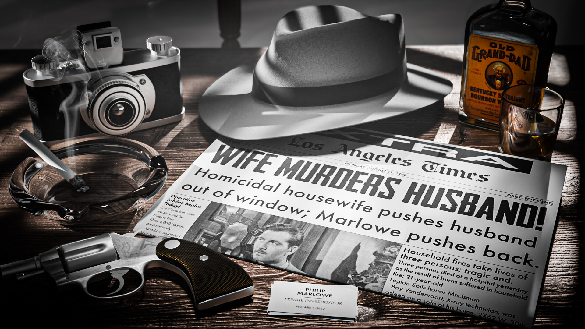
@mfortunato Congratulations on your ‘Text’ collaboration entry. It has a real Detective Marlowe vibe. Tons of assets that can be used in other projects, and it shows a lot of technical skills. A well-deserved first place!
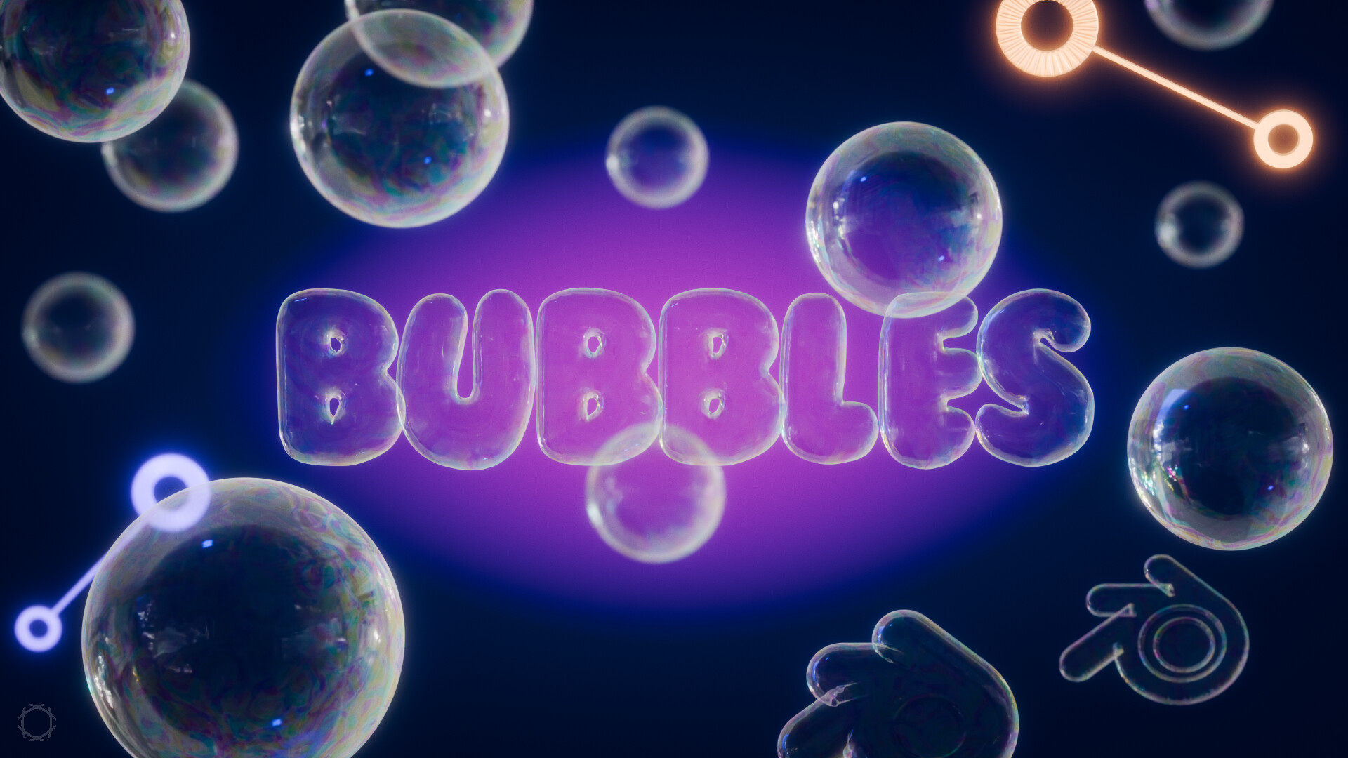
- CypherPoet - Soap bubbles are difficult to make in 3D! They’re hard to see in real life, so we need to make them clearer in the scene. Slightly less white border and more colors could improve the realism.
- Turgul - Great animation. Great job on using Geo-Nodes. The animation is more lively.
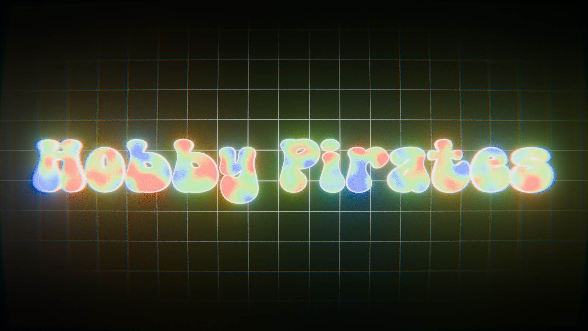
- HobbyPirates - Technically very nice. But also a bit difficult to read. Some characters are not distinctive enough (P, e).
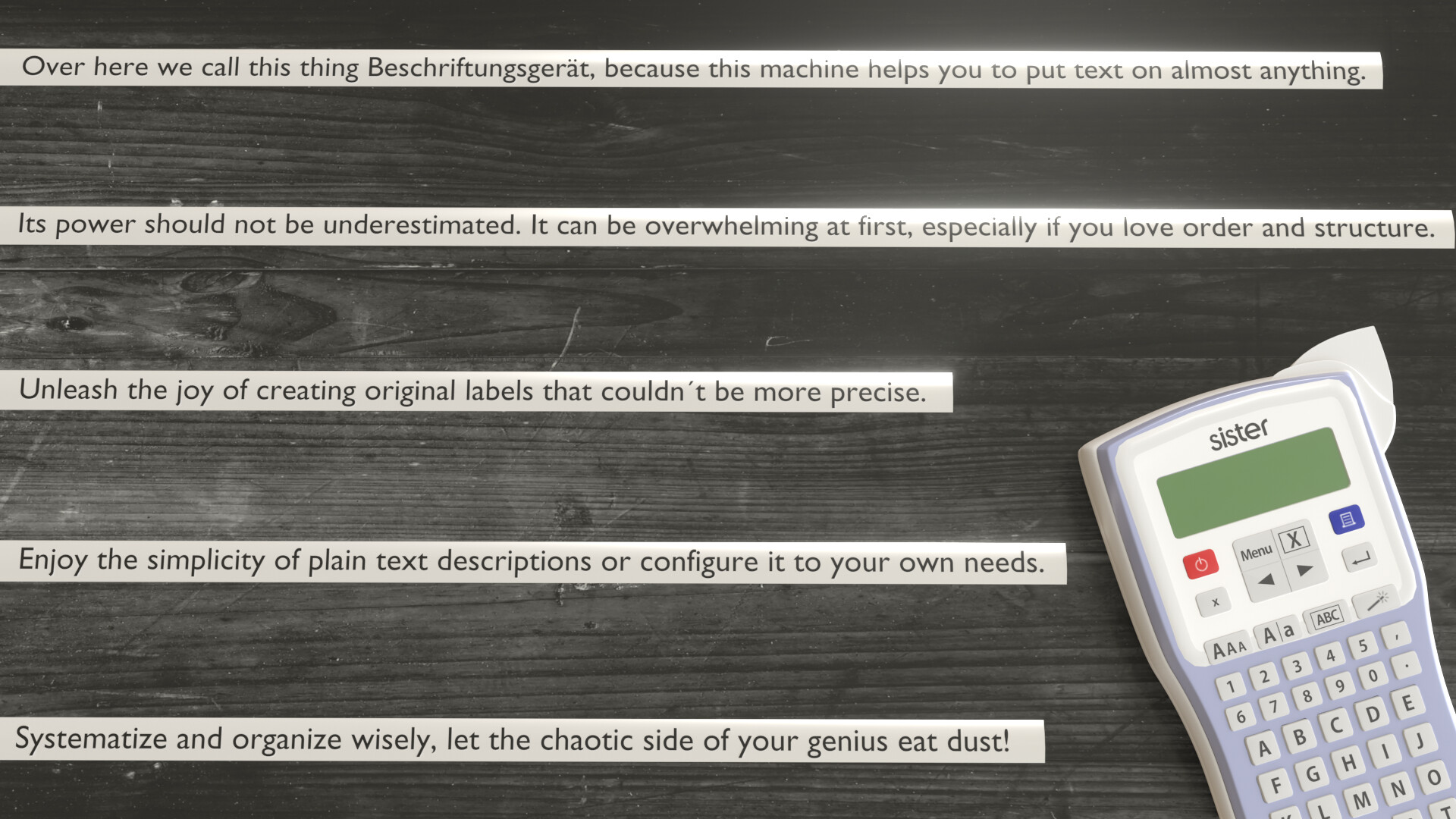
- Kasimir - Nice label printer kit. It could be more a scene, a story if you placed those labels on books, CD’s, etc… not as plain text. Those lines doesn’t match the look and feel.
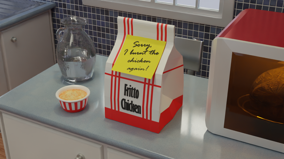
- Megane_Wang - A lot of work to build the complete scene. I think two objects are fighting for attention. I think making the microwave white (more diffuse?) will give the subject more focus.
Note: I don’t want to offend anyone. I try to write down positive ideas and visions in my simple use of the English language. I am also sometimes more inspired by a particular subject or solution. I’m also learning from you!
@mfortunato - I don’t normally comment on the winner’s entry. But I really like your project and maybe you can easily improve it with a few simple things. (Good for your portfolio)
- It’s the fifties or so. Add grain and noise to the artwork.
- The Whiskey label is too colorful compared to the rest of the image (it draws your attention)
- The items around the newspaper are too organized and placed too neatly around the news page. It could be more random and playful. You don’t have to read the entire headline. For example, it may be covered by a glass object.