2023 Collab: Week 8 “Freak show” - VOTE CLOSED

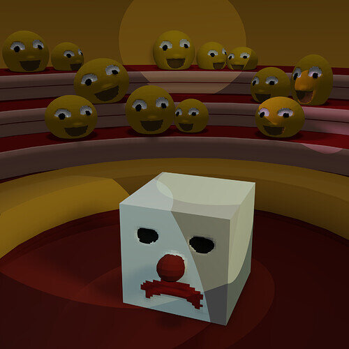
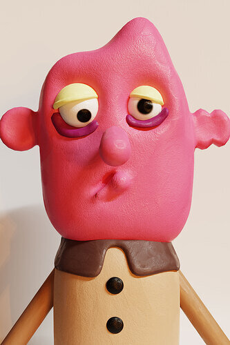
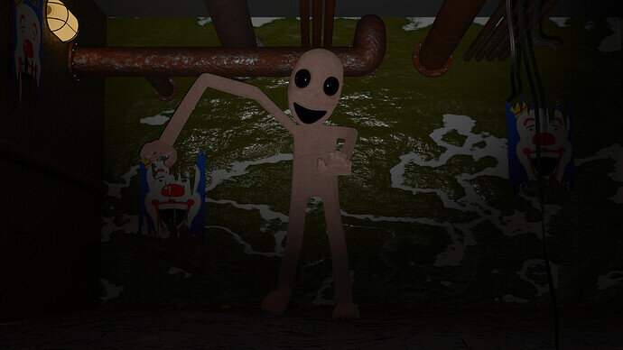
@Oloztarr - He looks like a character from an old stop motion animation, adorable!. The materials really sell it. Love the asymmetry.

@Tyger2 - oh no, poor marshmallow man looks severely depressed. Great pose on the character.

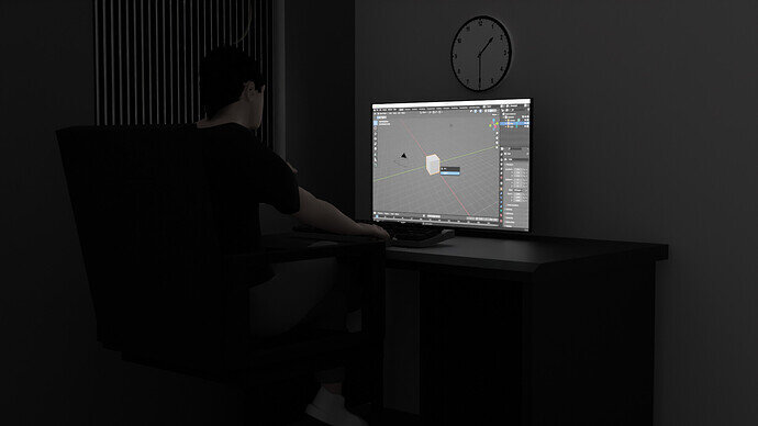
@TheDespicableDM I’m in this picture and I don’t like it!

3 Likes

True. Learned a few new techniques while doing it, so I don’t think it’s time wasted

1 Like

Feeling like I’m trying to jump into the last carriage :laughing:

It’s hard to be square in a round world…

6 Likes

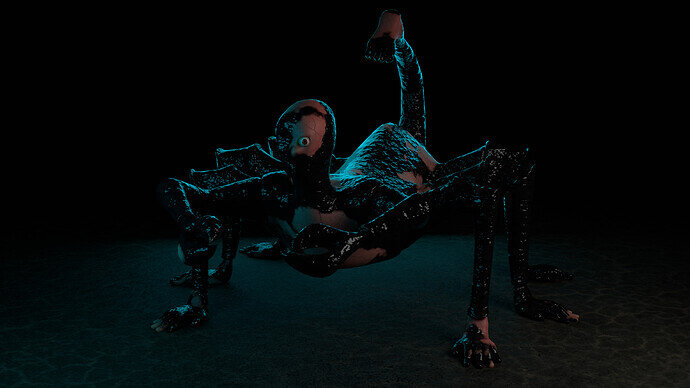
My weekend project. Freaky enough? :laughing:

7 Likes

Definitely

Yeah he’s not exactly in a great place right now.

@Kzanna Nice work! I feel like you’ve boiled it down to the essence of what it means to be a freak.

3 Likes

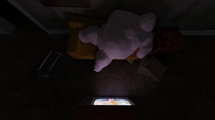
I thought this above angle was more interesting, but the character doesn’t look as dynamic in it, and we can’t see his weight bending the sofa enough.

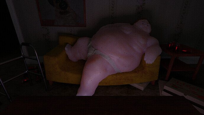
So in the end I went back to the original angle. Here’s my final entry:

Lenny The Large

I need to improve my use of subsurface scattering. It looks better with than without it, but still comes off looking kinda waxy.

7 Likes

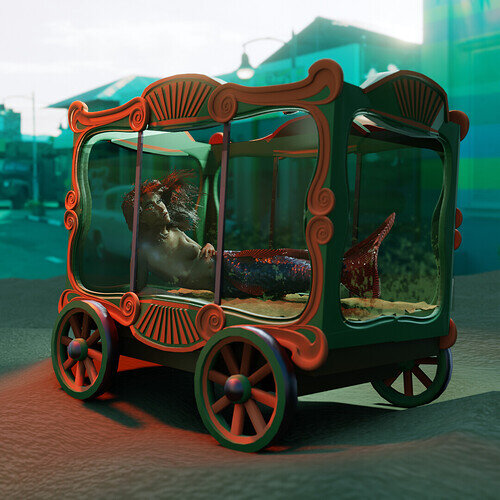
Nice Cart.

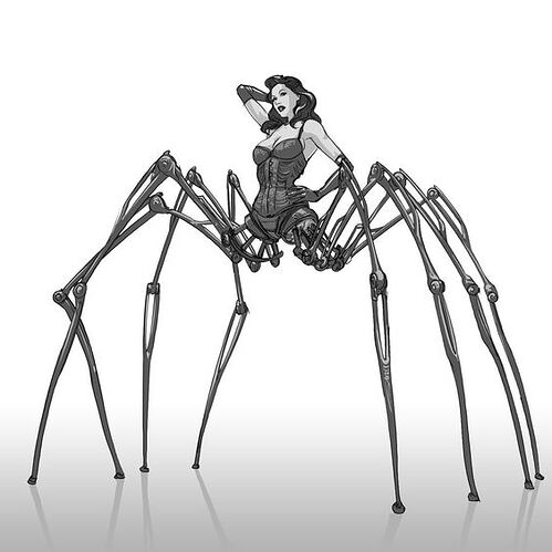
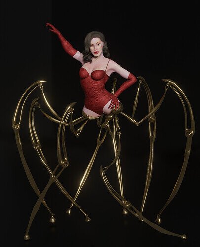
I had this character saved on Pinterest for quite a while and thought she fit the topic well. Unfortunately, I started working on the project too late so here’s my unfinished entry! :expressionless:

Reference

6 Likes

We @BlenderCollab have a few days to vote. You can vote fast but also think slowly about design, colors, technique, difficulty, subject, realism, etc. Choose consciously and not on your own entry.
And the new subject week 9 “Music” has already started. The winner of this week’s “Freakshow” challenge may select a subject for next week 10 and wins a badge.


5 Likes

@benu Congratulations on your winning entry on this week’s freak show. I must say you’ve nailed it. It’s a freak on display (show) and it tells the story very well.


  • Cathy_N - I think the way you’ve placed the legs, makes it less fluid. Normally the visual has a flow. Lines of view to guide the user. The legs are crossed.
  • Oloztarr - I love the texture, it’s like clay. The figure could be a character in a cartoon. But I miss some margin (ears). Pay attention to the overall composition.
  • Tyger2 - Such a nice progress, and idea. Skin is too pink (subsurface scattering). It’s more like wax. Needed more time …
  • Kzanna - Great idea! try to use vertex paint to smooth out the paint. It’s easy to do.
  • TheDespicableDM - Nice model and composition. But I miss the reference to the subject.
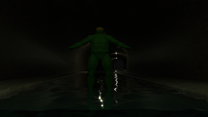
  • Gordon - It’s a freak for sure. A bit more lighting on the front. The blueish glow will still be visible. But then we see the creature’s details better.
  • Joey_Cuevas - It’s more fun than freak because of the smile. Some sort of cookie. The basement theme is a nice idea.
  • Willrun - Ninja Turtles comes to my mind. Play with more ceiling lights to create an atmosphere. Adding details like rats, and sewage dirt.

Note: I don’t want to offend anyone for any reason. I try to write down positive ideas and visions that I have in my simple use of the English language. I am also sometimes more inspired by a particular subject or solution. I’m also learning from you!

4 Likes

Privacy & Terms