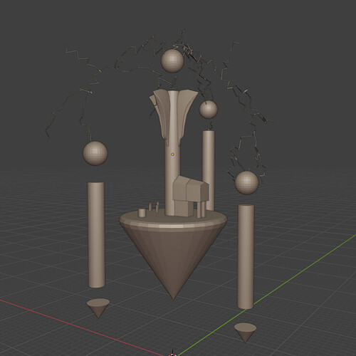
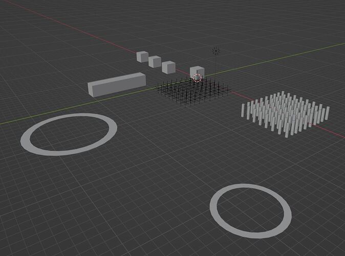
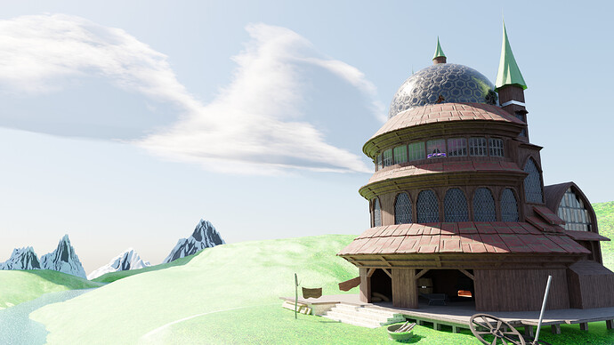
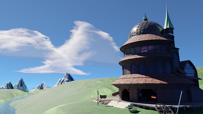
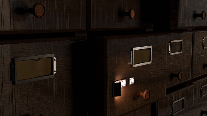
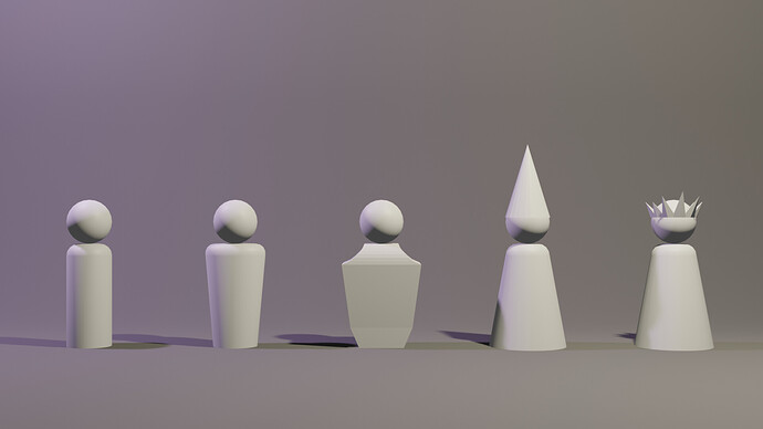
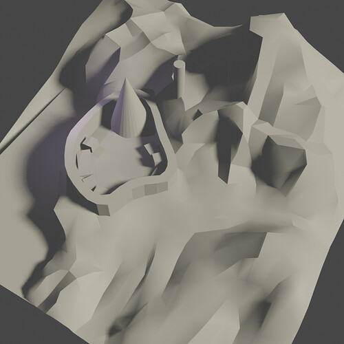
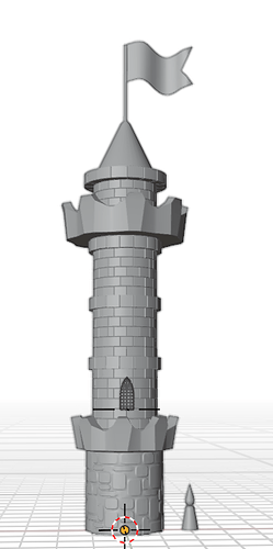
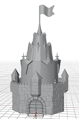
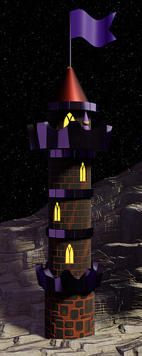
Day 1 - looked at inspiration and did some random blocking
I’m thinking an alchemist’s abode? Maybe wizard’s sanctuary? We’ll see! 
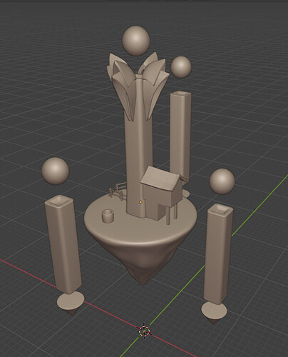
So day two - I didn’t have a lot of time to play today, but I at least got my blocking cleaned up and started on modelling.
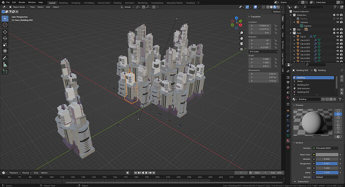
Using Blender 4.0, but the material behaves strangely.
Set roughness to nearly one, still highlights visible.
Updated with version iteration 8.
Try reducing the IOR Level under Specular?
Very nice looking city.
I just discovered that I accidentally copied many lamps, which caused the strange effect. 
Beautiful
Check grass material It’s too shiny, too bright.
WIP. Since I have a lot of free time (not), I decided to make a whole city. Of course, now I don’t have enough time to finish it, so I’ll share the process.
Future inhabitants, layout of the territory, wizard’s tower and royal castle.
update:
I regret a lot. And I can already see that the building does not suit the style of the residents. But here’s a wizard’s tower with its occupant.
I also need to learn how to light large objects. I don’t understand why the top of the tower is in the shade, the sun should be shining there!
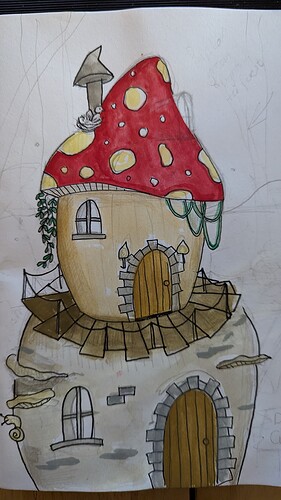
Here is my fantasy building from idea to final render. This is my first time doing one of these challenges and really enjoyed it. Still working out/learning about textures!
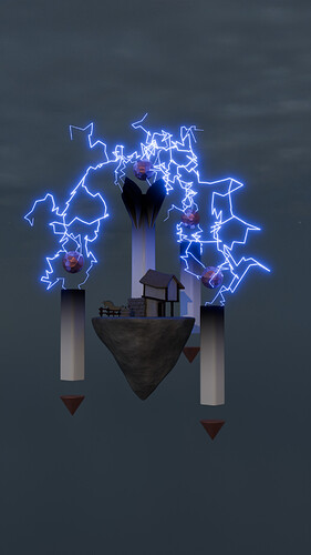
An alchemist discovered mystical conduits, left behind by an ancient race. He decided to slap a house up right against the main conduit so nobody could come and claim it belonged to them. (Yes, he isn’t a very clever person. I mean, thatch? Under perpetual lightning?).
So now he tries to harness the energy to fuel his experiments with creating gold. He also brought his very unfortunate donkey, who lost a dimension due to a time paradox. (There wasn’t enough time, but seeing as time is infinite, hey presto! Instant paradox xP).
But yeah. I meant to work on this all week, but I didn’t get the time I had planned on, to play in Blender 
As far as I can tell, it’s only the purple material that looks like it’s in shade.
I had a similar experience with some boulders. They looked like they were overly crazy reflective, despite me cranking the roughness all the way up. I realised I’d plugged a colour into the normal on my bump node, instead of into the height.
Dunno if that’s what’s happening here, but maybe check the material?
We @BlenderCollab have a few days to vote. You can vote fast but also think slowly about design, colors, technique, difficulty, subject, realism, etc. Choose consciously and not on your own entry.
The new subject week 48 “Reindeer” has already started. The winner of this week’s “Stylized Fantasy Buildings” challenge may select a subject for next week 49 and win a badge.
0 voters
Probably, it has to do with light physics. Also check face normals and your shader node as Breagha already explained.
Also work on real scale, because Blender render defaults are based on real scale!
The light will have a quadratic falloff (it is not linear). Inverse-square law - Wikipedia
Like a 100Watt lamp. It will light a room (if on real scale) as expected. Put a 100w bulp near an object, if will overflood the object. Then you probably lower the 100watt. But then (because of this quadratic falloff), it will not be lit evenly. Then you probably add an other lamp, or environment making it more complex.
Light in 3D is a difficult matter. Also because Blender Cycles is some sort of raytracer, but it never can mimic the real world. That’s why we use all sorts of tricks to make it looking natural. Nowdays with the help of AI.
All very good entries this week, hard choice.
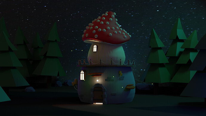
@DustyUnicorn Congratulations on your winning Collab entry for ‘Stylized Fantasy Builds’. A beautiful night scene with blue moonlight. The composition is well done, low-poly trees and detailed building in the center. Nice color palette too.
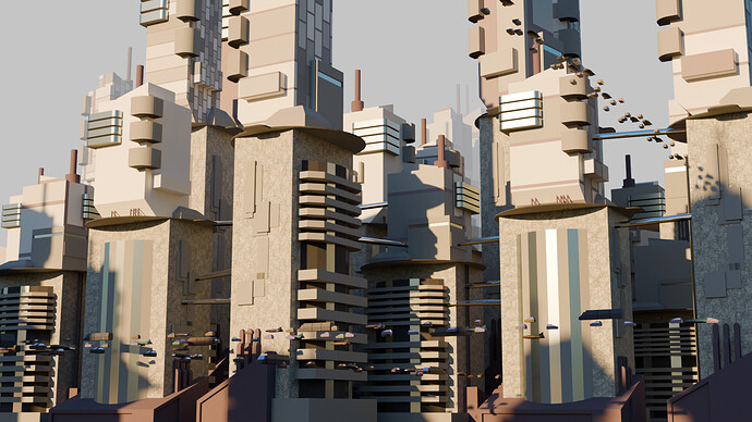
- FedPete - So strange, I just mocked something (blocks). Used basic city view guidelines and got this scene. Most time spend on Mist factor in the compositor and “Why didn’t the Array modifier not working, how I wanted it”. Instead of working many hours on design guidelines, composition, etc. Just do, seems to work better…
- Joey_Cuevas - Beautiful scene, high above the sea level (blue sky). Nice sunny weather and great architecture. You should do a second try on this project. Because I miss some balance at the left side of the image. Right full of details, left empty space. Check cinematic composition.
- Artur_Nastaly - Very fun idea! It’s a shame you didn’t develop this concept further. Opening a door, leading to nothing. I miss a city feeling in this concept.
- Kzanna - Like I said in my own review. Sometimes thinking to much about the 3D design process, looses it’s creativity and focus. You had a great stylized building concept. Maybe like me: copy it ten times, scale a bit rotate, and you have filled city view… try it out?
- Breagha - I think the focus lies too much on those mystical conduits. Good concept to start with, but maybe too far away from the stylized fantasy building subject. The mystical conduits are now the main focus. Bigger (closeup) building, with smaller magical mystical conduits (stones) lying around?
Note: I don’t want to offend anyone. I try to write down positive ideas and visions in my simple use of the English language. I am also sometimes more inspired by a particular subject or solution. I’m also learning from you!
@DustyUnicorn - congratulations! Awesome mushroom building! You really set the mood and fantasy feel 
Thank you for the feedback, @FedPete. You’re right, I think in addition to not having the time I thought I had, I definitely lost sight of the whole ‘building’ part of the prompt 
Thanks for hosting these ^^


