2023 Collab: Week 19 “1950s” - VOTE CLOSED

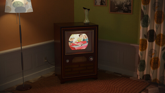
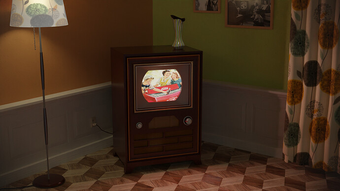
So much to tweak, but it’s my hardware limit and my time.
Cycles 1400 samples (about 35min render time), because low lighting and the denoiser had problems with dark areas.
I wanted to add a carpet on the floor (the 1950s) (maybe I still try it). And I need more details and objects at some locations, to make it more interesting.

Have fun!

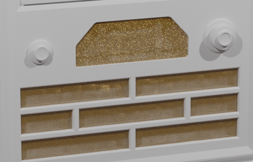
The scene is about the first color RCA TV-Set, released in 1952.

10 Likes

Hello! Everryone is well? I hope so :wink:
I had to be away for a while, but I’m resuming my studies now.
I was seeing again these very cool community scenes on gamedev, I’m posting them again on the collab, I hope it turned out nice too!
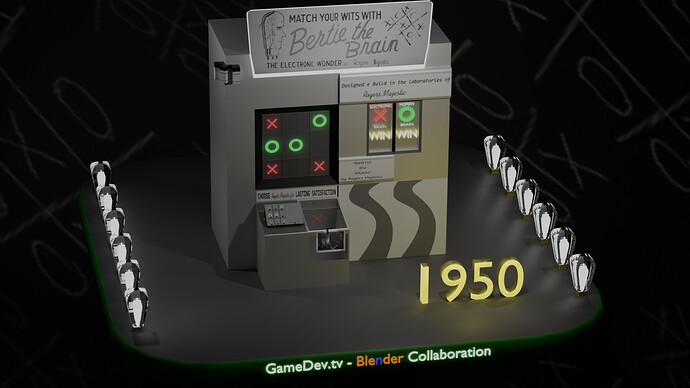
This is my scene, like a little representation of the 1950’s invention Bertie the Brain - using lamps a game of Tic-tac-toe (American English), noughts and crosses (Commonwealth English), Xs and Os (Canadian or Irish English), Jogo da Velha (Brazilian Portuguese).

Link about::
[Bertie the Brain - Wikipedia

6 Likes


Love these challenges. Would love to actually collaborate on a project with someone in future.

8 Likes

Never knew this!
Such an interesting topic.

1 Like

Good 1950s vibe, well done.

We @BlenderCollab have a few days to vote. You can vote fast but also think slowly about design, colors, technique, difficulty, subject, realism, etc. Choose consciously and not on your own entry.

And the new subject week 20 “Library” has already started. The winner of this week’s “1950s” challenge may select a subject for next week 21 and wins a badge.


1 Like

Well done all, I even set out to do this and just got nowhere near anything useable. Time, and my bad habit of getting too involved in a minutia of one tricky bit that would barely if at all be noticed by anyone. lol.

3 Likes

How do I vote? xxx

2 Likes

Just click on the circle above the picture, I do see that you figured that out though, if you need to choose someone else, hit “Show Vote” at the bottom and revote.

2 Likes

Nicely done this week, your scene really does scream 1950 with all the “older day” accessories with the small tv and the design with the tiles and curtains, nothing in your scene looks modern which is good. I like the subtle details in this scene a lot, the tv and the paintings add to the realism a lot.

@Medial I recently did a school project on this exact same thing, the Sputnik 1 was conveniently the first satellite launched into space in like 1957, so amazing work with the realism, and picking a significant event to revolve your scene around. The lighting also works well here, really showcasing your satellite, Earth looks good too.

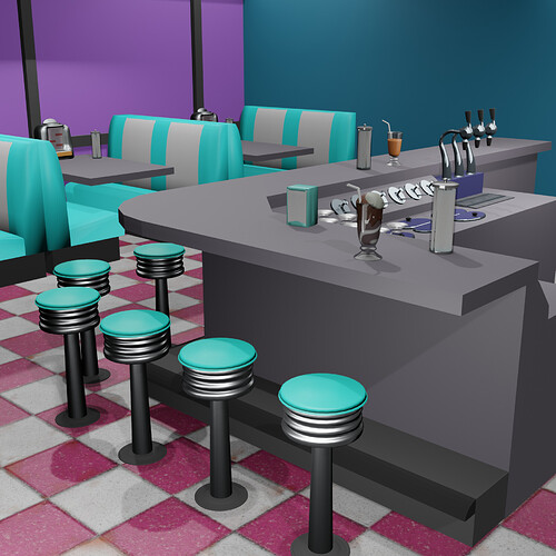
@visionary5 This scene kinda reminds me of the good burger movie for some reason, something about the barstools and booths just felt so iconic there. I love the rims on the chair to add some realism. Everything seems to have that old-school color, so that’s fitting nicely.

@kidgokubr I like all that you did with the scene, I noticed the Gamedev tv Blender Collaboration thing on the bottom and thought that was pretty neat, don’t know if I’ve seen that before, works well. As for the main part, looks like a tic-tac-toe slot machine in my eyes, but I’m probably wrong, I love the electric lighting all around, the the scene all together looks very neat and nicely crafted.

@Joey_Cuevas Pretty funny card, I feel as if that’s something I’m more likely to see nowadays more often with all the artificial stuff floating around, I like the drawing on the card, the facial expression is good.

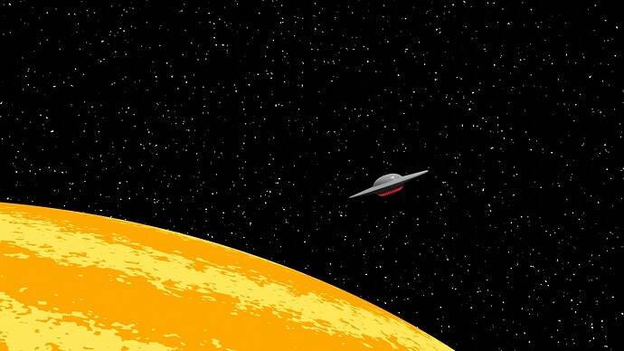
@DANB1 I love the idea of a UFO :alien:, however I feel as if this is something that could qualify in any time period, I love the streaks in the sun, nice space design as well.

-I am going to stop putting “Amazing job” or “wonderful work” at the end of everything, seems kinda pointless given the context-

4 Likes

Thanks dude, hope you’re having a wonderful today!? lol xxx

2 Likes

An ordinary day for me… Nothing much just some school and some game dev

2 Likes

I’m super, super happy today. I was really unwell at the end of last week, I slept for 3, straight, days. I can’t understand it, - I never get sick? I’m happy today because I’ve been able to draw for most of the day, lol xxx :heart_eyes:

2 Likes

That’s nice, maybe you join the blender Collab at one of these next weeks?

2 Likes

funny you should say that - I did start on a pic today, for collab, lol xxx

2 Likes

That’s great, hope to see it soon.

1 Like

Hi, thank you!

It’s all about reference! I searched the web for photos using the term ‘1950s’.
Amazing what you get. Only I couldn’t find a good carpet texture (frontal). Because in those days, the carpet was the thing to go for. Not a wooden floor. My floor was just a quick fix, to be replaced by carpet. But I was too busy adding a wire mesh to the TV set. Which created a huge vertex count. And in the end, it wasn’t visible enough.

tv-set - 06 C

Have fun!

3 Likes

FedPete congratulations!


  • Medial - Great atmosphere. I still think the vignette is too strong. Also, the metal reflection could indicate multiple light sources. Moon and sun, maybe one lamp too much?
  • kidgokubr - fun idea. Look like a product advertisement. Try to add tiny details, which will help the scale of things (a fighter jet vs. a Battlestar, the last one has more details).
  • visionary5 - Great 1950s vibe. I miss windows (the purple wall converted to outside windows) it will give more depth to the scene. Don’t forget to bevel the edges a bit. It can help the reflections of light, which also adds tiny details.
  • Joey_Cuevas - The idea could work, but a bit of reference study could also help. The fonts used are too modern. See your own example. And also color print was expensive in those days.
  • DANB1 - Concept could work. But wasn’t the film in black and white? To make it more interesting add a halo, clouds, or ground texture. Improving things to explore. Close by of the UFO with UFO details.

Note: I don’t want to offend anyone. I try to write down positive ideas and visions in my simple use of the English language. I am also sometimes more inspired by a particular subject or solution. I’m also learning from you!

3 Likes


:sweat_smile:

2 Likes

Thanks :slight_smile:
I totally agree about vigniette, but I didnt even had that 15 minutes to fix it after you pointed it out.
I also find out its not easy to lit totally smooth object. Too much roughness and it quits being polished. Not enough and it reflects light in a strange way. So I went with one too much light source to lit it from above - maybe it would work just to delete it?
There is sun, moon and earth blues light from behind, but idd, one too much of unknown origin. Must be alien spacecraft :wink:

1 Like

Privacy & Terms