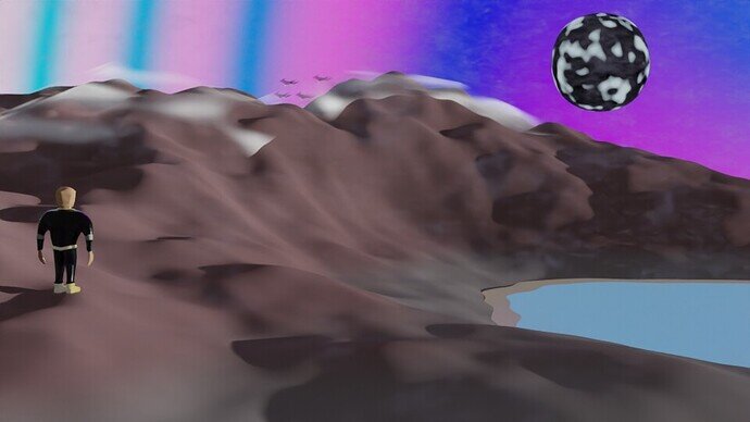
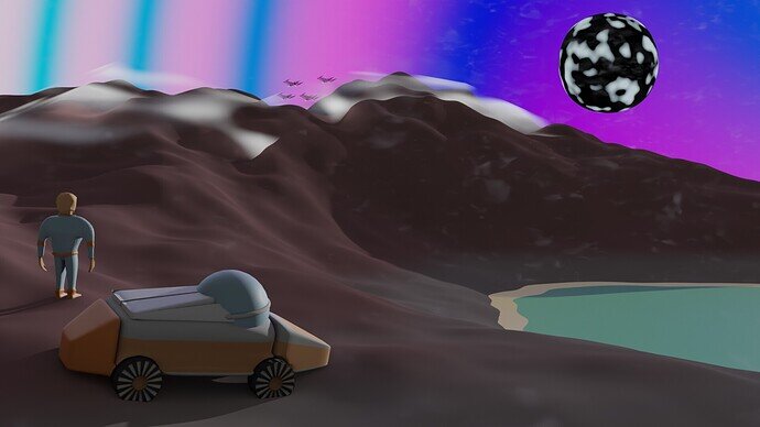
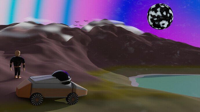
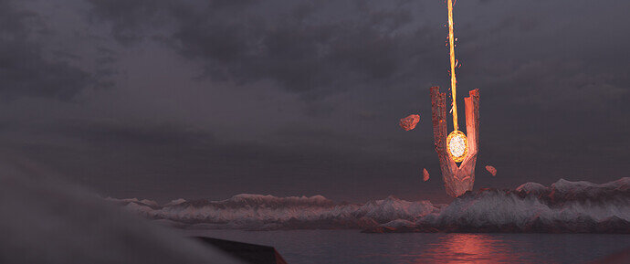
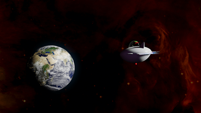
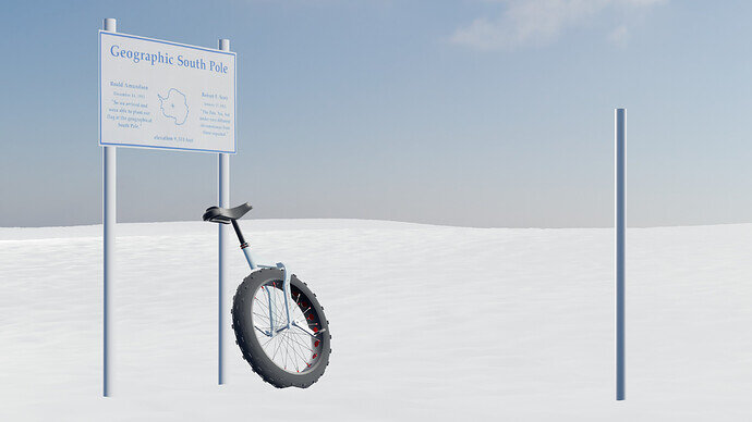
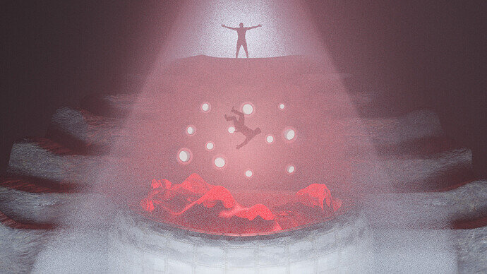
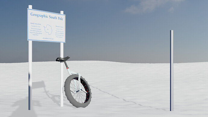
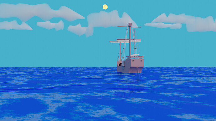
Time ran out, so here is my submission. Long time no blender, so it all went pretty frustrating and aimless. My plan was to take an old abandoned project, which just had completely blank landscape. Perfect to make somebody explore it. Wanted to rig the figure and put him in an interesting pose, sadly i forgot how to rig properly and messed it up. Doing the nebula and dust was fun, but something looks off with that, can´t really tell what exactly. I like the scene nonetheless, it´s easy to spin a story around it i guess.
Have a great weekend everybody 
I don’t know if the deadline is closed. But the time thing says 3:55 PM but I don’t know if that adjusts for timezones automatically. Anyways it’s 1:57 AM right now. I was planning on working more on this today. But hahaha I’m worried it’s too late.
Just add your entry(ies).
In about 24h I will create the vote. On that moment it’s really closed 
it’s officially closed at 00:00 tonight, but then I probably sleep. So tomorrow I will gather the entries and form a vote. So if vote is created, then no more entries accepted.
You have still time …
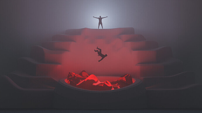
I saw the subject for this colab tonight and thought about a portal for some reason. This lead thinking about a civilization that sacrifices people in an old portal in order for these “pioneers” to find new more prosperous worlds to live in. This portal has been there for as long as anyone can remember and nobody has ever came back. But they remain optimistic 
I have two versions. A cleaner unaltered version:
And one with volumetric lighting and textures. I left the light graininess there on purpose. I think it looks better without the denoising in this case.
Which version do you like better?
I miss some shadows … just a little tweak … 
Remember I will use the last entry.
Cool Idea! For me it is the First one. My eyes directly Focus on the Pioneer who falls. In the second one the lightest spot in top also Puts emphasis on the Person above. So my brain basically reads two different themes. First one “sacrifice”, second one “Display of Power”. Nice renders, but i’d never Interpret the Exploration aspect without given the Backstory. I really Like the Base Idea though. What would Work for me to visually read the Story would be to See, that another world, or maybe Something Like a corridor, ließ behind the Portal.
I also think the first one is more visually appeling. So I’ll make that as my final submission @FedPete. And I also agree with you @Kasimir, it doesn’t really fit the subject that well. But this is just what I ended up with tonight 
You even made an animation. I missed that! Awesome 
It’s cool you kind of found your style. I always recognize one of your renders
A great way to get back into Blender though! Many cool little effects there and you played around with a lot of tools. Next time it will be even better


