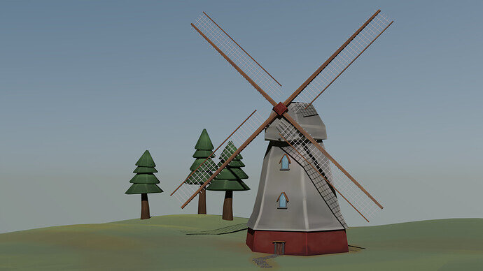
Very much a beginner and have no idea how to make my renders all spiffy yet 
But was looking for something to practice with as I feel a bit trapped in tutorial vortexes so wanted to see what I could do with minimal outside help just to see what I can remember. Turns out its the most basic of low poly modeling and some texture painting, but I’m pretty happy with what came out, lots of issues and improvements to make but as an exercise, I can see what I really want to be learning next.
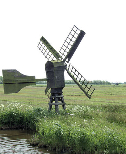
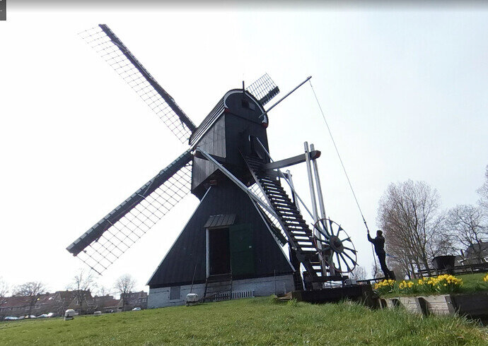
A Poldor Windmill. Seems to be for powering pumps for land drainage.
The mill is what the Dutch describe as a Weidemolen (English: Meadow mill). Example Arnhem post mill (1946) - Wikiwand
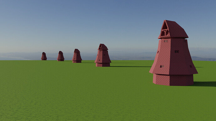
Tricky thing to model. Debating between an array of windmills or just duplicating and rotating individually.
WIP
Keep it up, doing the collab challenges are lots of fun and when I noticed I had actually learned quite a bit and you’ll learn to do new things each week because you’ll have a specific idea in puzzle in mind to solve.
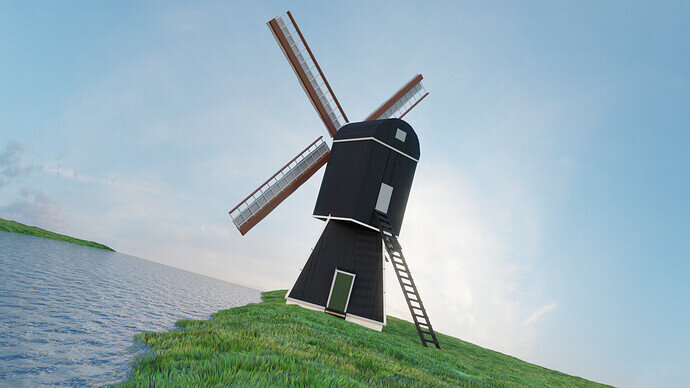
Here is my attempt at recreating a windmill that I liked. If you’re wondering why the camera is like that, it’s called the Dutch angle 
The camera angle plus the fact that the top part is also at an off angle to the bottom makes my brain hurt in a good way, who knew a windmill could make me feel uneasy love it.
 Exactly, I catch myself tilting my head every time I look at my render… Maybe I overdid it, but I stand by my decision!
I will not have enough time to do what I originally planned but this isn’t the worst. These windmills naturally have really odd shapes and getting it right was fun to try.
That’s what I too do feel.
Creating a windmill, I realized, is real time taking.
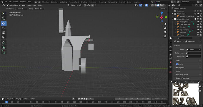
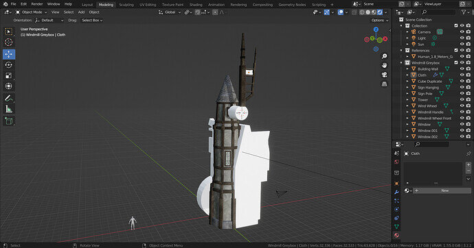
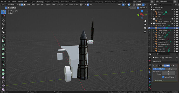
After Greyboxing I thought windmill as a great asset for games too. So, am creating a windmill that is low on polygon (not necessarily low poly), quad and triangulate faces and animatable.
Finding it really hard to do within time!
Will miss this topic!
Since it is a complex structure to design, may I request extension of date by one more week for this topic?
If not possible, it’s ok!
We’ll keep the weekly timeline.
In the past, we have had many requests for challenges over a month or so.
Even team events. But it’s hard to do so. Basically, a lot of the students find it hard to spend 4 weeks on one subject. And it’s also not the idea behind a weekly challenge.
There are some options you can do:
- Promote your visual in the “Show” section.
- Create a WIP timeline of your work.
 very funny interpretation …
We @BlenderCollab have a few days to vote. You can vote fast but also think slowly about design, colors, technique, difficulty, subject, realism, etc. Choose consciously and not on your own entry.
And the new subject week 43 “Abstract Art” has already started. The winner of this week’s “Dutch Windmills” challenge may select a subject for next week 44 and wins a badge.
0 voters
WIP…
Till now I have been able to do this much only on the Windmill.
This is the most time taking project that I have done till now. Lot of Modelling, UVs, Texturing etc
The side view
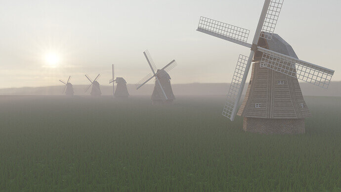
@sezpul Congratulations on your winning “Dutch windmills” entry. The early morning sun with dew is a beautiful combination and composition. If you also added a waterway, the scene would be complete. Mills in this setup were used to pump water from the low-lying land.
- Daniel05 - I very nice bright with high contrast scene. The camera tilt is creative but also makes it strange and unexpected.
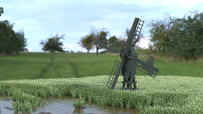
- NP5 - You show us a good understanding of composition, and scene building (rules of third). The flowered grass looks too much, too evenly. Maybe because of the lighting conditions.
- Joey_Cuevas - So much fun with this design. Could be part of a different topic. I like this concept very much. The sails could have a thinner, transparent feel.
- Simon_McCaffery - Good scene and composition. The shadows are too strong. Us a sun lamp, because it’s an outside scene and increases the sun angle, which gives you softer shadows.
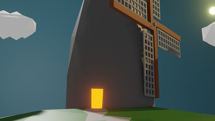
- Cows - The (attention) eye goes to the door opening. The windmill is there, but it isn’t the center of attention.
- umishrak - Planning and work effort are sometimes difficult to handle. I see a lot of potential in your design. Starting with a block out is an excellent idea, but it should also be an indication of the work involved.
Note: I don’t want to offend anyone for any reason. I try to write down positive ideas and visions that I have in my simple use of the English language. I am also sometimes more inspired by a particular subject or solution. I’m also learning from you!
Thanks! yeah my initial idea had a marsh and streams and tulips but time flies.


