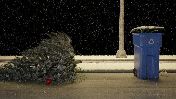
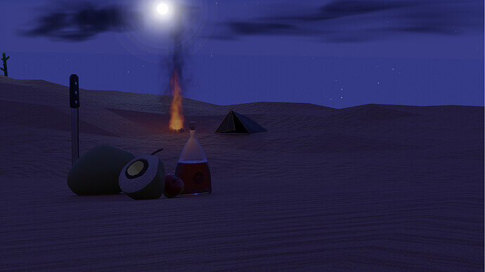
Update: I’ve got a day or so left to tinker with this, but I’m oddly unsatisfied with it and can’t quite place why. Thoughts and critiques?
I can see a couple of problems.
The main one I’d say is the framing, the 2 main focal points are spread slightly out of the rule of thirds without link between. The viewer has nowhere to look (nothing interesting to look).
The second problem is the lack of contrast (same mistake I made on the desert challenge). It may be the colors or the light choice, I can’t say for sure.
EDIT:
I want to add one thing, the composition could’ve been more interesting if for example the dumbster bin was positioned exactly on the right third, put the tree behind it as it was left there. This post is distracting in this current position, maybe move it more to the left and make it less Bright/Saturated so it does not attracted so much attention. Maybe keep it behind the bin but make the much brighter than it. On the left empty space there could be a city landscape or something else that fills the space without been the main motive.
PS: I may not know what I’m talking about. Please use your own discretion when receiving this feedback.
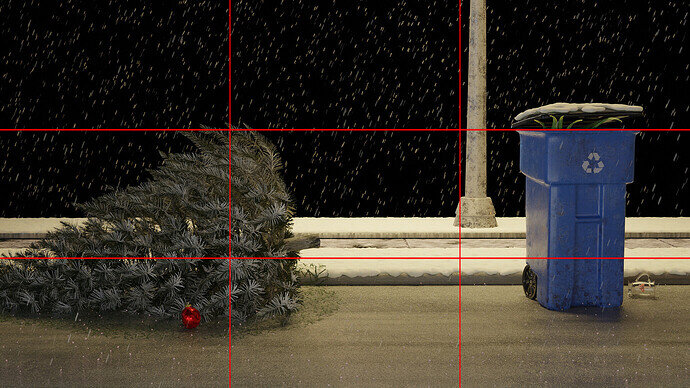
I agree with @igorfv about the Rule of Thirds issue. Here’s a quick markup I did to help you visualize what he’s talking about.
Only the lower half of the tree is at the bottom left focal point. The other 3 are empty of any of the main objects in the scene.
It’s missing a story.
Adding the tree partly in the bin, would be more one statement. Like, It’s too big to recycle.
Oh man that is funny 
I may just have to do that now.
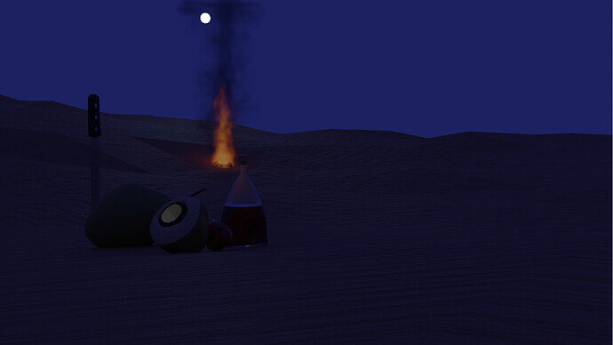
Still have a couple of things to add… stars and clouds and some other objects maybe some more lighting
- Apple and Cognac bottle from Week 1 “Glassware”
- Desert Scene from Week 2 “Desert”
- Moon from Week 52 “Snowman”
- New Coconuts, Machete and Campfire etc…
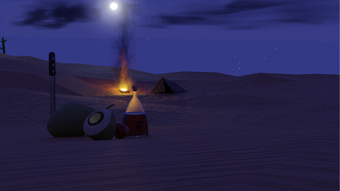
Yes, add a bit more light (on my monitor it is dark).
Yeah I figured it would be on some monitors, looks perfect on mine but every bodies monitor setup is different so will add some more 
Oh, that’s exactly what I meant with my EDIT but you used english that actually makes sense.
I had absolutely no inspiration so I made a recycling sign and uploaded a few versions to Wikimedia Commons. Maybe somebody will have a use for them
Summary
Made entirely in Blender 
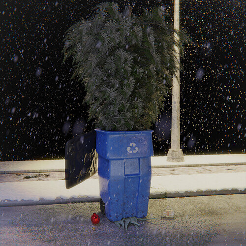
Final: I took everyone’s excellent advice and made a much better image for it (with some changes of my own as well)  Thank you! @FedPete @igorfv @Miss_B
Much Better!! Now it’s more properly set up for Rule of Thirds. 
The only other suggestion I would make is raise the camera, as you don’t need quite so much of the empty ground in the foreground, and then you would have a bit more sky above the tree.
Give the edges some bevel.
Or make the arrow bending part a round curved style.
It will add more spunk.
Hopefully bright enough for everyone now ?
May want to do one more thing with but may not have time.
It’s better!
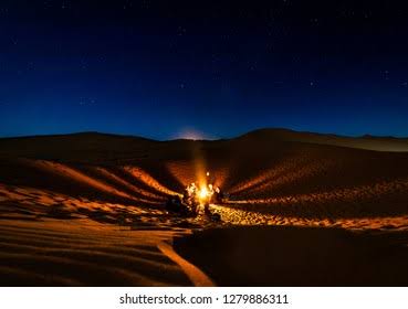
The only wrong thing in my opinion is the bonfire. It was supposed to the the brightest thing in the scene (in a realism pov) but it’s faded.
That’s it!
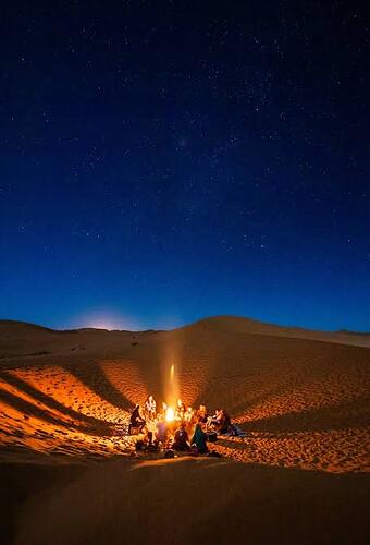
That’s the reason we should always use reference photos =)
Nice scene! I see you used the rule of thirds much more effectively than I did (I actually had to look it up  )
)
Much improved with the brightness of the lighting and the fire 


