I know, but haven’t gotten up the nerve to play with them . . . yet!
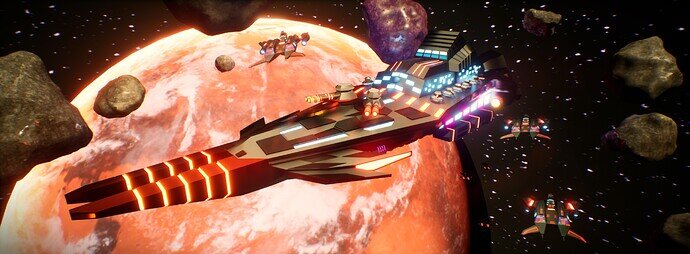
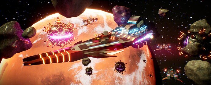
It’s something… I’m doing a space-based game for  gamejam. And what space game needs? Spaceships!
Some more info
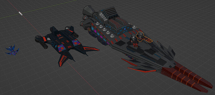
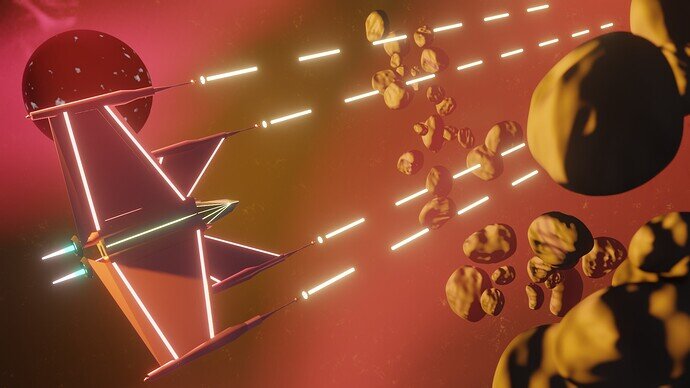
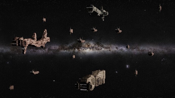
We are making a game in unreal that is about capital ships… The big one above is ~230m long, the “little one” is ~90m long. There are couple of fighter ship there (barely visible).
I made the rocks with blender+substance (just for baking) + quixel mixer (I finally used it for something! It’s nice for such things.
The planet is based on satelite phothos of mars… combined with Earth’s clouds :D. With Fresnel ofc.
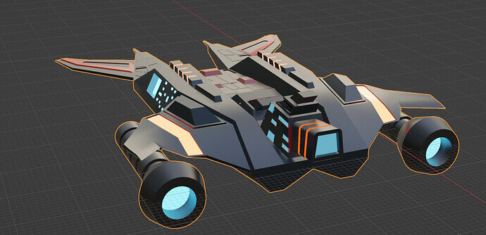
Ships were supposed to be ‘low poly’, but I got a bit carried away while adding details… but it’s still based on very simple coloring with palette texture.
Here are those 3 ships in a viewport:
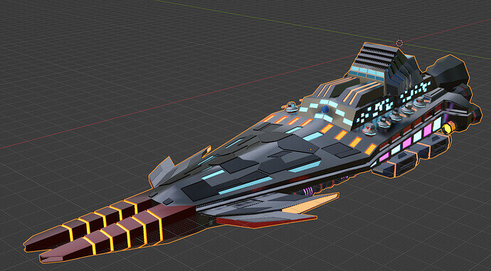
And lookdev preview of the main one:
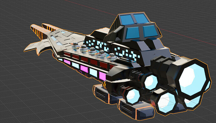
And lookdev preview of the ‘smaller’ one:
I might update the submission, depending on what will be current priorates for the gamejam 
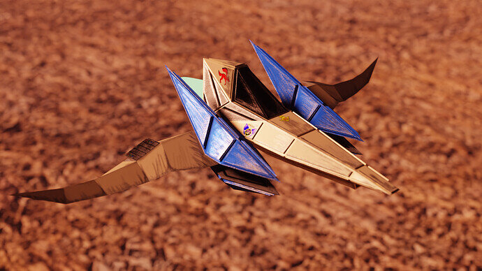
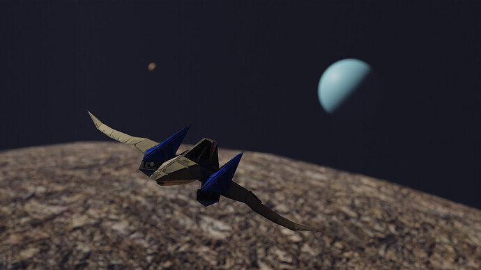
Here is my submission for the 2022 Collab Week 20 “Spaceships.” I recreated The Arwing from the 1997 promotional art of “StarFox 64” or as it’s also known as “Lylat Wars.”
I had created the central body of the ship a long time ago, but never continued it. This was long before I had done Grant’s orc / ogre character creation.
I was inspired by alex_torres1 model of the “Blue Falcon” Section 3 - F zero model blue falcon. So I decided to make a model from another franchise on the Nintendo 64.
I would like to thank NP5 for sharing a link from that post, otherwise I would not have discovered this topic and taken this challenge.
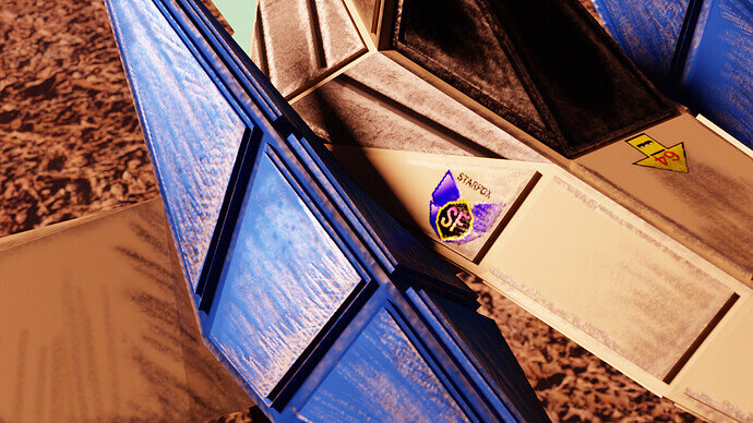
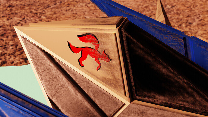
All the details are texture painted. The decals, while referenced, were hand drawn and refined in Krita. Aside from the central body, the rest of the model and the textures were made this week.
As a final note, I wish to thank Grant Abbitt for making the character creation coarse. This ship was approached with the same techniques as the ogre / orc (except for sculpting). This was a great project to undertake and I hope to do more in the near future.
Hi, everybody! Long time no see. I’ve been out of the Blender action for a while, but I recently started up the Unreal Engine C++ course, and decided to check back in here. Then I saw this awesome topic and really wanted to get something in at the last minute. Boy do I feel rusty! 

Here’s my submission:
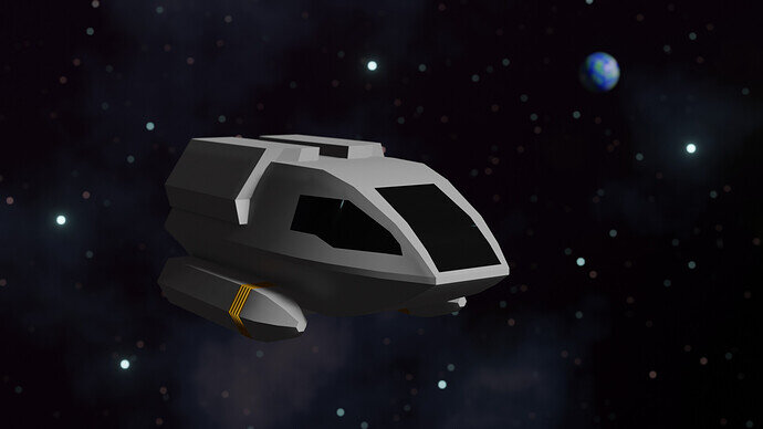
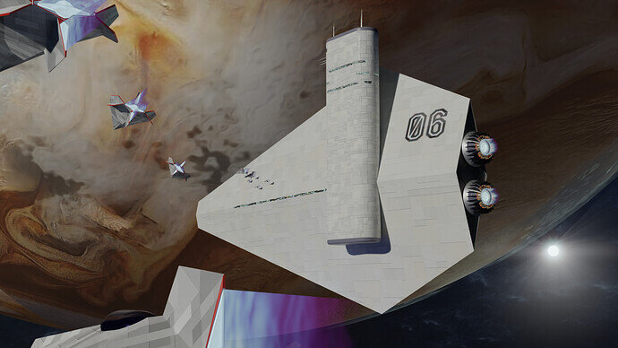
Low Poly Shuttlecraft Type 6 from Star Trek: The Next Generation
I thought I could throw together a low-poly Enterprise in a couple hours, but I underestimated my Blender atrophy, and it proved too complex, so I ended up going with the more simply shaped shuttlecraft instead. The stars and planet in the background are reused from old projects.
Don’t know if I’ll have time, but I might try to join in a few of these again. Nice to see you guys again!
WIP, it is so slow working with a material editor, compositor, rendering …
It slows down creativity.
Update:
Changes were made
- First, I fixed sun direction - planet shader is independent from sun and I forgot to align them previously.
- I fiddled with camera angle a bit
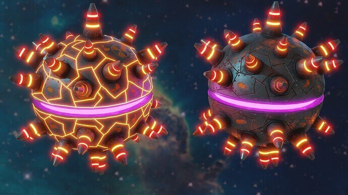
- and the biggest change - I added anit-capital ship space mines :D. Here are mines rendered in Blender with in 2 extreme states: near explosion on the left, and dormant on the right:
Welcome back, you escaped from the dark side!
Good to have you back in here.
Space mines when ‘dormant’.
Surely would be as near invisible as possible, not illuminated so they could be seen and avoided! Once they exist, they will probably be like stealth planes, hard to pick up on radar type systems too. Even proper old games like C&C mines were invisible to the other side until your vehicle drove over them!
Yup. 100% correct… but I like glowies  Sooo let’s say… the clocking tech is soo good on those, that the ‘100% dormat’ is invisible (it’s the third one on that render, just in front of those 2
  ). And the 2 are “near explosion” and “lock onto you”
fun fact… I’m working with another person on the jam… and he hooked it up like you said in the game (i.e, no glowies when far away :D)
We @BlenderCollab have a few days to vote. You can vote fast but also think slowly about design, colors, technique, difficulty, subject, realism, etc. Choose consciously and not on your own entry.
And the new subject week 21 “Spooky” has already started. The winner of this week’s “Spaceships” challenge may select a subject for week 22.
Spaceships seems to be a difficult challenge.
arggh They’re all so good. Will be a tough one to pick just one.
pretty great stuff! and awesome texturing!
Thanks. I hope to see more of your work in the future as well.
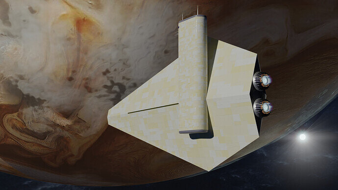
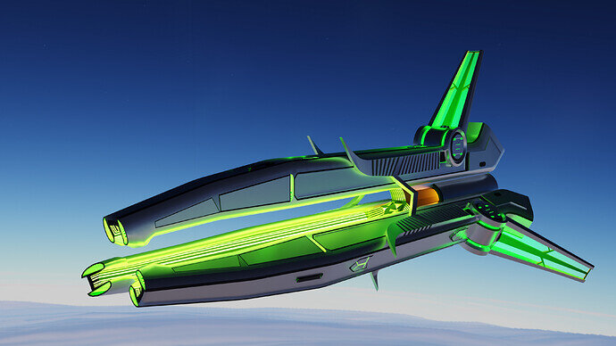
@Lintari Congratulations on your winning spaceship entry. It has a distinctive spaceship design. And because of your presentation (above a planet) it is very recognizable as such. It has a simple main shape with a lot of details, which makes it fun to see. It’s also mysterious, alienated shape. It lets the viewer guess, what the function on the green ‘intake’ will be.
- 3DE_study - Also a good spaceship presentation. But it could use more ‘spunk’. It’s too simple, adding engine exhaust or so?
- FedPete - The smaller spaces ship are barely recognizable and too simple in design. It’s hard to give the viewer an impression of scale.
- NP5 - Although the objects are generated, it does just fine for what it is intended for. I like this scene, but the nebula does overtake the tinier ships.
- Typer2 - Very recognizable (iconic). But it lacks details (textures).
- bOBaN - Very colorful, but also difficult to read. There is too much going on. For a game difficult to see, the object of game attention. Avoiding mines, then those mines needs to be more visible, for example.
- Kasimir - I like your color schema. Also your presentation, layout. The rocks could have more ’ rocky’ details. Look up reference material. Add more texture to the spaceship. Armour plating, a sign. Choose spots to make it more interesting, by adding details.
Great entries everyone. Have fun and importantly, did you learned something new this week? I, for example, learned more about generating sun rays in Blender post processing.
This was an important challenge for me to participate in. I was able to clear my confusion about texture paint settings, learned how to better appropriate space for small details on a UV map, and do the entire workflow within a week.

