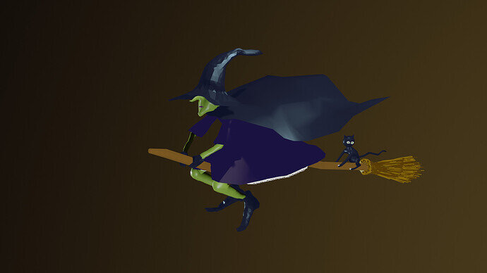
We @BlenderCollab have a few days to vote. You can vote fast but also think slowly about design, colors, technique, difficulty, subject, realism, etc. Choose consciously and not on your own entry.
And the new subject week 15 has NOT been started. I’m waiting for a subject. The winner of this week’s “Idioms” challenge may select a subject for week 16.
Nice entries, well done to everyone and good luck
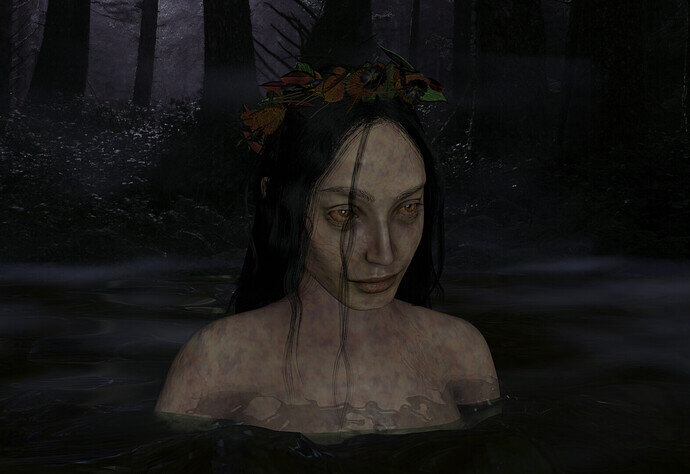
@Cathy_N , Congratulations on your submission of a mysterious-looking, mesmerizing, lady in the lake. The hair looks great and it’s a good composition. Focus in the middle of the scene, well lit, even under dark conditions. To me, personally, it could be part of a horror scene …
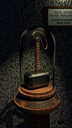
- FedPete talking to FedPete - It’s an old project and back then it was the best you could do. But it has it flaws; the back wall looks restless, too noisy. The wood texture is wrong. The glass looks to perfect, more plastic-looking, I miss bevels on the objects, Lighting could be better (spotlight in the middle ages?). The clue of the story isn’t clearly visible (thor’s mini hammer, bottom right).
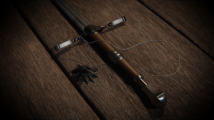
- Peter_Khromov - I like the way you’ve modeled the sword. But it is too clean. And the light could be improved (darkness on the shadow side), color …
- Lintari - Not sure, what viewers should expect to see in this scene, for “Myths and Legends”. Which is also cultural of course. Personally, I like it, but I miss the context with the Collab subject.
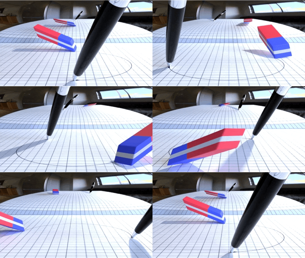
- Kasimir - I like the way, you did the distortion of the mirror. And yes, going for animated GIF, you need to lower the number of colors. What puzzled me, was you did the trick of the erased line. But now I think it is a rotating image plane?
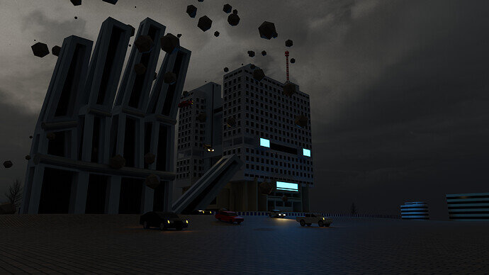
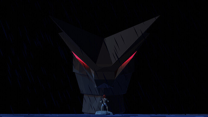
- Yee - it’s too dark. I do think the small figure confronting the monster, could be more emphasized. Stronger color, light beam?. It’s about guiding the viewer through the scene. At first, I see two eyes (red beams). Beter if at first your attention goes to the small figure and then trying to find out why he’s is standing there.
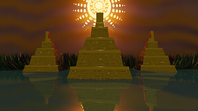
- Kax - Lovely golden city of “Eldorado”. But it needs to have more spunk. Try to Improve the composition, adding details like people on the road, adding more details. …
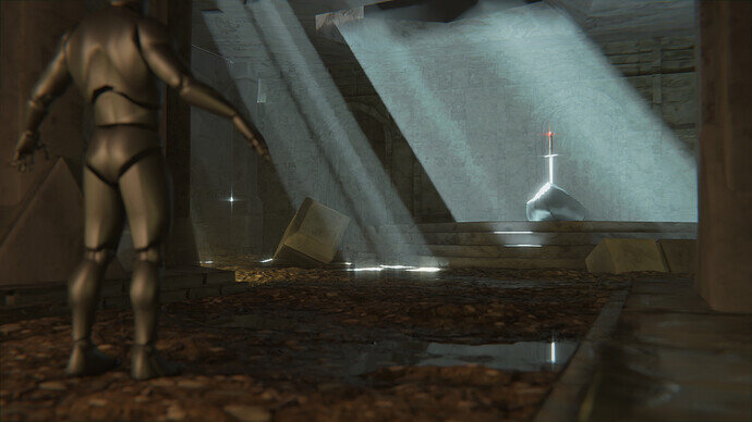
- ZachDude - A very good start with a very promising scene. I Love the way you composed the scene. Introducing guides to the subject, rule of thirds, triangles. Really impressive, but I think you’ve run out of time. And why it the sword always 100% vertical?
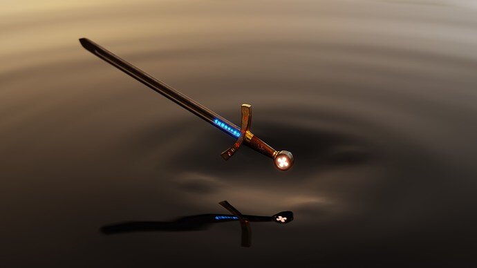
- bONan - welcome back. It is a clear scene. But I miss the hand, arm of the lady in the lake. It makes the visual story complete. The (blue, white) lighted symbols, do give me a sci-fi feel.
- mimsybean - You’ve used very recognizable symbols. To express something about Myths and legends. And more details to make the scene more complete, like a sky (moon) and some rooftops with smoky chimneys …
Great entries, you should be proud of the things you did!
Jaco_Pretorius - I really like your scene. Maybe not so Myths and legends, but who knows … I’m impressed with your lighting and story. It feels like a late evening sun, with a bit of haze. It looks mysterious. maybe adding some sort of engine (descending) distortion?
Have fun, everybody!
Hi FedPete,
thanks for your feedback. If I got you to „puzzle“ how I did the thing with the erased line, I see it as an accomplishment. Let’s solve the puzzle together, so everyone can profit from the solution 
Background reflection
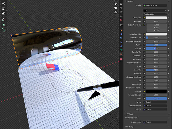
At first it was a mistake - I didn’t want to reflect anything in the background at all, just wanted a nice gradient. To control it a bit easier, I decided to project it on a cylinder. Didn’t find it interesting enough, so I just cranked Metallic to maximum to see what happens - my guess was it would stretch everything to unrecognizable. Didnt´expect to get a clearly visible reflection! I loved how it mirrored the circular motion going on with the objects. Made the whole thing appear more dynamic! But - uh oh - it also reflected the hdri background, which i set to be transparent for good. Couldn’t figure out how to make the cylinder only reflect the scene without the hdri. So I made the bug a feature. Will experiment more with that in the future!
Erased Line
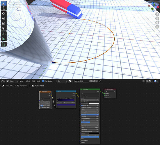
Nope, it’s a mesh. Add (very thin) Torus → (keyframe 360 rotation) → cut in half plus positioning so it meets the tip-points of pen and eraser. Also added some more thickness where the ink comes out of the pen → scale on z-axis to 0.05. Done.
It’s that easy, but was a long way to get to this simple solution.
Originally I made it with grease pencil. Looked better and more „inky“ but didn’t render properly in cycles, it alway overlapped the other objects when they should appear in front.
In conclusion this weeks project really helped me to figure out how to do looped animations a bit better. Still so much to learn, but i clearly see progress! Thanks to the whole community!
Have a sunny day, everyone!
Kasimir
 i didn’t expect that!
use camera focus and or Blender post-processing features!
You can render HDRI light info, but not visible as the rendered background image.
 did not see that one coming …
Blender is so much fun in all its possibilities.
Great implementation and problem solving.

