Right in my alley this. Since I developed quite a fascination with glass over the break.
I’m planning to make it to scene of kings  Sitting down with glass of wine and contemplating place kind of thing. Working on another piece of jar thing and thinking about surroundings. Book shelves etc. doubt Ill have the time. Back in my mind is this image of streaks of light bursting trough in to the room but try as I my I cant get any result to that effect. Any helpful advice? I hope some day Ill be able to do with out HDRI but I’m sooo bad in lights.
So far I got this.
I think the glass (foot/base) needs to be thicker (beveled)?
And the table texture (look) doesn’t match the table edge (flat & sharp).
I miss more peripherals to give it a kitchen look.
Maybe use a different environment (party table?).
A better fluid design could improve your entry (You have still some time left …?)
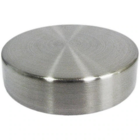
Also, the cap is too shiny, in reference to other bottle caps.
I agree. It needs to be more bowned up and rounded on the edge. Rim of it need some refining too.
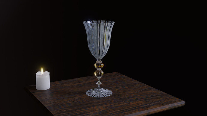
I’m currently ripping off a glass designer Yourmurano. Not sure if its the guy name or region. Anyway in research for references after a while this came up and c’mon. Imagine you could do it by hand In real life. Its mad piece. An its $500 a piece :). But to know this shapes and colours are actually made in glass and not sand blasted. That is a skill. They actually make this lattice and forge it in the fire! Sick.
Volumetric lights did the trick, without it the scene is terrible =/
Looks like it’s a glass making region in Italy.
Also, $500 for a single piece is really expense. Specially knowing that I’d break it
The model is looking really good, I just think it’s looking too sharp in like, I’d cut my lips if I dare to use it.
Maybe, you can create a room with a single windows and pop the hdri strength to illuminate it. Also, I don’t see a problem on using hdri if you want realistic lights/reflection. You can complement the natural light with some other lights, like the candle you did.
Its why you use this glass for the first drink and than swap it for plastic ones for seconds 
More still to come just showing progress so far 
you forgot to attach the image 
The second one would be a Bloody Mary
Volumetric lights… Hmm. Need looking up…
I’m a magician 
Gorgeous glass!
Alpha image to make the white frosting?
I suspect, not looked it up, the frosting would be on the outside only. I have the impression it is on the inside of the bowl as well on your model.
Your impression is right, what it was intended to be from my part. Truth is, glass worker made it so its is inside and out as it is 3 dimensional part of the glass. Now, I tried to wrestle with this idea but results in render was very shady so I went for overlaying material over the glass surface (I’m talking twisted bits, they did them in and out). So I used path and twist for the profile to go trough, than a little bit of sculpting ang here it is.
And for the “frosting”. It’s not frosting at all. What they do is very thin drips of molten glass to create the patern criss crossing, rehiting, remelting, untill it looks the balls. To be honest, being the King was a good place to be:)
I have actually came up with my own solution though:) I used voronoi texture “distance to edge” for hash and wave texture for horizontal border to it to separate whites and blacks. I used UV coordinates and tedious uv alignments so I could use this procedurally. It is attached just to roughness. I know its not consolidated patr of glass but it kinda looks the part. Golden ring is just put on to single segment of faces but I added gradient texture to middle leg material with coords and ramp for gold shine effect on middle part of the leg to emphasise gold emission .
Getting lost in details now :).
It’s supposed to be a metal cap within a science facility. I thought super clean and super pristine lol 
I really should try to work with the water more. It just takes forever to bake to only find out it still looks lumpy unfortunately. I may give it another go before the end. Thank you for the feedback though!
I think you can use a vertically or horizontally stretched noise texture on the roughness channel to make it look like a metal cap. Right now it feels like plastic.

@FoolishJester there’s actually a shader that can give that look. Anisotropic BSDF.
You can also try to model water.

