Wow! That looks stunning. Love your models, coloring and that distortion… it certainly is adding another dimention. Great job.
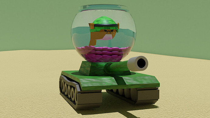
Haha. I see yours cow turtle  and his dancing partner
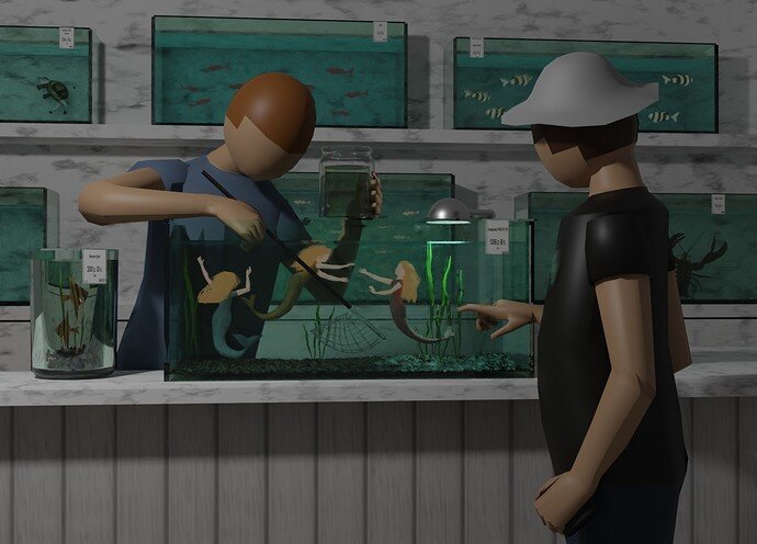
Going to have trouble squeezing that small mermaid in the jam jar! 
Great idea the aquarium shop, and mermaids.
You always have really creative entries! Fun idea!
Thank you!) I often think too long what to make and don’t have time to complete it…
Wow, such cool submissions this week, really inspired 
sadly I’ve been pretty busy the last couple of weeks and won’t be able to submit anything…
I’ll try to make some time this week for the new challenge
Voting entries week 20 “Fishtank” theme
We have a few days to vote. You can vote fast but also think slowly about design, colors, technique, difficulty, subject, realism, etc. Choose consciously and not on your own entry.
And the next subject, week 21 “ Creepy crawlies ” has already started. The winner of this week’s “Fishtank” challenge may select a subject for week 22.
I see a lot of tanks, and I hoped for seeing a lot of colorful fish. But all the entries are beautiful, to the point, smart stories, fine renders, or just fun. It was a good collab week!
Always love your poses and anatomically correct figures!
Image is a bit too dark (like it is nighttime). The mermaids could be brighter, more as in the center of attention.
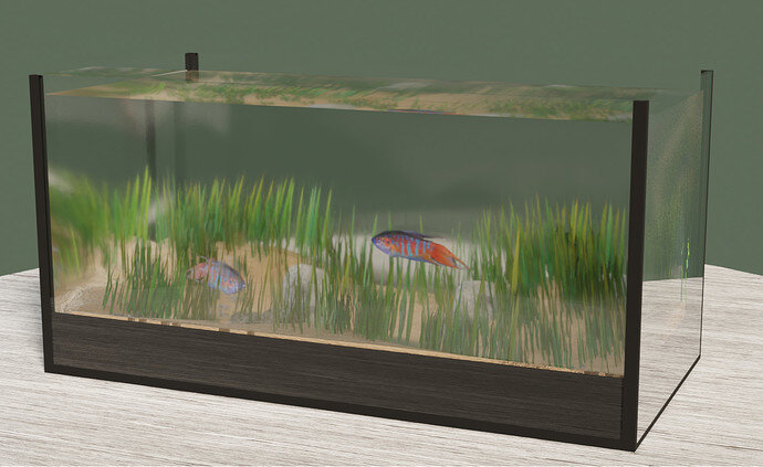
You should have added a simple background and some reflective HDRI image mapping.
Easy to do in time …
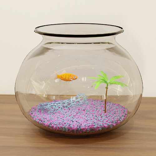
I’m not sure, but I think the bowl object could have more subdivisions.
Like the dark top ridge/ring shows pointy artifacts.
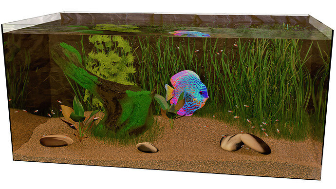
The DHRI map has many repetitions (window reflections). It draws too much attention I think.
Yes, the transition between water and glass is difficult (reflections).
What I miss is the thickness of the glass rim, on top of the tank.
I’ve adjusted it so many times that it lost it. I didn’t even noticed it.
The bowl is a screw modifier + solidify modifier. I tried increasing the steps, but unfortunately it didn’t help with the lip issue.
Probably needed to apply the modifiers and bevel the sharp edge.
I agree about the reflections. I chose the hdri because of the color tones and I wanted some subdivisions. The worst part is that the reflections look circular… I tried increasing the size of the back wall but it didn’t change the reflections at all. Still, I think reflections are an improvement over nothing.
Do you know of a way to clip an hdri? Like have it only cover 180 degrees of the background?
@FedPete Amazing work. the water effect and the light really set it apart from the rest, truly amazing.
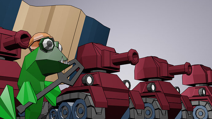
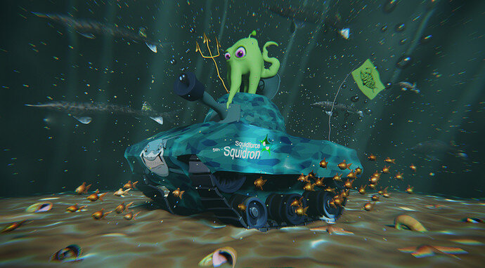
@Blest Excelling at storytelling as always. Amazing use of previous works.
@Cyndi I just love the entire concept and execution.
@TripleJ The entirety of the entry screams cuteness. The mean face of the fish is just perfect.
@Mateusz The background plants look great, the movement they have truly convey water.
@yo_johann The rocks and the fake coral really make it stand out.
@Alex_Rusu To me, you get the prize for best reflection, it looks quite realistic.
@Myself Really? Low Poly and low effort again? Come on! 
Great entries overall, it was a hard choice.
Thank you! I did really appreciate the concept of your scene.
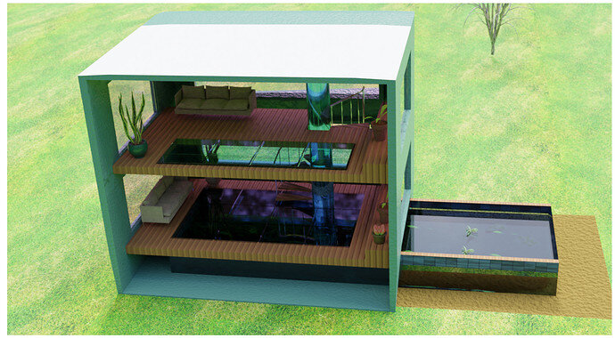
Great variety of entries, fishes with tanks, to whole house aquarium, fish in tanks, cartoon styles to realistic. Testing times with glass and water reflections etc. Most entries could be winners this week.
Very, very difficult choice!! Good work everyone!!!
Yes, thank you, I finish at night with a dark screen mode. I can overestimate the lighting. I’ll pay attention to this.
Ok, I will remember for next time. My apologies. My work schedule is crazy and I forgot to check back sooner.


