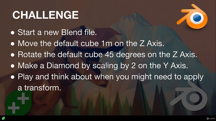
Round 2 of dedicating myself to learn Blender!
Last time i stopped and got distracted as that is what life does. Anyways i’ll be Re-delving into the course and keeping everything i do here in a single topic thread so it can act as a journal for me.
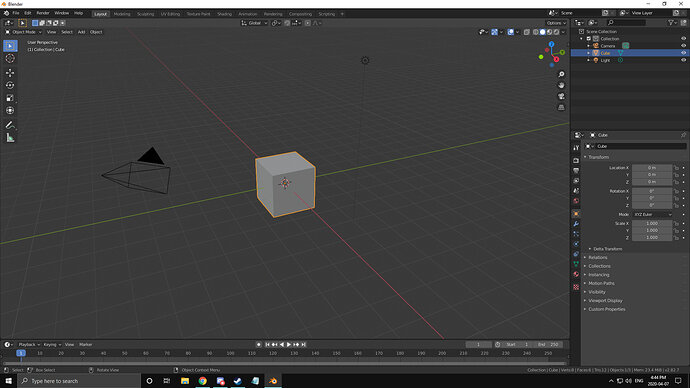
Step 1a:
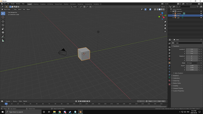
Click on Cube
Step 1b:
Press “G” to tell blender i want to "transform / move it’
Step 1c:
Press “Z” to tell blender i only want to move it along the Z Axis
Step 1d:
Press “1” to tell blender i want it to move one meter in the positive direction
Step 1e:
Press “Enter” to confirm my adjustment
Step 2a:
Click on Cube
Step 2b:
Press “R” to tell blender i wish to rotate this object
Step 2c:
Press “Z” to rotate the cube along the Z axis
Step 2d:
Type “45” to cause the cube to rotate 45 degrees
Step 2e:
Press “Enter” to confirm my adjustment
Step 3a:
Click on the cube
Step 3b:
Press “S” to scale my cube
Step 3c:
Press “Shift”+“Z” to not scale along the Z axis
Step 3d:
Type “2” to scale up the X+Y axis
Step 3e:
Press “Enter” To confirm your choice
Note: It is not a diamond yet.
Step 4a:
Click the Cube
Step 4b:
Press “Ctrl”+“A” to open the application menu
Step 4c:
From the menu select the option to apply “Rotation & Scale”
Step 5a:
Click the cube
Step 5b:
Press “S” to scale your “Cube”
Step 5c:
Press “X” to scale your “Cube/Diamond” along the X axis
Step 5d:
Type “.” to signify we are going to scale by less than 1 (1 being the base value of the cube)
Step 5e:
Type “5” to complete our scaling order of .5/1 (Which is dividing by half. Since the new X is 2 opposing points on our “Diamond” scaling these back by half would make us “Squish” the diamond into the desired shape.
Step 5f:
Press “Enter” to confirm the scaling
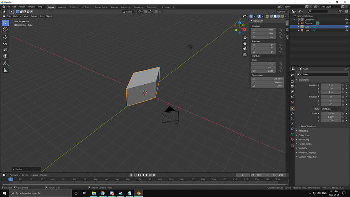
Tada! The diamond is here! 
Ahhh!
i was supposed to apply the rotation after applying it, THEN i was supposed to scale the X axis
Step1:
Click Cube
Step2:
G,Z,1,Enter
Step3:
R,Z,45,Enter
Step4:
Ctrl+A, Apply Rotation,Enter
Step5:
S,X,2,Enter
Don’t give up!
It took me a year to finish it. Doing all challenges … keep the spirit up, or just create one in Blender.
Thanks for the support FedPete!
(2020-04-07 4:39pm)
Alrighty, back to the Grind! Had a good sleep, played a game of which i was trying to guess what objects were used in each scene. Trains, swords, bow & arrow, Shotgun, “Magic”, couches, beds, supports, stairs, railings, clothes, storage boxes, tables, books and much more.
Lesson 7: Duplicates
Challenge time
So i’ll try and build the spiral staircase that was in the video first. After that i’ll maybe try a table, couch and coffee mug.
wish me luck

Lets begin! First lets make a stair out of this cube!
Step 1: Flatten
a) Click Cube
b) “S” to scale
c) “Z” to only scale along the Z axis
d) “.1” to scale to 1/10th of it’s original length
e) “Enter” to confirm selection
Step 2: Apply transformation
a) “Ctrl + A”
b) Select Rotation and Scale
Step 3: Make the cube a Rectangle
a) Select Cube
b) “S” to scale
c) “X” to scale along the X axis
d) “.5” to scale it to half it’s current length
e) “Enter” to confirm transform order
f) “Ctrl + A” to open the apply transform menu
g) Select “Rotation and Scale”
Step 4: Rename
a) Realize i should’ve done this earlier
b) Select “Cube”
c) In properties menu i can rename it to stair
d) “Enter” to confirm
Step 5: Lift Stair
a) Click Cube
b) “G” to move it
c) “Z” so it’s locked to the Z axis
d) Eyeball it? OR better yet, instead set the Z axis in the property manager to “0.1”
e) Apply transformation
[I’m going to stop with the “Select Cube” and “Enter” substeps from now on]
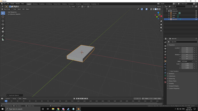
Also, here’s my stair
Step 5: Duplicate (Regular, not linked)
a) “Numpad 1 (NP1)” to adjust to Orthographic Front View (OFV)
b) “Shift + D” to duplicate my stair
c) I just place it randomly and set all the transforms to (0,0,0)
d) Time to lift it above the first stair and rotate it into position
da) G,Z and eyeball it (or use the property manager on the side, as it turns out the thickness of the stair is 0.2m cuz i eyeballed it first as a sort of rough measurement
db) “R” to start a rotation transform
dc) “Z” to lock it on the Z axis
dd) “-30” to get it to rotate clockwise
de) “Num7” to get a TOV
df) “G” to move and eyeball
dg) Apply Transforms
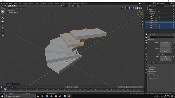
Step 6: Duplicate both stairs
a) Shift click both stairs to select them
b) Lift them up by 2 stairs or 0.4m
c) Rotate them by “-60”
d) Apply Rotation
Step 7: Duplicate all 4 Stairs with the same principle as step 6
a)duplicate and set Z axis to correct height
b)Rotate the whole stack by -120deg
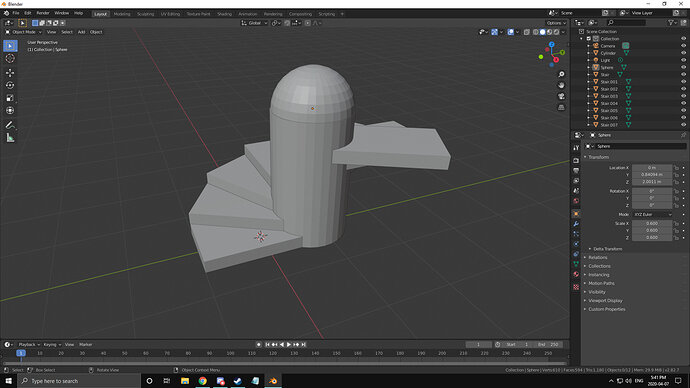
Step 8: time to add the Cylinder
a) “Shift + A”, Mesh, Cylinder
b) Use the transform skill you have to fit it into the center of the stairs, raise it to ground level, scale it up/down to make it aesthetically pleasing and for bonus points fit a UV sphere on top
Alright, that was a “Basic Structure” now i’m going to try and make a whole living room i guess

Alrighty trying for the table now
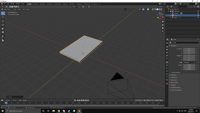
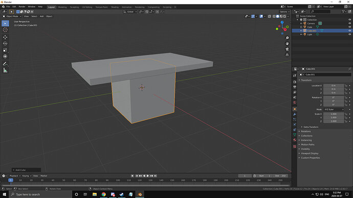
Step 1: surface
a) S,Z,0.1
b) S,X,3
c) S,Y,5
d) G,Z,1
alrighty, looks like it’s actually HUGE. Seems the scale is as a radius from center and not the whole length of the table. So my table that i thought was 3x5, is actually 6x10. imma shrink it down now
X=1.5
Y=2.5
Now for the table legs. I vision them as Cubes but rotated 45 Degrees and cylinder bars attaching the adjacent legs together
just as a note, this makes a very simple table that would also work
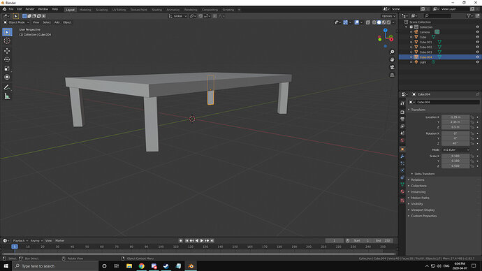
Legs:
a) “Shift + A”, Mesh, Cube
b) S, Shift + Z, 0.1
c) S,Z,0.5
d) G,Z,0.5
e) R,Z,45deg
f) Bottom Othrographic View
g) G, Shift + Z, eyeball it to a corner
h) Tidy up the X,Y coordinates to the nearest hundreth (0.00 = 2 decimal spots)
i) Duplicate the leg and using the coordinates from the first you should be able to set the new location transforms to the proper positive and negatives, IE: my first leg was set to X,Y,Z (-1.35m,2.35m,0.5m)
the others were moved with just adding and removing a negative in either the X or Y coordinates
[leg A(-1.35m,2.35m,0.5m), Leg B(-1.35m,-2.35m,0.5m) Leg C(1.35m,-2.35m,0.5m) Leg D(1.35m,2.35m,0.5m)]
j) Dont forget to make a new collection and rename all the parts like TableTop and Leg.001
k) Apply all your transformations with Ctrl+A
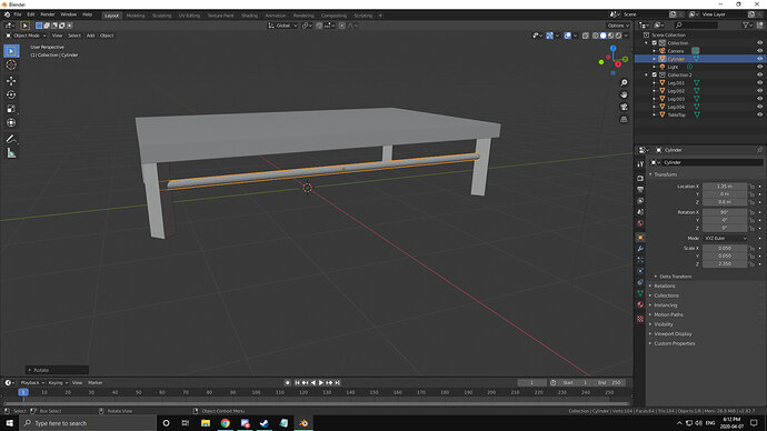
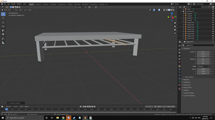
Now to make the Cylinder bars
a) Shift+A, Mesh, Cylinder
b) S, Shift+Z, 0.1
c) R, X, 90
d) G, X, 1.35
e) G, Z, 0.5 (i liked the look of 0.6 better)
f) S, Z, 2.35
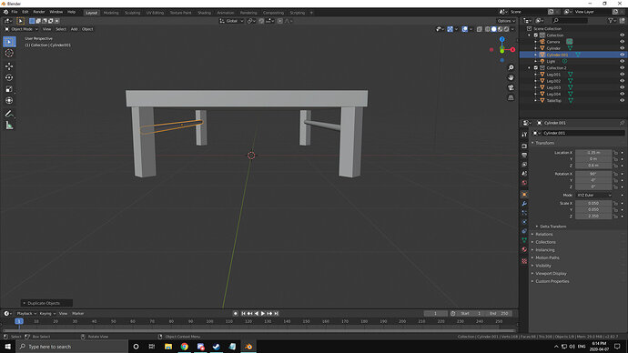
g) Duplicate “Shift+D”
h) G, (-1.35, 0, 0.6)
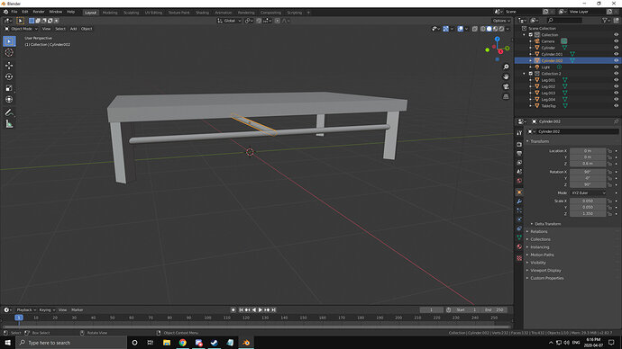
Now for the other 2 cylinder cross beams
i) Duplicate “Shift+D”
j) G (0,0,0.6)
k) S,Z,1.35
Note: i do like the idea of a bunch of these along the cylinder level to give it a sort of shelf so i might add a bunch of these, but for now lets stick with the original vision and place the last 2
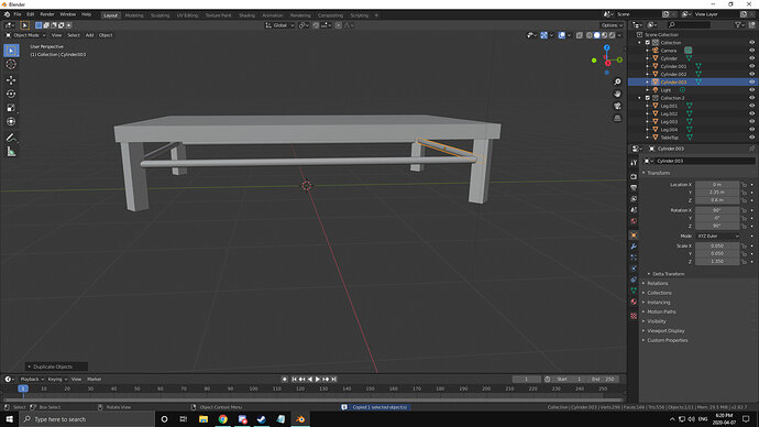
l) G, (0,2.35,0.6)
m) Duplicate “Shift+D”
n) G, (0,-2.35,0.6)
o) Rename your cylinders (I’ve chosen the name support)
p) lets add all the slats now. Duplicate and adjust the Y value as desired. in my case i placed one dead center (Y=0) then at each half (Y=2.35/2) then at each quarter (Y=2.35/4) with the corresponding negatives.
so yeah theres the table
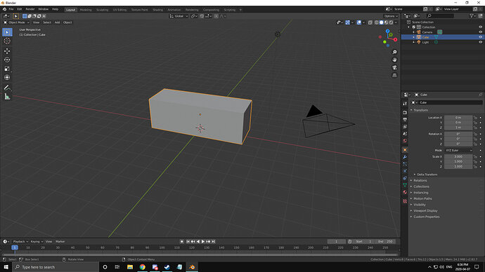
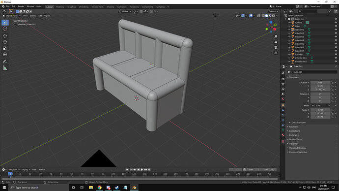
i think the next one is the couch?
look at that HUNK!
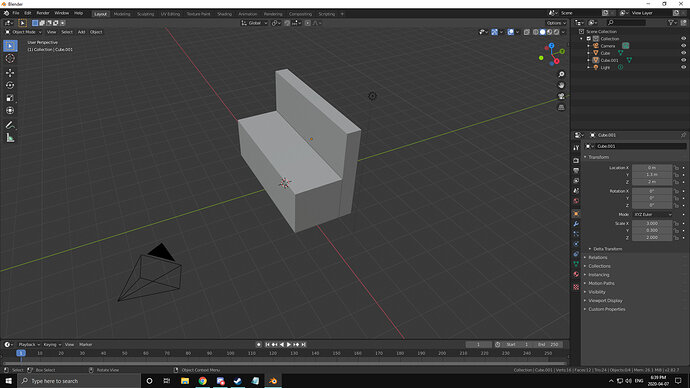
alrighty lets give it a backrest now
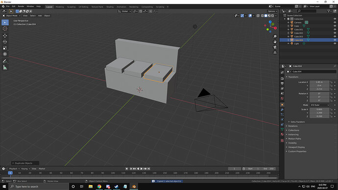
now to big blocks don’t look Super comfy, so lets give it some cushion
lets round these out with some cylinders and spheres
well it looks more like a bus station bench for now but it’s what i got anyway
the mug can wait so i’ll start with the next lesson now
(2020-04-07 8:00PM)
Lesson 8: Materials
and the challenge is!
so using what i have learned in the last video, it’s time for me to go ahead and apply my materials to my models.
Step 1: assemble the models together in a scene
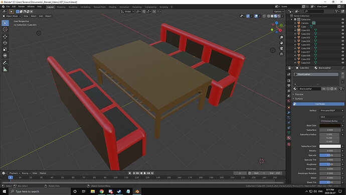
Note: i learned that you can use Ctrl+C to copy and Ctrl+V to paste from one blender scene into another! so i went and pasted both my table and 2 of my “Couches” into the scene and assembled them facing one another with the table in the center. Then i went ahead and scalled them to be of similar size to one another cuz my couches were about 3 times as big as my table. After that it was time to “Colour” (apply Materials to my objects).
a) Select all objects that you want to share a material
b) in the properties window, select the tab indicated by materials
c) Remove any material that is already there via the “-” button on the right
d) Create a new material (or alter the existing one)
e) Rename the material to the colour it is supposed to be IE: Red material should be called red
f) Ctrl+L to bring up the link menu
g) Select “Material” which will link all your currently selected meshes to the primary meshes’ material
h) don’t forget to turn on the view of colour in your 3D editor window (the window you can see all the stuff in)
i) Repeat with all other meshes which don’t have a material until satisfied
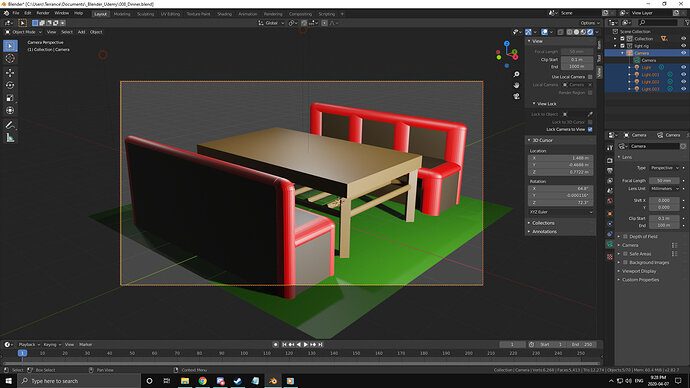
here is my result
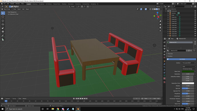
kind of a weird restaurant booth. i should add a floor and center everything back to (0,0,0)
There we go! though i should have made that mug now XD
(2020-04-07 9:28pm)
Lesson 11: basic light set up
i just played around with the lights
2 lights above the booths at 100w for basic lighting
1 light above the table at 1kw to draw attention to the bright spot in the center of the table
1 light off to the side at 25kw as a sort of sun? which just overtakes everything
and one without the “Sun”
keeping the bottom of the model dark and “Mysterious” while the action and attention are drawn above the table. Maybe food has caught folks attention, maybe it will be the faces and conversation above, or perhaps there is a drunk person being illuminated and their keys have fallen into the darkness to showcase the loss of control? idk lots to learn and implement.
(2020-04-08 1:06pm)
Lesson 15:
Time to use all i’ve learned so far and make a few more models/scene
So after looking at what some of the tother folks on the site / course have been kind of both intimidated and inspired. There are some really beautiful scenes where people have put together an entire room. using Lighting and blinds to bring alot of contrast with shadow was really cool. Some have created housing for their lights such as street lamps or fireplaces where they even changed the colour of the light. Others have used shapes i don’t know how to make yet to build figurines. There have also been cases were people have made workshops. By golly there is a TON of stuff here. So what am i going to do?
Like i said i’m intimidated by the scale some of these projects are on. I want to make a big scene like those cuz they look cool but i don’t know if i can make it look even remotely as good. So i’m going to make a series of models i can bring into my main scene kinda like what i did with my bench and table. However i’d like to bring in more than just 2 objects. Next i need to determine what kind of scene i’m looking for. I work in a casino so i could draw from that pool of flashy lights, table games and restaurant. HOWEVER i shouldn’t make the scope of my project TOO BIG so i’ll try and focus on one scene for now.
Let’s go ahead and start with a restaurant. No slot machines, no tables, no track betting and no hotel. Just a restaurant with: Booths, Chairs, Tables, Food, Windows, Tv’s and maybe People? (Whatever the 3d equivalent of Stick people are). As for where to start, probably pick one of the afore mentioned and google a reference image or two. I think food is where i’ll start. Make some basic Fruits like oranges and maybe grapes. then move onto meats like fish or steak. after that make a pasta dish. perhaps some drinks. Alright i got a sort of plan so here i go!

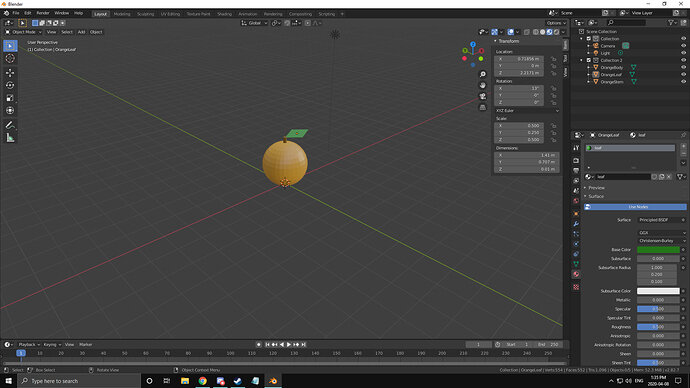
Alrighty, so my first snag was once i made a material for my orange my sphere didn’t change colour. Added a Cube and tried the same thing with no luck. Looking through my previous notes i had found i forgot to turn on colour for my viewpoint editor. Clicked that and viola, my sphere is orange which makes it an orange!
there we go, orange complete
(2020-04-08 2:05)
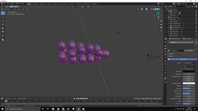
Grapes
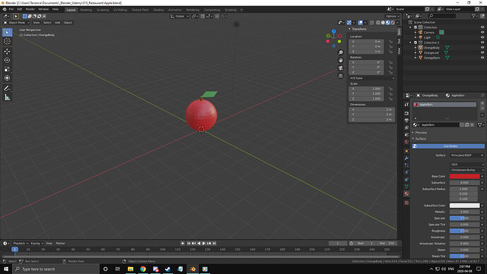
Apple (Just Reskinned/applied different colour material to my orange)
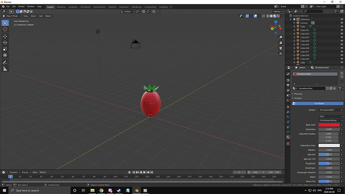
Strawberry! (Had trouble when i made the leaf, tried to rotate it around and it was orbiting the orange dot instead. wasn’t too bad but i guess i’ll learn how to make that work better next time. Also my strawberry looks kinda like an Egg and a tomato so i guess i’ll make those next)
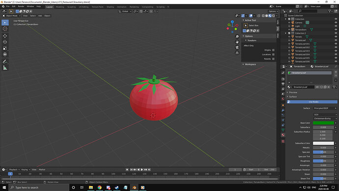
Tomato (First of all, i strongly dislike the taste of raw tomato! Secondly i looked in the tool box and i found an option that let me move the orange dot, so i just eyeballed it through translation in front Orthographic View and top Orthographic View till i was happy. Managing the leaves afterwards worked out pretty well!)
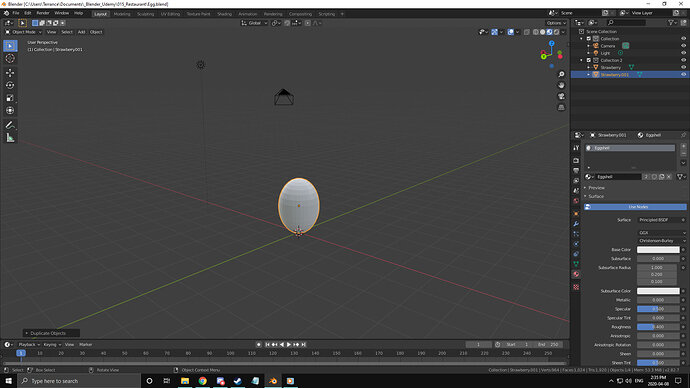
Egg (when i reloaded my Strawberry i fixed all the naming as well)
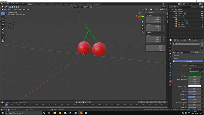
Cherries (Tasty tasty Cherries)
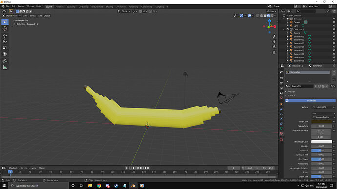
BANANA!
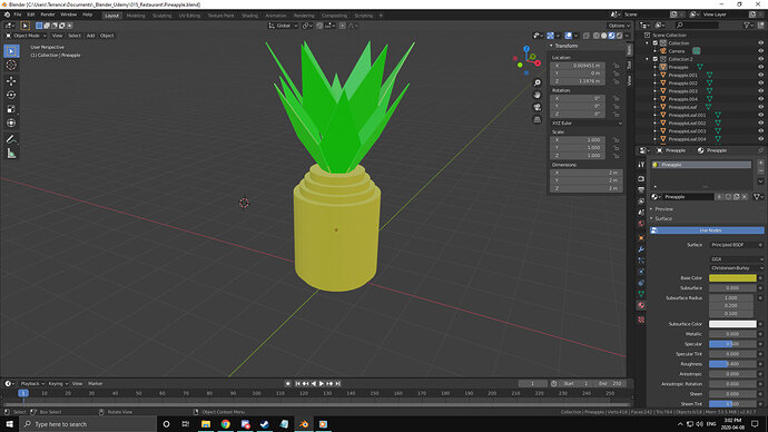
Pineapple
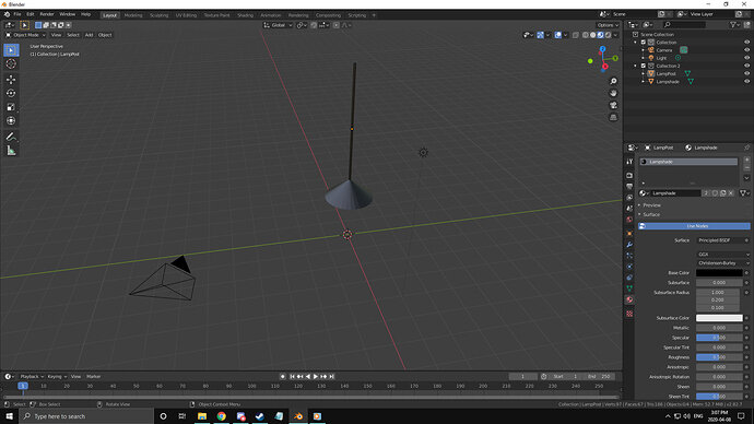
Lampshade (i know it’s not a food but they are part of most restaurants)
Broom (seemed Quick and easy to do so why not)
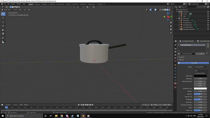
CookingPot
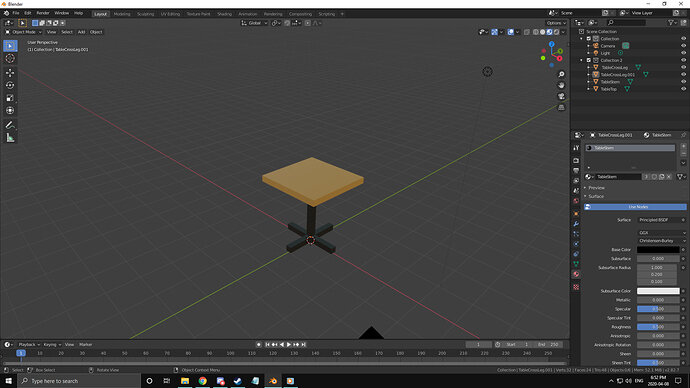
Table.001
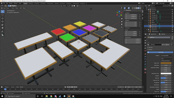
Many more tables! used a plane mesh for the colour on top, it’s hovering .01m over the table itself. Found out i could get the tables to intersect nicely and make shaped tables kinda like building blocks. Hence the 2x1, 3x1, 2x2 and 3x2 with a missing piece. The Chess board is several planes that are .2m in width and length, and then i just duplicated and adjusted by .2m to lay them all out. then duplicated the row till i had a whole black board as 10x10 .2m black squares, then i selected each alternate one and coloured them white. The table beside the chess board has cylinders and spheres on the edge to round it out but i couldn’t flatten out the spheres on the corners just right so they got kinda funny looking bumps. Now onto the other stuff
just a close up of the bumps on the table
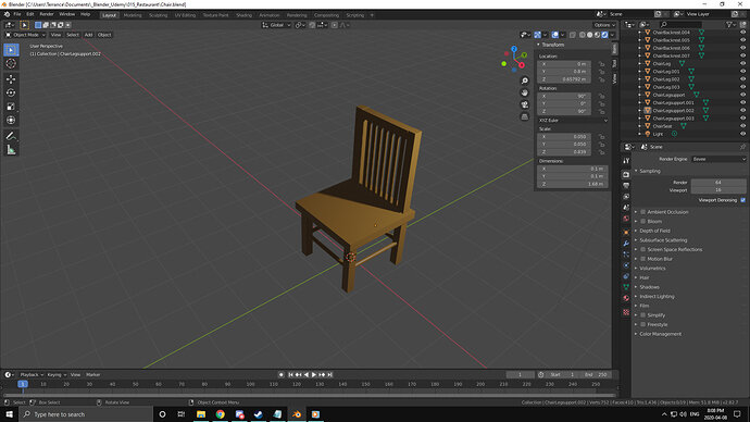
CHAIR! Huh, i should move the light so it can cast shadows on the seated surface
With the shadows along the surface (planning to use this for blinds letting in light on tables)
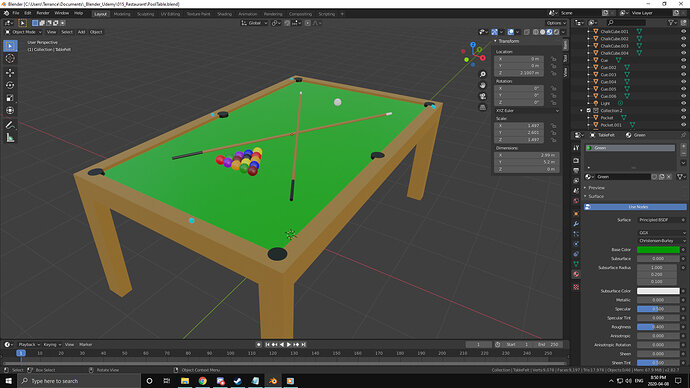
Well with the addition of the pool table i’m leaving Restaurant and moving towards bar. Might just do that though
After looking Through my previous posts i notice i do alot of step by step images and talk about my progress, so i’ll try and get back into it! Sorry for getting lazy with that 
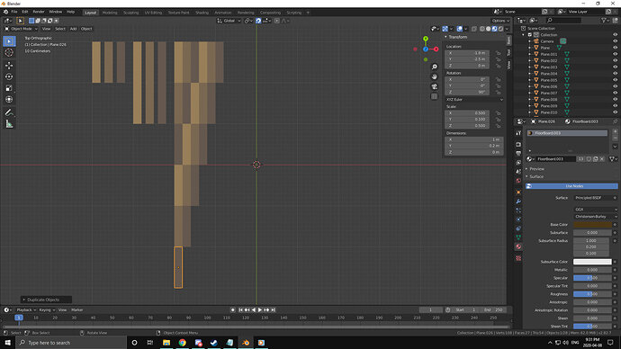
Made some planes, Shrunk them down, coloured them Wood-Ish colours, now i’m laying them to try and make a wooden floor look
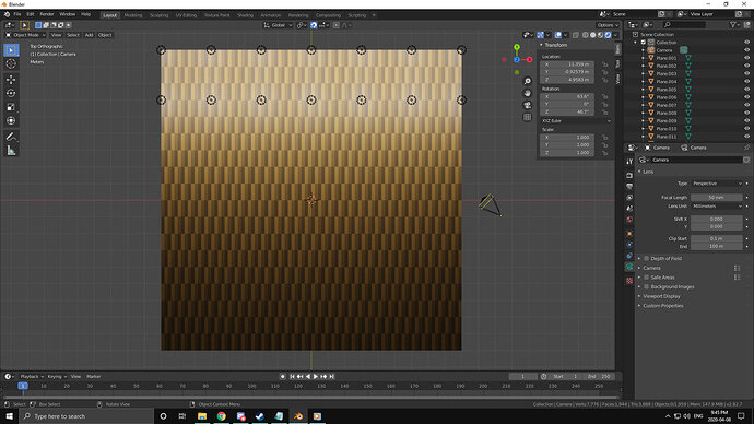
here is a gradiant of light (each 500w) against the woodden floor. Not sure i’m digging it to be honest but maybe with the low lighting of a bar it’ll look alright?
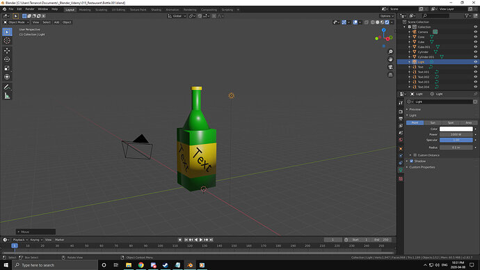
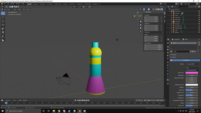
Anybody up for a bottle of Text?
I’ve got no idea how to change the text or font yet but at least i was able to manipulate it onto the other sides of the bottle label

