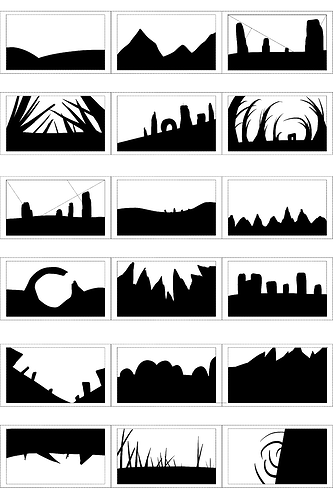
I definitely tried to stay with a very simple interpretation of the tones, black equals ground and white equals sky so my images don’t try to convey anything more than simple environments.
I am surprised though at what can be blocked out with only two tones.
I tried inverting the landscape and pushing the ground line to almost vertical (seen in the bottom left and right images) but found it became less and less of a landscape the closer to vertical it became. I did, however, have a look at other people’s work (notably @attila and @aby) and found that an inverted landscape is possible.
