I think we’re all here to learn and improve, so I wanted to give some feedback. I tried to say something about each entry. I always appreciate it from others, so I’m going to assume that you guys do too. (If not, sorry  , send me a DM and I’ll leave you alone in the future.)
FedPete
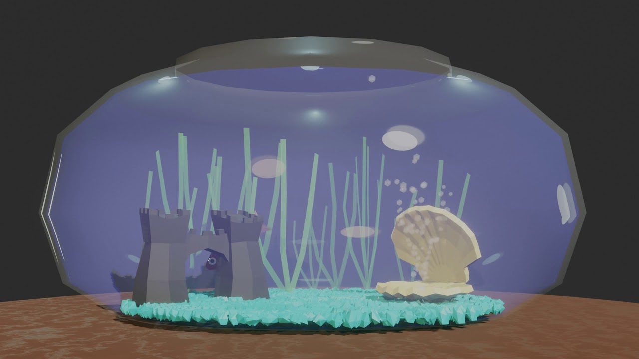
@FedPete I voted for yours this time. I’m impressed by how you’re able to consistently create quality works in seemingly short periods of time. That is something I strive for. The picture is simple, yet feels complete. The only thing I would add is maybe more seaweed. But that’s a nitpick. I like your compositing idea, too. I will get around to trying it eventually. Thanks for the how-to.
Ethan_Martinez
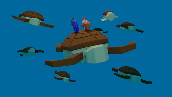
@Ethan_Martinez I like your models and composition. Also very recognizable in its depiction of the Finding Nemo scene. The image feels a little incomplete to me. IMO it needs some bubbles, or wake distortion of the water, or something to show that it’s under water and give the scene a little more pop.
dmrfodol
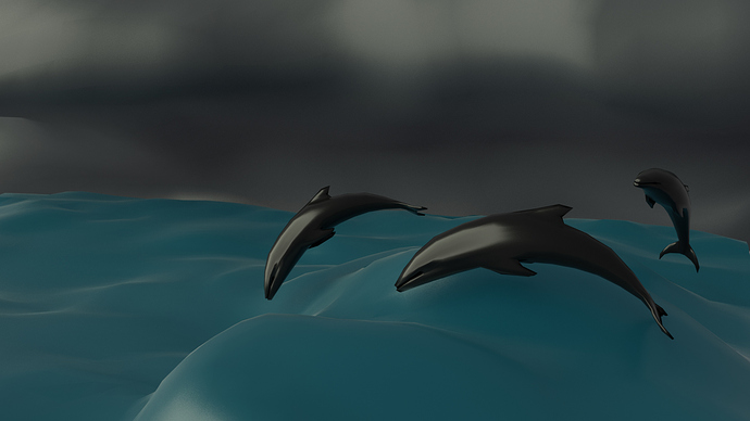
@dmfrodol Welcome to the challenge, and nice dolphins! I was wondering how you would solve the water spray issue. If you continue this project later, I hope you share it with us. Some spray and foam would provide some nice highlights to the image.
Albesca
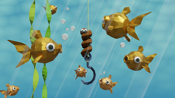
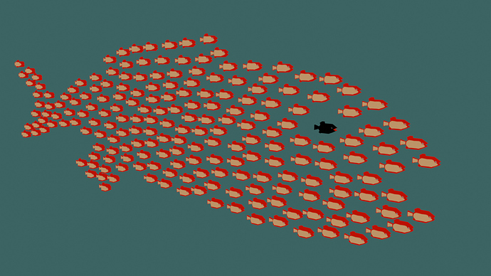
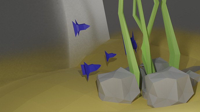
@albesca I remember that book! You’ve recreated the fish school pretty well. A background might be nice. Maybe could approximate the one from the book with noise nodes.
Kelsie_Anderson
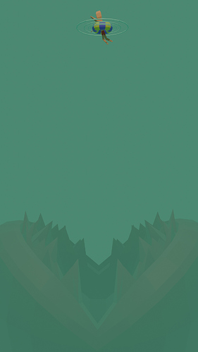
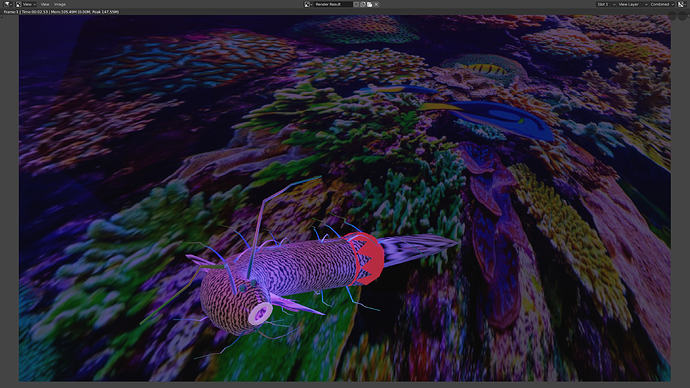
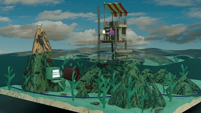
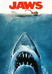
@Kelsie_Anderson I meant to welcome you back to the challenge last week, but forgot. I think you have a good eye for composition. I agree with @Ethan_Martinez about the ripple and piranha plant. I also like how the monster is kind of hazy, which happens under water. There is a lot of dead space, but I think it works. I feel like it needs a little more separation between over/under the surface. Maybe a horizon line? Maybe the things above/below the surface are colored/rendered slightly differently? I like it though. Over-all I’m reminded of this:
I’m guessing that’s intentional.
Sahil_Nain
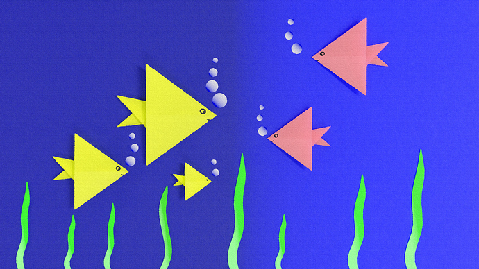
@Sahil_Nain I love this! Such a departure from your other work–which I also like, but it’s cool to see the range! Before post it looks like paper. After post it looks like canvas. I like it with the post-processing better. The colors are a little richer and the contrast is a little better. Plus the canvas texture is nice. And the composition is balanced too. It’s not photo-realistic, but it doesn’t look like a 3D model either. Very cool! This entry was my choice for poll 2, but it was very close.
KStarr
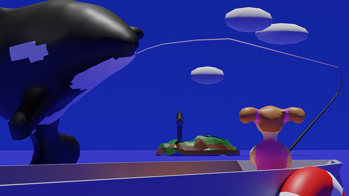
@KStarr Nice orca! You said it’s not done, so I won’t say too much. Only maybe the fins should come to more of a point, or be a bit thinner at the ends. I hope you share it with us if you add more to it.
Leon_V
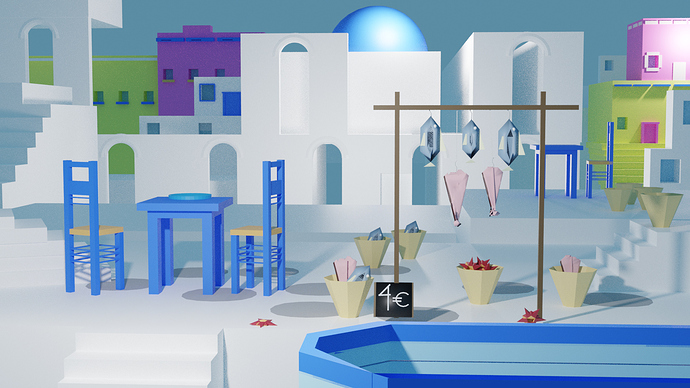
@Leon_V Welcome to the challenge! That’s quite a complex scene! Is it based on a real place? The buildings have a lot of nice details, and I like the bright mix of colors. Maybe the floor should be a different color to distinguish from the walls and stairs? Just a thought.
Enodes
@Enodes Welcome to the challenge! I like the light ray in the back, and the way you blurred the foreground and background. The composition feels a little unbalanced to me. Maybe pan the camera to the right a little, or even just cut off some of the left side of the image.
Capricas_Kirito
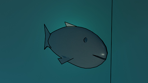
@Capricas_Kirito Welcome to the challenge! I think I like the cycles render better. It’s interesting that the fish is not realistic, but in the cycles render it looks like a real object because of the depth and shadow. The water looks murky. I’m guessing that’s from the volumetrics.
Bradley_Bowers
First I read the description from the notification, and I thought Oh no he’s using the condom again, but then I saw what you added to it and I thought Ha! OK that’s pretty funny.
NP5
You did a good job mixing low poly with detailed textures. That’s something I struggle with in low poly. Only the man seems a little out of place because of his lack of texture detail. The water looks great!
Blest
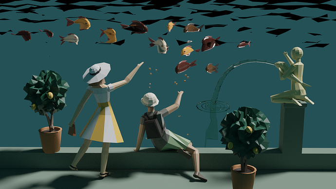
Another beautiful scene. Like @FedPete said, like a painting. I like how you depicted the waves in the water only through their shadows. My only issue is that at first I found the perspective a little confusing. The fish almost seem to be above the people, as though they’re in the sky.
Me
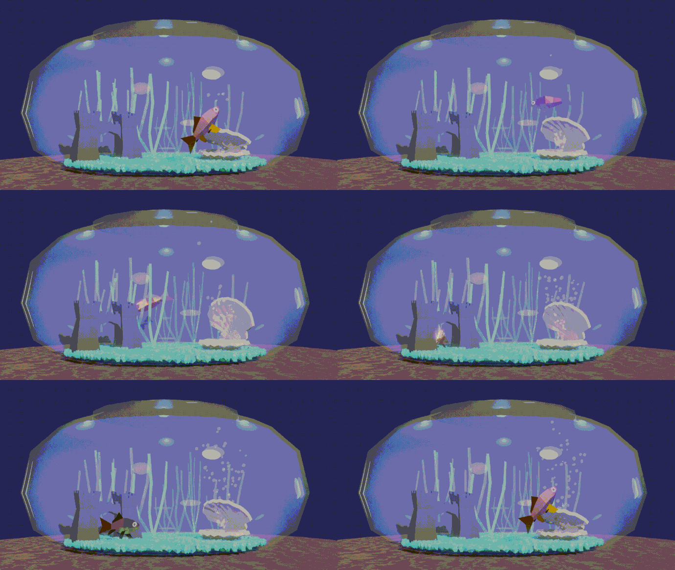
I mostly focused on the animation, and so the models were very simple. I was disappointed with the over-all look of the scene. I thought the background was too plain and the lighting was not great. I was also not happy with the glass or water, as they seemed so desaturate the color. I was happy with the fish animations, though, and I learned a few things.
That’s a lot of entries! Hope we can continue to grow this challenge. It’s a lot of fun to see what you all come up with!
@FedPete I like the two polls, but I’m not sure if I understand the distinction between the two. Is it kind of a “technical score” and an “artistic score”? Or just an “overall favorite” and “second favorite”? Anyway, cool idea, and I’m open to more experimenting in this regard.
Nice work, everybody!



 , send me a DM and I’ll leave you alone in the future.)
 )
)