Starting my studio and website (Deciding Logo)

Hello guys, how are you all?

I’ve started to build my website and a brand too so I can start concentrating my work on a single place, the name of the studio is FirePit Games and the website is under development (you can access it here: firepitgames.net ), I still have a lot to add and modify.

I’m currently working on the Logo, the FirePit idea is that it is the place where the ideas and games are born (represented by the fire), besides the natural connection that we all have with Fire because of the human past:

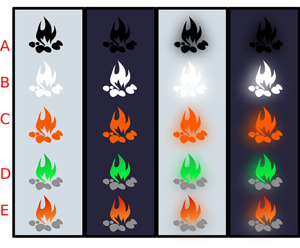
It would be nice to have your opinion about the Logo, what I currently have is this:

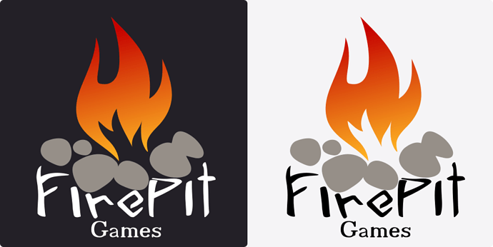
Chosen logo:

6 Likes

Hey Johnny, congratulations :slight_smile:

I am a big fan of the orange colour and persomally really like the bottom row of images. First and second columns, less keen on the blurry one.

That said, having the negative white/black imagery could also be useful for other things too.


Updated Sat Jul 15 2017 21:57

Website : need to update the email address to something @firepitgames.net perhaps :slight_smile:

1 Like

Hey Rob, I also like the orange colour, I just can’t decide which of those I should choose. How about the design itself? Any suggestion regarding it?

I will eventually change my email to @firepitgames.net, but I will wait a little since it would cost me around USD 5,00 / month to use it :confused:

1 Like

I really like the design, I like its simplicity and that it represents the name of the studio. I like the use of only the two colours. The flames with the crisp lines and the points suggest to me a modern brand.

Row E on the darker background I personally feel works the best, followed very closely by the lighter background in the first column.

Have you tried scaling any of these to fit the various frames that social media sites provide, e.g. the square profile picture on Facebook, the circle on Twitter, LinkedIn, and here! :slight_smile:

1 Like

Glad you liked it Rob. The actual logo will be one of the images from the first and second column :smiley:

Haven’t tried it in the social media frames yet, still iterating the design :x

1 Like

Keep us updated :slight_smile:

1 Like

I have decided to use the orange version:

Also added text:

I can also use the black and white on some situations:

3 Likes

They look excellent Johnny.

Were these done by yourself or did.you bire someone to do them for you? I saw other artwork on your website that look awesome too.

1 Like

Glad you like it Rob, I made it myself :smiley:

1 Like

It is really good. Also looks fab as your profile icon here :slight_smile: :slight_smile: :slight_smile:

1 Like

Good :smiley: how about the font? Is it too ugly?

1 Like

Not at all. I think it suits the design really well. Looks like fire wood which I suspect was the intention. That is at least what I have assumed.

One suggestion - remember that this is your brand, whilst getting feedback can be good, you need to be happy and confident with what you want to use. As a consumer of your products and services I need to have the utmost confidence in your abilities - that’s got to start with your own confidence. :slight_smile:

Personally I think your logo is excellent, it is clean, crisp, distinctive - all in all 10 out of 10 :slight_smile:

1 Like

Good advice regarding me being happy with it, Thanks. It is supposed to look like wood indeed

1 Like

Fantastic! :slight_smile: Nice to see someone stepping into enterprise! This Logo looks very professional.

2 Likes

I will have to agree with Rob and Motoko here.

And I will also say that going complex can make things get too busy. Whenever I actually get near any sort of solid product (if ever), I think simple and clean is the best way to go.

I think the design is really good; just changing the color for whatever reason can enhance any of your products. So let’s say you have maybe a loading screen, you can use one theme there. Or if you have a spooky game, you could use that green one with maybe purple rocks?

=========

But I must say that I am against the all orange with orange glow. That is too much orange, and I like my orange! The left two columns for C are fine though.

Anyway, good luck~ :+1:

2 Likes

Thank you! It is just a step and a way to centralize my work, I’m happy to know that you liked it!!! Means a lot.

1 Like

Thank you for your support :smiley:
I agree, it gets busy, but I think that I would have to take this step early or later. I think that it is a good think to make PR and start to build an brand early on, it helps with the marketing when we will need it.

I agree regarding changing the color depending on the situation, and even animate it, it is a symbol that allow us to play a lot.

I will be using mainly this last one, the orange with the grey stone. :smiley:

Thank you very much for your support

1 Like

Something else to consider on the branding front Johhny, if you haven’t done so already, you might want to get and register all of the main social media sites in the studio name, Facebook, Twitter, Google+, YouTube and so on… even if you don’t initially use them, at least you will have them… just a thought :slight_smile:

Hey Rob, you are right, I have to create a profile on those social media sites. I’ve created an Facebook and twitter (although, the FirePit_Games profile already exists), besides YouTube and google+, which do you recommend?

I wouldn’t try to do all of them :wink: Just pick a handful of the big ones, or the relevant ones where you would want to be featured and perhaps where you believe you customers may think to find you.

Try turning things around, if you were wanting to find details about a game studio that had made your favourite game, where would be the first place you might look?

To some degree it may also depend on what you share, or plan to share, in the future.

I’d personally certainly want to be found easily via a web search.

  • Facebook
  • Twitter
  • YouTube
  • Instagram
  • Twitch.tv

A quick way to do some research for this would be to check out a few of the studios behind some of the big, well known games and see what they are doing.

If you have loads I think it won’t be as good as having a select few, but those having interesting and frequently updated content. If I see something which hasn’t been updated for months I often assume it’s dead etc.

Considerations for what gets posted/shared too will be important, any kind of questions / support type things should probably be limited to personal accounts. Progress on games, prototypes, artwork, video of game play those would all be interesting and related content. News on new projects and especially of completion, linking to where the games can be found (Google / Apple stores etc).

On a personal note you may, if you have one, want to update a LinkedIn profile of your own and mention employment at the Studio, providing web links to it and so on (when you’re all set up).

1 Like

Privacy & Terms