Some CSS Blips

Are you guys making some changes at the moment?

I’ve noticed the menu appearing as a list on the top left instead of the drop down, and the code formatting and categories page changing a bit also.

Figure either updates at your end or patches being applied by Discourse?


Nasty gradient fill…

categories background / column background differences;

These changes are intentional. I’m trying to go for this kind of effect. Are we not quite getting it right yet?

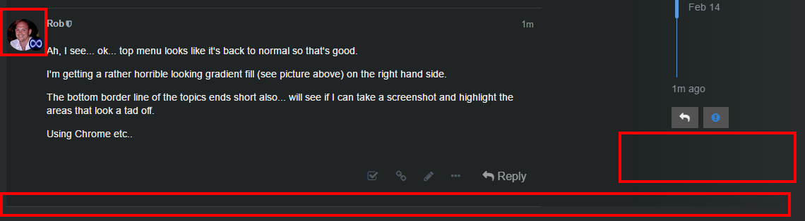
Ah, I see… ok… top menu looks like it’s back to normal so that’s good.

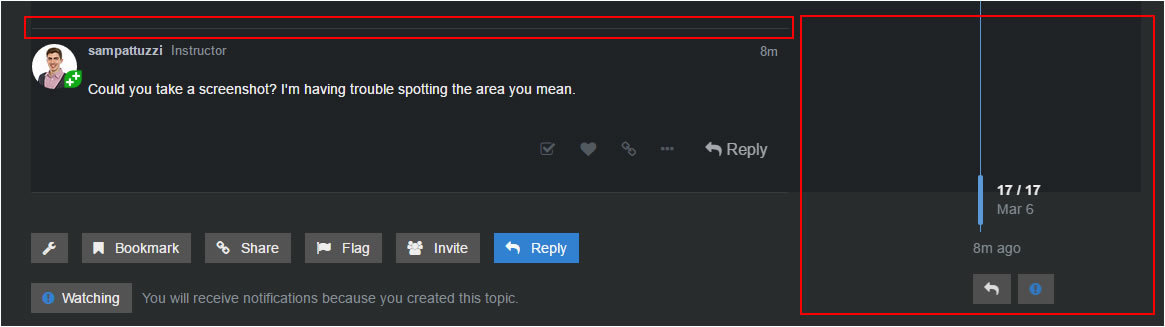
I’m getting a rather horrible looking gradient fill (see picture above) on the right hand side.

The bottom border line of the topics ends short also… will see if I can take a screenshot and highlight the areas that look a tad off.

Using Chrome etc…


Updated Tue Feb 14 2017 14:42

Profile image looks a bit squished to the left, maybe this was always the case but now I think a little more emphasised with the background colour and topic background colour contrast.

Bottom border line ends short (see bottom red box)

Gradient fill a tad odd, maybe because of the background colour behind it (instead of the image as per the desired result?) - see right box.

The gradient fill is grainy on the example website also, but because there is a primarily light colour behind it I think it kinda works with the fuzzy image they use. Their bottom border is also b0rked. One other difference is that the horizontal lines between responses on each topic go all the way across on the example site but stop short on ours.

I see what you mean. I think these would be more substantial changes and I think these changes so far look better than before. I will leave this for now perhaps refine things a bit more when I’ve had some distance from it.

1 Like

Okey dokey… gunna wear shades whilst browsing the forum so that I can’t see the gradient fill… on my laptop it stands out quite a lot (you know how the screen looks odd when you move your head to a funny angle, it’s like that) - unless I can find the right values for my head transform! :slight_smile:

If you find a tweak to the CSS gradient that works better for your screen then I will apply it. My personal head transform can’t find see it. :slight_smile:

If you find a tweak to the CSS gradient that works better for your screen then I will apply it.

I guess I can try to apply it through the Chrome Element Inspector to test it.

My personal head transform can’t find see it. :slight_smile:

hehe, I even went as far as checking my NVidia settings just to make sure Windows hadn’t removed a driver or something! lol…

Do you have plans for picture backgrounds? Just at the moment with the grey on grey its hard to see the benefit it delivers? I get the darker grey for the topics, it makes them stand out more on the page.

Yes, we would like to add a default background. Need to find some stock photo that will work.

The larger GameDev logo (YouTube etc) is quite nice, faded out/grey scaled might look nice, it might not be the right size to fit, not to see the text anyway, could always remove the text I guess?

Lose the bits in red, then move the logo / add a large one on the right so that it pokes out from behind the topic backgrounds, filling a lot of vertical… all greyscaled?

@sampattuzzi, just as a heads up, the gradient fill looks a little odd on mobile - not because of the fuzzy gradient, because you dont get anything other than the main topic block I think. See below for a couple of examples, wondered whether maybe it could be disabled via css for mobile?

Images will typically always scale to the width of the topic thus a block effect is created. The text floating over the gradient is a little odd to.

Might look different again on a tablet device, not sure.

Oh yeah, that’s not great.

Just looks a tad odd huh… as I say, no idea about on a tablet, perhaps you see more of the background on the edges on one rather than it scaling up the topic area? Don’t have one to test it on I’m afraid…

Is it better since I made the change?

Hi Sam, on mobile yes.

One thing that isn’t looking so great is the topic content areas, I think the width is set at 100% so the images / writing go all the way to the edges - unless you’ve changed it again since? On mobile at moment AFK etc

Actually, it is at 100% on mobile too…

I’m not sure where you mean. Is it something you could update in the CSS?

The profile inage of the person making the post and their text is align to the left, I thought it was ightly indented before. I just checked the Meta site but its the same there, so I must be wrong.

Desktop version last time I look, the slightly lught horizontal line which separates the replies in a topic, this line does go all the way across under the scrolly bar (on the site not the browser one), it didnt before, but now that the right hand side is dark grey too, like the background of each post it looks like its missing… in my opinion…

The changes back from the gradient are definitely better on mobile tho :slight_smile:

Could you take a screenshot? I’m having trouble spotting the area you mean.

Sure Sam, see below;


So, the red box on the left - this has the horizontal line in it which separates each post in a topic. Previously, because the background of the red box on the right wasn’t the same colour as the background for the main topic area, it didn’t look as if the horizontal line fell short - but now because both backgrounds are the same colour, the line looks like it just oddly ends…

Make sense?

Yes, I see what you mean. I won’t prioritise that fix but if you can figure out how, feel free to fix it yourself.

Are we okay to close this?

Privacy & Terms