
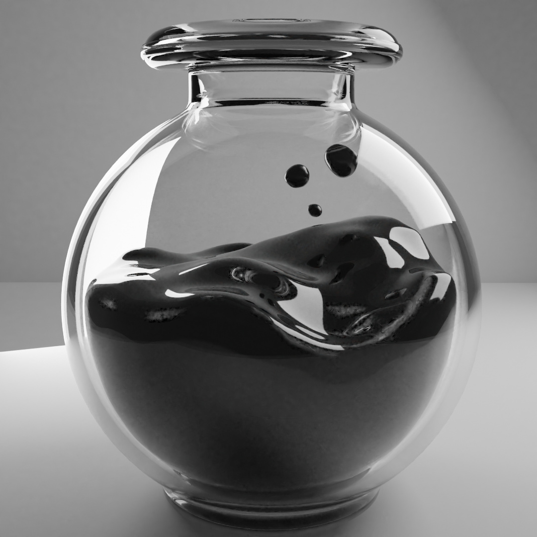
I’m trying to make this ink bottle for a project and the ink material is kinda weird. The top part is darker than the bottom and the resolution is kinda weird even though it has a x3 subsurface mod… Can someone help me to improve it?
1 Like
One of the most difficult things fluids and glass.
It think because of no sharp edge between the fluid and glass.
You use subdivision, which makes edges round.
Then also you have to cope with the table reflection, due to the round sphere of ink and glass.
Then there is also a problem with the reflection layers.
Glass in Glass out, and third reflection of the ink layer.
Overall I don’t find this a bad project. It good in my opinion.
But if you need photo realistic outcome.
Then you have a long road a head.
There is this thread Why is glass and water so difficult?
Have fun, let us know how you progress.
i’ve read it and i didn’t knew how messy glass can get. I’m not aiming at 100%realism. The whole project is to have an octopus inside with a clay shader, kinda stylized and maybe a boat or a quill too. I don’t mind the ink being not glossy if it helps with the issues i’m getting, being the major one the difference between top and bottom, but maybe I can fix it in the compositor after? Idk, and thanks for the comment!
I used sculpt tools on the ink, maybe that is causing some problems?
With the heads up this is not an area I have any great knowledge of.
My impression is it is the reflection of your table. But more than that it is reflecting on the ink more than the glass.
Does the ink need to be glossy?
If the top does, as a sea surface, possibly make the ink in contact with the glass inside, a separate material of identical colour but non glossy?
This clip includes something I had heard of too, expand liquids ‘into the glass’. That may even solve it on its own.

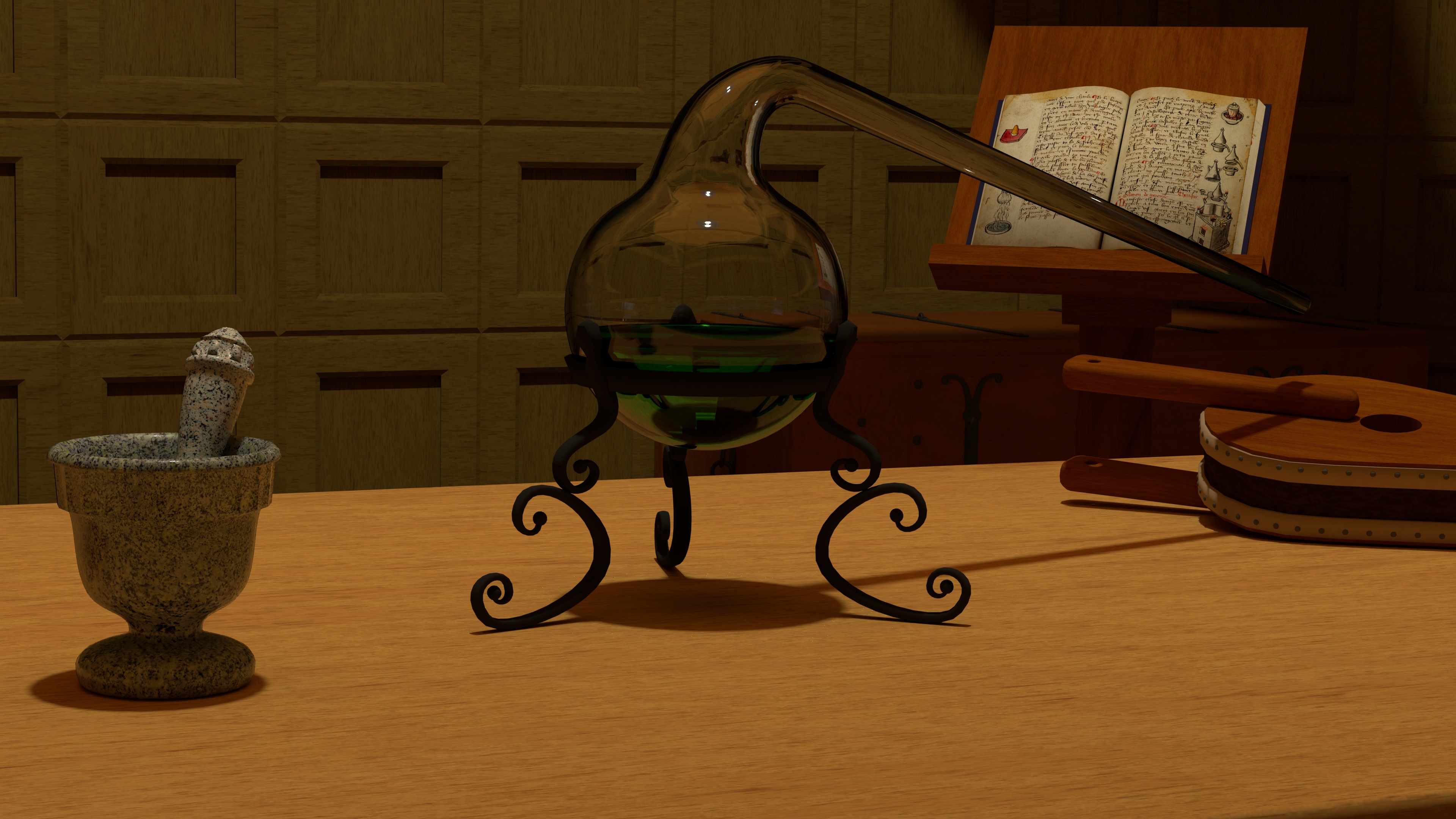
I did this retort ages ago its liquid is expanded into the thickness of the glass.
Not a solid opaque liquid though like yours
2 Likes
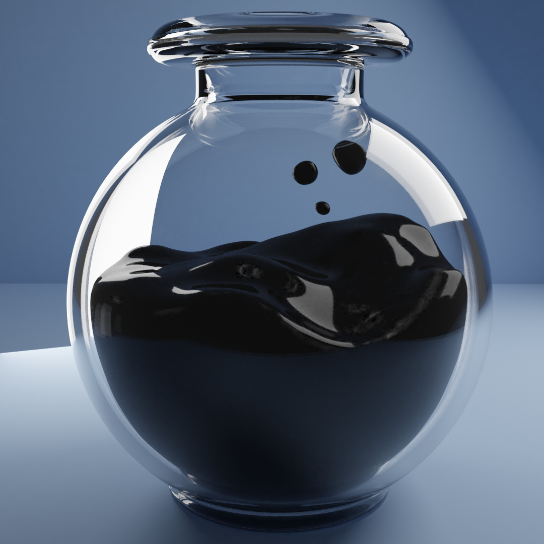
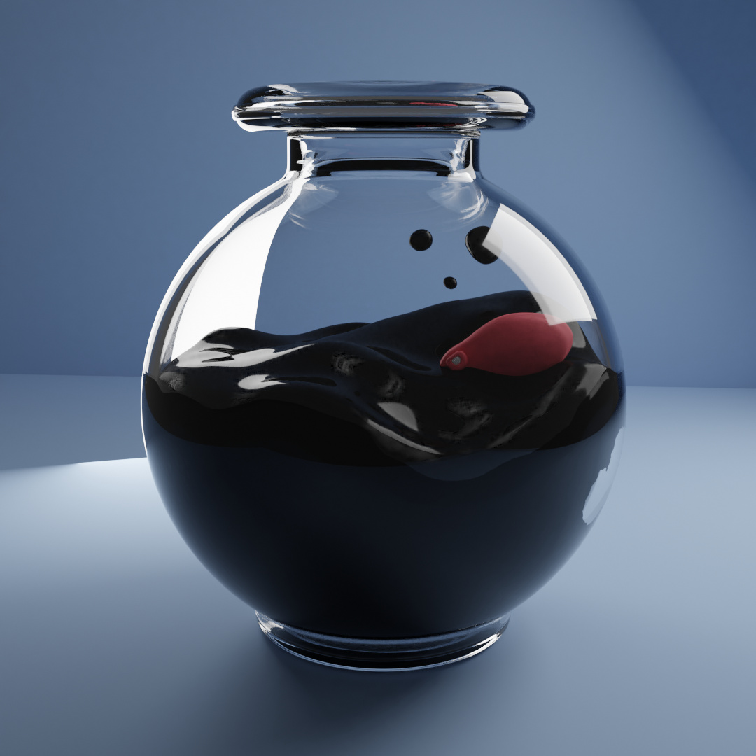
Thanks! expanding the ink did improve it in my eyes, unfortunately I lose the thick glass by doing it. The difference between top and bottom was a reflection of the floor plain, now my only issue are those little grey and kinda low resolution areas on the top, not the white reflections… Also: octopus uptdate!
Great progress.
The ink expansion only needs to be just into the glass, not sure if that helps leave thickness showing better, or even, without looking into it, if the glass thickness does show if the liquid is non transparent.
On the octopus. Is there some way of making it look less ‘clean’. It would have ink wetness at least apparently lapped up against the sides of the head showing above the water. If you dipped your finger in ink, the wet bit would look different.
I am guessing the ‘grey bits’ are the reflection of your background plane. Not sure there is any way round that, bar some complete cheat, photoshop sort of thing. Photographing silverware or any highly reflective thing is very hard, in effect you are photographing the things it is reflecting no the item, lol.
Thanks!
I think i’ll let the glass’ thickness just like that, it’s fine.
Yeah, the octopus is not even close to be done, i’ll still work on some tentacles, textures, etc… But do you have any ideia of how could i make this ‘wetness’ on it?
Well i’ll have to just accept it then, not that big of a deal, I still like how it’s coming along.
This topic was automatically closed 24 hours after the last reply. New replies are no longer allowed.