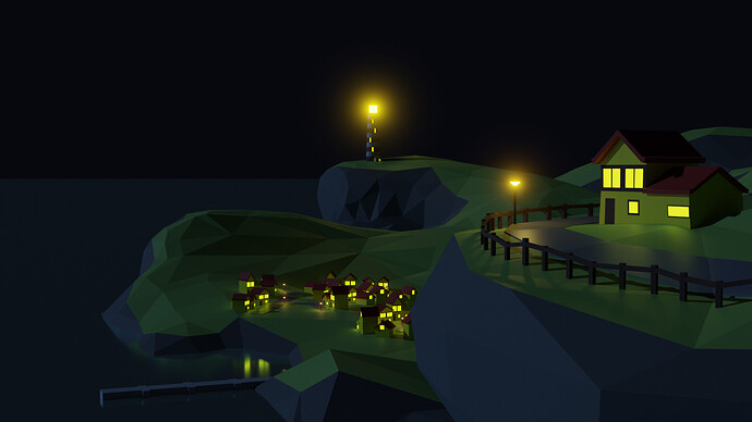
Lighthouse Island

At first i just wanted to post the result of simply following the course, but after seeing Brlee75’'s post i was motivated to go a little further and apply what i’d learned on a more personalized kind of render instead.

I realize that this was going a bit far - Grant mentioned that we shouldn’t go further into it for now, but i felt i should push myself a little. It took a few days of on and off tinkering but over that time i kind of learned the keybinds better and got them in my fingers fairly well.

I’ve only had to find 2 things which weren’t mentioned: Eevee kinda was weird with the shadows, especially on the fence up close on the right, and it just didn’t look right - Hence i used Cycles. That however didn’t reproduce the moody bloom, which prompted me to look up how that works. Turns out, surprisingly simple! (Composition window → Use composition → Add glare filter in between). Only took me a few minutes to play around with to get a fairly decent result.

The other thing was because the way i ended up making the roads, the surfaces were not entirely straight. I thought this might be a problem, so i triangulated the faces to prevent any strange things from showing up in the render (select all faces in edit mode → right click → Triangulate faces).

I tweaked the materials a bit to get them to look better, not too shiny, but also not too rough. I ended up giving the water a tiny bit of roughness to simulate its surface, rather than keeping it full metallic and 0 roughness. I also had a bit of an issue with the sky and water not being easy to tell apart. At first i wanted to add a starfield background like my inspiration did, but i opted to keep it flat for a more consistent look, so i simply add a tiny bit of emissiveness to the water to make it pop a bit more. Another obvious addition is the grass on the island, kinda felt more alive that way.

It’s also still ‘low poly’ imho, though obviously much more detailed than really called for, so i’m not sure if i’d pass this course if it were an artistic assignment.

There’s more i kind of want to tweak (the sky is a bit too dark probably, the lighthouse light could be a bit less, the pier might need a touch more detail?), but i understand that at some point you just have to move on. I hope the final result is at least satisfactory!

6 Likes

The only thing that bothers me here is the blue going through the middle but besides that honestly it’s a amazing scene, lighting and details are both on point, I really like the driveway on the right, really cool part of the scene, amazing topography as well, overall it’s a near perfect lighthouse scene, would make for a great game piece!

1 Like

Good job! Its one of the biggest befefits of this forums, so you can get inspired by others.

Well done with materials and water solution, that’s good idea.
You can also use world material node to change the sky color, or as a metter od fact use a plane mesh to put it as a sky. (It would have to be lit though, so this is also a caveeat in this example, youd need to make it emissive).

Lighting and shades are a bit harder with eevee, but you can make them work. More info will be for sure down in the course.

And this is for sure low poly. Now, low poly is more aesthetics that real polygon count. (But it usually comes with low poly count indeed :wink: )
You can check this weeks Blender Collab on this forum, to see what our community does within low poly style, get inspiration or participate yourself :slight_smile:
This week is low poly nature:

2 Likes

May be a bit of a hot take but in my opinion you should always push yourself and try to make something your own when following tutorials. It gets you to think about what it is you’re actually doing and checks if you developed the skills properly instead of just braindead copying what’s shown to you. It will also be a better piece to use in a portfolio in the future if that’s something you want to do.

If you’re having problems with eevee it may be that some render properties aren’t enabled in the Render Settings. I don’t know why eevee still comes with half its features disabled when literally nobody wants to use it like that but you have to go in and manually re-enable them. It may also be worth tweaking the shadow resolution there.

3 Likes

Very nice lighthouse island scene. All the extras well worth the diversion to find out about and do.

2 Likes

Very nicely done! I especially like the point of view you added.

1 Like

It’s supposed to show where the water ends and the sky begins. An earlier render made the water almost unnoticeable and the sky still as dark, and i wasn’t sure how to fix it because i didn’t have a good skybox to reflex off the water otherwise. It would have taken too much time to find a better fix (can’t get stuck on it for too long!), but if i had to do this over again i’d probably look into it a bit more :slight_smile:

2 Likes

In this case Eevee simply couldn’t propetly do the shadows on the fence in the foreground, and it made the shadows elsewhere rather blotty - Regardless of the shadow resolution. In the end it was actually simpler to do it with Cycles and add a glare filter than try to make it work with Eevee and get a (much) worse looking result :stuck_out_tongue:

I do rather prefer rendering with Cycles anyway i’ve found. Eevee is nice to get a preview but Cycles just makes everything pop much better, at least here. I’ll find out whether and how this will change as i continue the course :slight_smile:

1 Like

Privacy & Terms