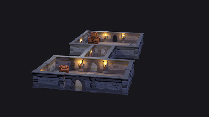
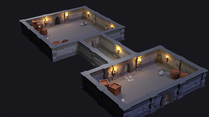
I like you blueish nighty color settings. All items are there!
Maybe a door too?
Have fun!
Very nice little dungeon. I like the second pillar with the wider slabs in it.
Looks good! I see the larger rocks you’ve added as a custom item, and that’s a great start.
Consider this: if this wasn’t a follow-along course and you were instead making this as your own custom project, what’s the first thing you would add to this scene to make it better? You don’t have to answer, it’s really more of a challenge =)
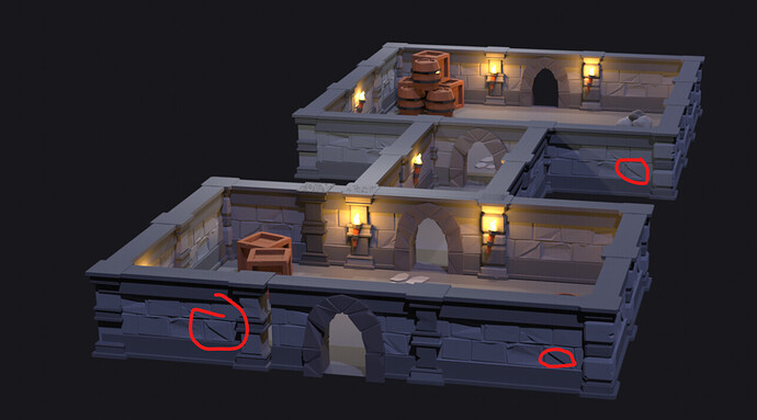
Looks good. As for things that are beyond the course, but to keep in mind in the future: in modular pieces avoid doing big details. Big details like e.g.,
are super obvious when they repeat. My advice is to make modular pieces ‘boring’ (without any obvious popping up details) and break them up with stuff (which can be extra decorative pieces, shaders, decal etc.)
Noted. Thank you for replying.
Thank you for replying.
Thank you so much
In the Lighthouse lecture, we created low poly rocks. So I decided to place some rocks as I already learnt how to draw


