Hi @Myriam, @MoMutrz
Thanks for both reaching out regarding the colours used on the forum.
At this moment in time there isn’t a switch that can be pulled to offer an alternative. Marc (@Marc_Carlyon) is correct there was an item brought up at the very beginning when the forum first launched (approaching a year ago now) and this was the chosen colour scheme.
However, the community using our forum has grown enormously since then, and I do fully appreciate that, putting personal preferences to one side, accessibility also has to be considered, or rather, re-considered.
I wont promise any immediate changes, but I will promise that this item is discussed and investigated.
You may/may not be aware that the forum software we use is a paid for solution, not a home grown solution, whilst it is very flexible and has a significant amount of customisation, there are limitations.
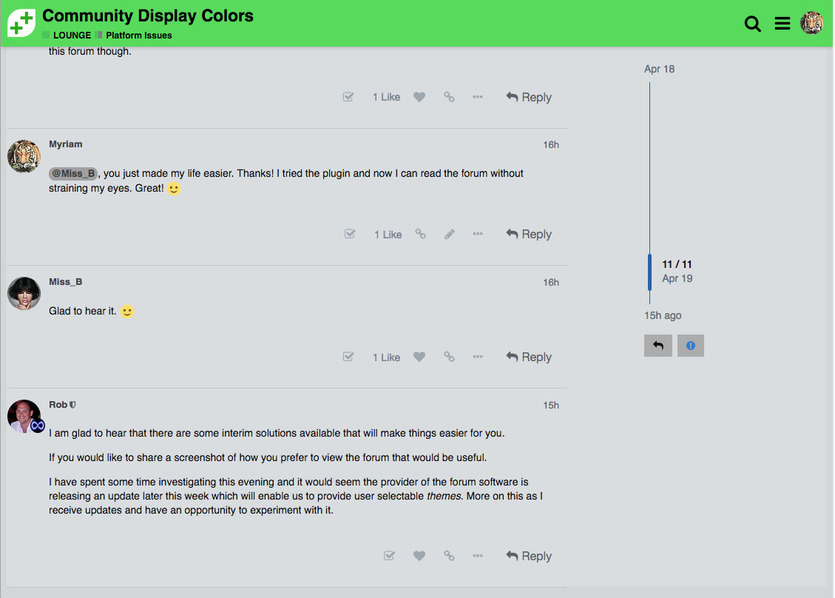
I appreciate that you may not experience the same specific issues, but just to give me a little more information, is the main issue the contrast between the white text on the black background? I know for example some websites do offer some accessibility options (often icons at the top of the screen) for text size and colour contrast, but from what I am hearing it sounds like having a lower contrast would work better for you? Could you confirm, and, ideally, provide any small screenshots of alternatives that work well.
Thanks in advance, and again for reaching out.