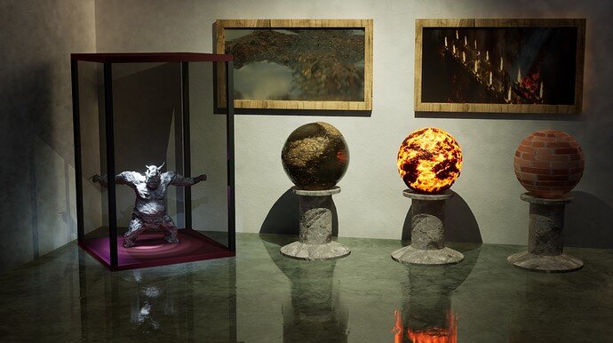
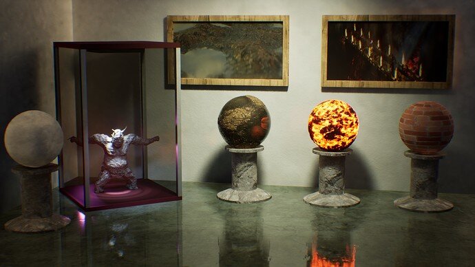
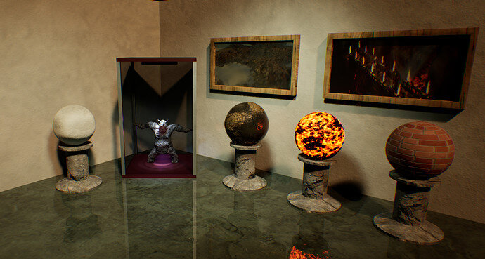
Collab 2021W08 - Modern Art of Materials Museum

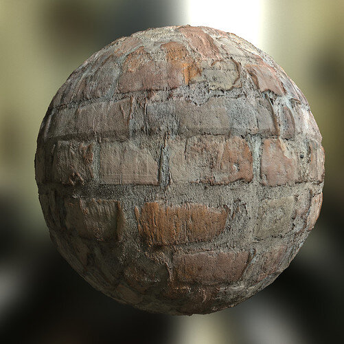
Fascinating damaged bricks. The hairline cracks fair enough, even with subsidence widened up a bit.

But whatever made those ‘carved’ curvy marks? Perhaps they were a very local hand made early brick that had the clay of two handfuls pushed together and not forced down enough to squeeze into the mould shape at the lump joins?

1 Like

You might have guessed correctly. It’s quite an old building that my friends is living in… But I think this is lost to the history and we will never know for sure…

PS. If I have time (lol) I will also make textures/materials out of this bricks directly. That’s why I asked him to take pictures of his wall. That might have been really strange request (as I noticed how awesome wall is behind him during work related video call :sweat_smile:)
:rofl:

1 Like

:thinking:

2 Likes

Or:

:thinking:

1 Like

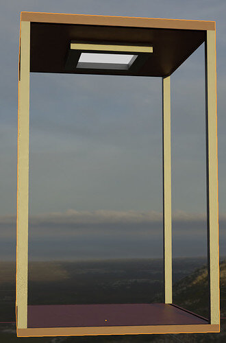
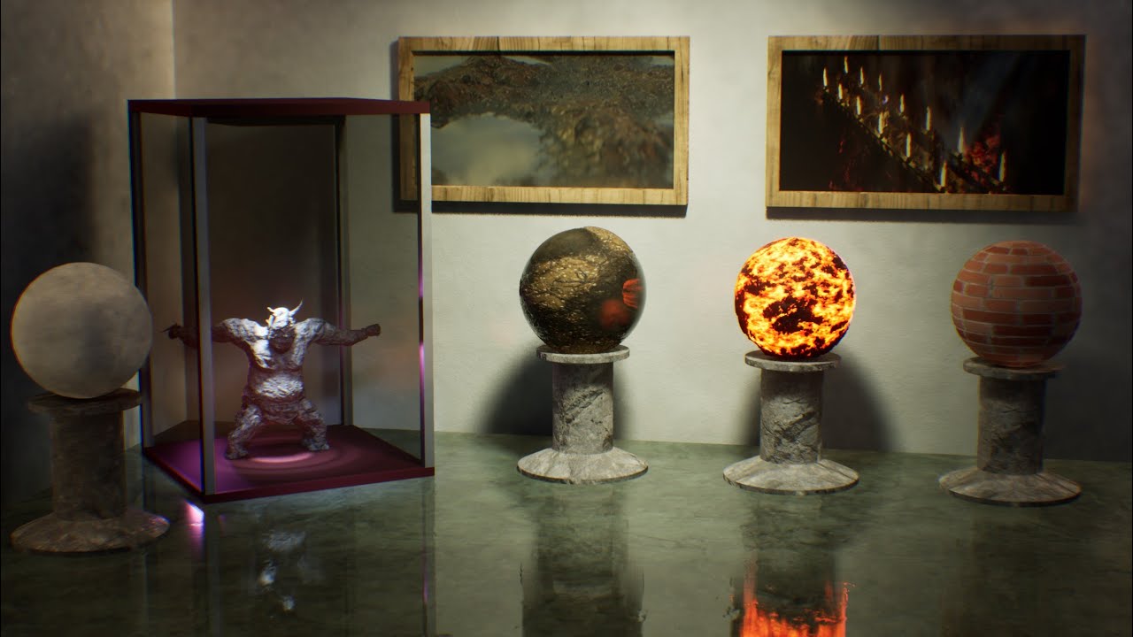
The light of the vitrine is off to me…

Perhaps it is missing the light origin? The light bulb? Or a light cone?

1 Like

Thanks, added a lamp thingy

but it doesn’t really help :sweat_smile:

Unreal today seems to be fiddly… lot’s of grain etc.

Enough… will have to be enough for now. Too tired…

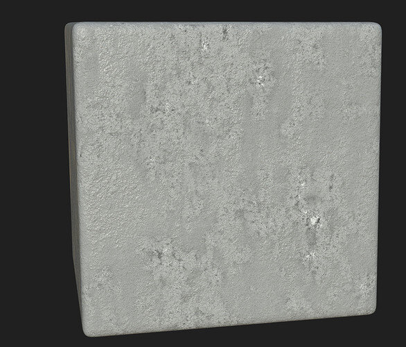
btw. I made also material for walls:

Which is quite simple and nice looking…

2 Likes

Made a short video:

2 Likes

I think you’ve missed a chance.
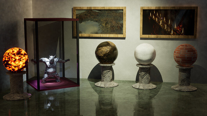
I see some previous art work on the wall (Orc).
So why not put some previous work on those pillars …?

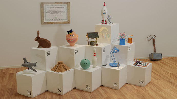
This is what I did this some years ago. GameDev 2.79 challenge results.

2 Likes

Yeah, that was always the idea… I just run out of energy :frowning:. That’s what is on my “plan” that I created when starting this collab:
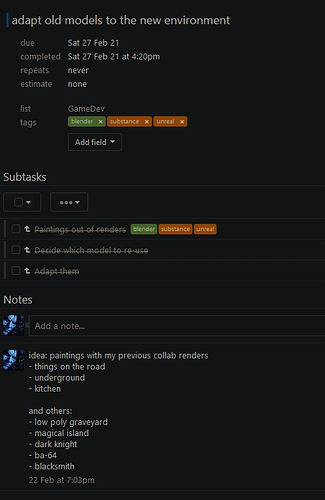
Looks awesome!

3 Likes

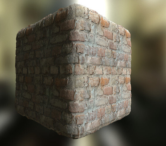
Great texture! Loving it.

1 Like

A much better brick texture.
You use materialize?

1 Like

Yeah, nothing can beat a picture.

… although this guy is close to it:

His artstation profile:

That was me using Materialize for the first time :smiley:

1 Like

Quick post mortem on the work for this collab:

  • tiredness from last week was played a big role (plus this week I had overtime everyday)
  • 2 of 4 learning goals met (didn’t do any sculpting or texture painting)
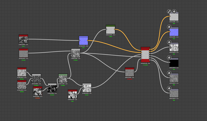
  • Designer is quite a beast to learn… will take many weeks for me to get good, but I already can create some basic materials. But nodes are fun :smiley:
  • Drawing course was released in early accesss and couldn’t resist to start it :sweat_smile:
  • Overall I will let the project sit there for a while, but (at least at the time I write this) I want to get back to it. It’s way cooler way to showcase materials in museum than as disembodied sphere floating in the void (as most people are doing from what I see on artstation and other places)
3 Likes

So it kept bothering me why the image quality and ray tracing looked so strange. So I created new empty level and copied over stuff from old one, and just re-did the global lighting and post processing:

It’s much clearer now, and what’s important is that there is no strange ghosting artifacts I had previously.

2 things learned:

  • start with totally empty map, not with the one of the templates as they were setup for specific reasons
  • use ‘brute force’ instead of ‘final gather’ global illumination method. The former is slower, but the latter produces those fuzzy ghosting artifacts (maybe there is a way to fix it, but I didn’t found it yet).
2 Likes

What gives this a “At the museum” feeling?
It could be just an Arch-viz interior design illustration …

1 Like

Could be… as many pictures of museum interiors I gathered on my reference board :sweat_smile:

Isn’t a picture of museum interior an archviz? :smiley:

Btw. this shows that I don’t really ‘feel’ the subject of W08 collab :sweat_smile:

1 Like

Privacy & Terms