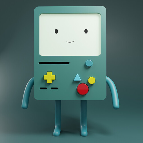
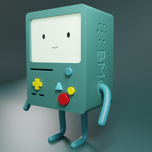
is it good ?
10 Likes
“Dude, stop pushing my buttons!” XD
Nice project!
I do wonder though, why do the 3 buttons in the bottom-right not follow any sort of alignment? This looks to be a deliberate design decision on your part and I’m just trying to figure out the reasoning (probably just a reference I’m not understanding, lol).
4 Likes
Looks good. I do wonder if such a hand held device would have softer top edges closer the soft upright corners.?
4 Likes
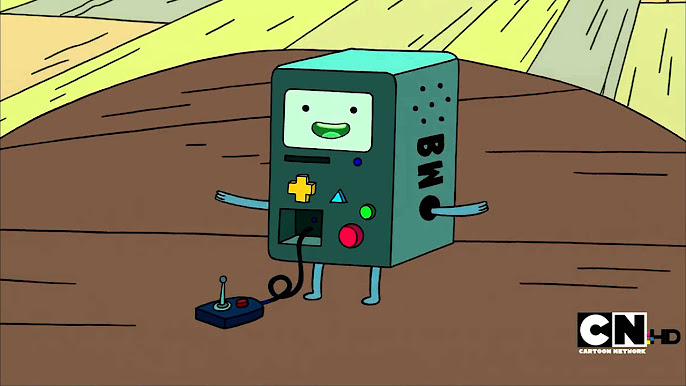
Yeah The buttons are not aligned because that’s part of the character, BMO is a beloved Adventure Time character

4 Likes
Aha! That makes sense =)
3 Likes


