Anyway I did a total mix salade.
So I have to add enemy canvas inside each enemy, and do the same with the script Enemy.cs ?

Anyway I did a total mix salade.
So I have to add enemy canvas inside each enemy, and do the same with the script Enemy.cs ?
Maybe it is better if i restart from zero 
Dont worry, I dont leave yourr course!!
Hi,
Yeah, there should be a canvas for each enemy and, each enemy should have the health bar script.
Might be worth flicking back to the appropriate lecture just to be sure you don’t miss anything.
Do make sure you make the changes on the prefabs though, or at least update them from the Hierarchy otherwise you will end up with some enemies with and some without the health bars.
I don’t think you necessarily need to start from the beginning again, maybe go back to the specific lecture about the healthbars and just go through that one again. 
Just a small change to the size and colour for me - just to bring it in line with the same theme as the player. Not 100% sure I’m happy with it, but I’ll stick with it until I confirm an art style I reckon.
My player healthbar drops in health to the left but the enemy healthbars drop in health to the right.
Any suggestions?
Also, the enemies would kill themselves as they shot at me before lesson 64. Now, nobody gets injured (enemies, players) upon change in the projectile script
Having some issues with the Enemy UI not lining up correctly (or being different with each enemy!) but otherwise pretty keen on my little radial health meter that winds down, looks neat! Will deal with the issue later.
G’day 
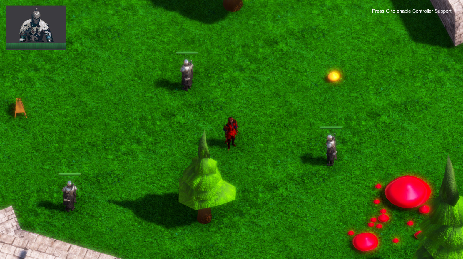
So here ist my implementation of the health bars. I tried to move the player health in the upper corner, just in case I integrate party members in the future (it’s nice to have all the character health in one place to quickly glance over it :-)).
I find the enemy health a bit “boring” right now as I found no creative solution for it at the moment. However there were some inspiring screens here allready so maybe I’ll try one of those techniques myself.
Disclaimer: The pixel art avatar is not my creation, just a placeholder to visualize how it may look.
All the best for your projects!

I am interested in that grass texture. Where can one get it from?
I don’t like the hovering health bars. I think they hurt the immersion somewhat.
My approach is to have the health bar show up at the top (centered) when I hover (TODO: make it a selection instead) over an enemy. This was a good practice for the Observer Pattern/Delegates as well:
My code is not so tidy though.
Hi @Vladimir_Mabhena, sorry for the late reply. I got mine from https://de.brusheezy.com/texturen/20185-nahtlose-gr-ne-gras-texturen, they are free to use under the Creative Commons License.
thanks @Quentara,
the standard asset grass textures dont look good for my liking. The one you have in your screen shot looks more vibrant and cleaner.