Firstly, apologies if a similar idea has already been floated.
With that said, I had an idea regarding the aspect ratio setup and was hoping to get the community’s thoughts.
Set aspect/resolution to 16:9 and target resolution for 1280x720 (Not sure of the proper terminology sorry).
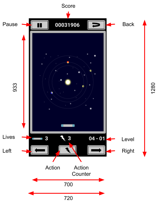
With that in place setup layout as below.

Some notes to explain the not self explanatory bits.
- 1280 x 720 screen aspect ratio (16:9) with gameplay taking place within a 933 x 700 (4:3) rectangle.
- Targets mobile but allows the bottom row of buttons to be removed for web and PC builds. Then move all elements down and place a header/title on top.
- Action launches ball at start of level then becomes the trigger for active collectibles. One active collectible at a time. Icon changes to display active collectible.
As I’m only up to the import package video, I wanted to see how practical implementing this layout would be with the eventual design of the game as it unfolds in the following tutorials. I’d really appreciate your thoughts. I’m keen to avoid shooting myself in the foot as I did with my overly elaborate take on Number Wizard UI.
If anyone wants to edit the concept “art”, it’s a Google Drawing that can be accessed here.
Thank you for taking the time to read 
