
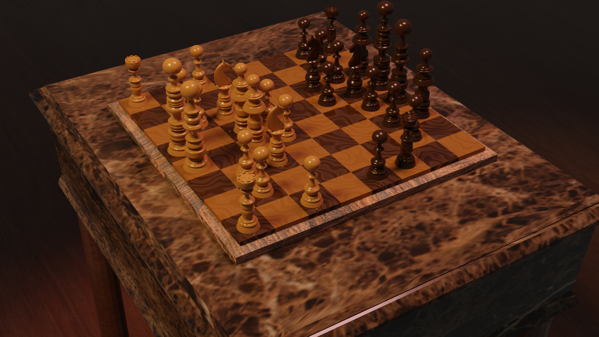
I still don’t know if I would change it to a more white type of light instead of orange since it makes it a bit darker.


10 Likes
I like lighting the way it is. Great job overall. 
Also, interesting choice of pieces, although if I played a game of chess with such pieces it would be quite confusing for me. XD
Wow looks great! I like the setting and theme you chose for the set. Odd design for the pieces though
The yellow orange (light) look, give more 18th century look-and-feel.
Like candle light. Which fits the overall design of the board.
I would add a slight bump map to the wood texture of the table.
The glossy it too smooth (unnatural).
1 Like
As Fedpete say the lighting fits the feel of the set up, all wooden room colours. I would not really have noticed or though oh coloured lighting. Which suggests to me it is just right, Personally if I notice the lighting colour with no reason, like sunset, artificial light, it means I see it as fake.