2024 Collab: Week 27 “Cold” - VOTE CLOSED

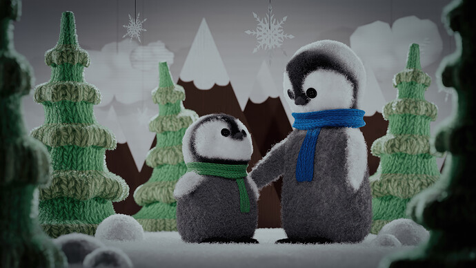
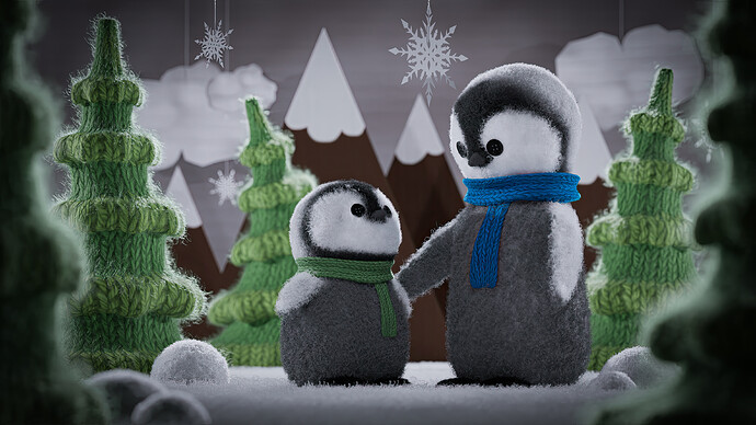
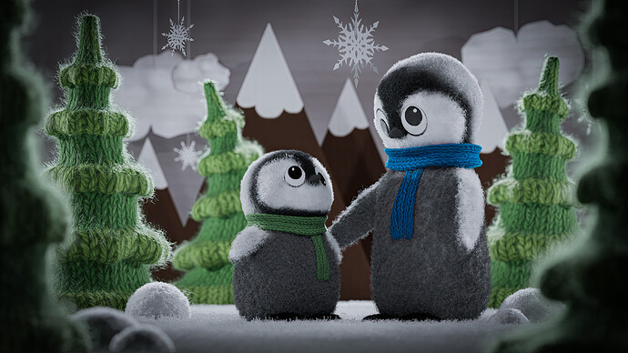
My first thought with the word cold was “ice”. And as I was thinking how I’d do something icy, I started thinking about penguins. When I started looking up penguins, I found various cute wool penguins on various sites like Etsy. I decided to create a little scene for my wooly penguins to sit in with crocheted trees and cardboard backdrops. It’s both cold and cozy :).

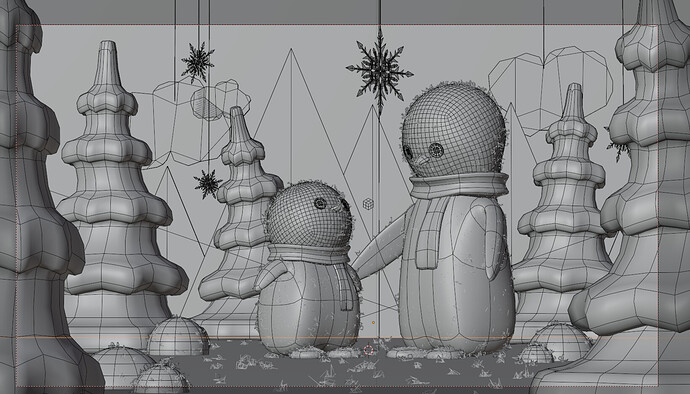
Wireframe:

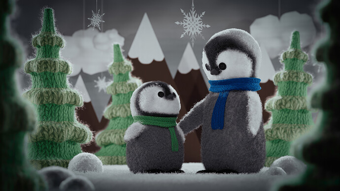
Updated render correcting cardboard texture in BG, darkened backdrop to better frame the penguins and other elements, and improved the yarn trees by making them look even more worn - as if they’ve been used for years.

12 Likes

I have been really enjoying your collab entries. This one has some awesome detail! There is something strange to me about the mountains; some combination of the focus and the texture makes it seem unnaturally blurry–they seem to have less detail than the clouds, which are further away. Exactly because everything else has such rich detail, it draws my attention. I think a rougher texture on the mountains, and maybe a slight taming of the FOV, would help unify the scene.

1 Like

Thanks, @Turgul. Think of this like a diorama or a shadowbox. The mountains and clouds are cardboard flats that are actually all very close together. They are not far apart. What may be throwing you are the clouds have horizontal cardboard lines which show up more prominently than the vertical and, especially, the one small cloud attached to the bigger cloud that has even stronger horizontal lines. I will tone down the displacement on that one and the other clouds and that may help resolve things better. I will also adjust the scale of the cardboard lines. I think the cloud lines may be too small which is also throwing things off.


I just adjusted the size of the cardboard lines and I think it already feels better. I will re-render later today to test my theory. Thanks again!

6 Likes

I think you did a great job with the diorama idea! I also think the cardboard looks better here. I think part of what was visually confusing before was the expectation that a diorama box is small so the blur difference between the mountain and the penguin right in front seemed a bit too much. I look forward to the updated render :slight_smile:

2 Likes

Thanks for all you do for the GDTV Blender community!

3 Likes

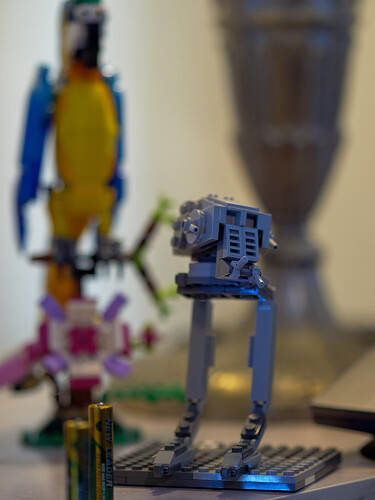
Thanks again, @Turgul. I don’t know how much you know about photography and lenses, so I apologize if you already know this stuff. I wanted the scene to have a very shallow depth of field. In Blender, I set up the camera to be 150mm with a f-stop of 1.2. That’s a really high aperture with a shallow depth of field. I took a photo of some items on my desk to demonstrate.

I shot the Lego figures with the same settings as Blender: 150mm at 1.2 aperture. The lamp in the shot is 3 inches behind the Lego parrot, which is about 4-5 inches behind the Lego AT-ST and the batteries are about 2 - 3 inches in front of the AT-ST. With such a shallow depth of field, only the AT-ST head and part of one battery are in focus.

Hope this helped explain my thought process.

6 Likes

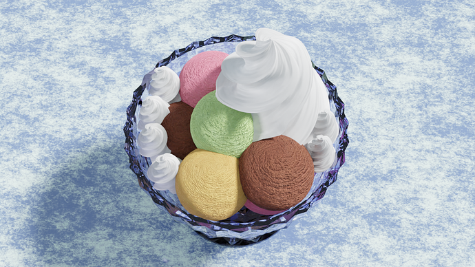
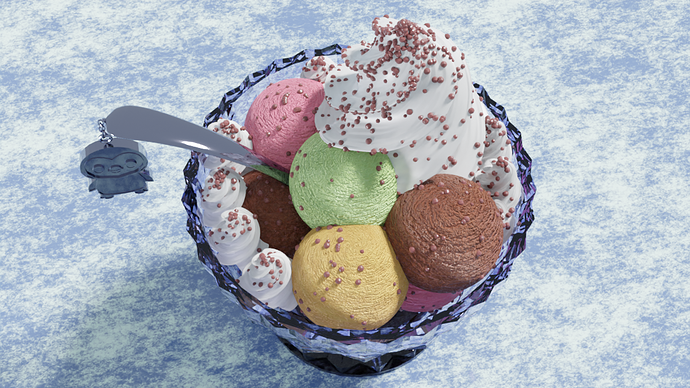
I am not sure that it is so cold, or I am dreaming about it because it is starting to be hot here :hot_face:, but this is what I am working on. I had a totally different idea (it happens really often these days :grin:), but simply had to make that glass.
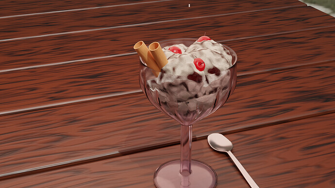
At last, at least I could manage to add some sprinkles, let’s try this one!

11 Likes

This looks delicious! Now I want gelato :rofl:

1 Like

10 Likes

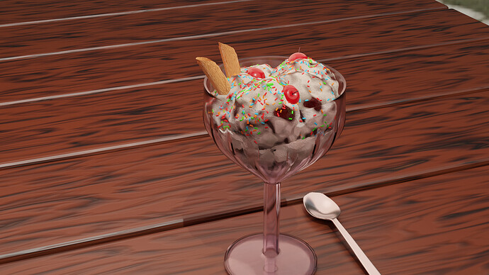
That looks really tasty, too. However, you may want to adjust the cookies a bit as they look more like uncooked pasta. I believe you are making tuile rolls, which look like this: https://thumbs.dreamstime.com/z/belgian-tuile-biscuit-curl-belgian-tuile-biscuit-curl-isolated-white-242545401.jpg
Hope the reference helps!

2 Likes

yeah still playing with it haven’t used blender in about a month so relearning it forgot a lot of shortcut keys and where stuff is but its coming back slowly
https://stock.adobe.com/images/vanilla-strawberry-and-chocolate-sundae-ice-cream-cup-and-wafer-isolated-on-pink-background/233459399
more like a wafer is what i’m going for

1 Like

I would’ve liked to add a few more props here and there to fill the scene out, but really, I’m just glad I managed to find some time for this.

Noot-Noot! XD

7 Likes

You done did it! And great choice to add the sprinkles on top. Nicely done!

2 Likes

That penguin is an Artiste! Absolutely adorable expression. Love that it is tooting its own horn, so-to-speak.

2 Likes

One thing that got cut from the plan was to have the Robby sculpture wear a musketeer hat or a tricorn or something (as a prop, like the top hat on a snowman). Still, pleased with how far I got!

Glad you enjoy it ^v^

1 Like

That’s nice, @CoreyKnecht ! That penguin may be an artist with Blender too :grin:!

2 Likes

Really nice scene overall. I think the improvements to the cardboard cutouts in the background help anchor the scale of the scene as a diorama, I’d maybe make them even more pronounced even. If I can drop my 2 cents on it I think there is maybe some scaling problems with the yarn texture. The yarn on the scarfs is significantly smaller than the one on the trees, I know yarn comes in many thicknesses but the discrepancy here seems a bit much. I would also suggest using adaptive subdivision for the yarn objects, it would give them better volume and help hide the color seams on the trees, though admittedly I don’t know how well it’d play with the hair system.

Also, if you can be bothered, I thought it’d be funny if you gave the penguins googly eyes instead of buttons, not for the final piece but just for the laughs. Just something I thought I’d throw out there for my own amusement :sweat_smile:

2 Likes

Did a quick update and re-render to fix the trees a bit. I repainted them, but I did it quickly, so it’s a bit sloppy, but definitely better than the originals.

And, for you, @VVruba, here’s some googly eyes (not for the collab this week, just for fun).

8 Likes

We @BlenderCollab have a few days to vote. You can vote fast but also think slowly about design, colors, technique, difficulty, subject, realism, etc. Choose consciously and not on your entry.
The new subject week 28 “In the summertime” has already started. The winner of this week’s “Cold” challenge may select a subject for next week 29 and win a badge.

1 Like

@mfortunato Congratulations on your winning Collab entry on the topic ‘Cold’. I have to say the cold looking scene gave me warm feelings. I love this style, playful realism. With a good choice of textures and materials. The scene composition is well done!


  • BH67 - So recognizable this one and a fun story. Try to add more variation (details) in the snow. It’s too equal (white surface)
  • Megane_Wang - Looking tasty. Everything looks in-place, except for the spoon handle, too blend? Maybe the reason to add a keychain?
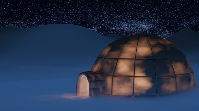
  • Joey_Cuevas - Cold vs. iglo … i understand. But light/heat coming through the dome is a bit unatural. Placing animals in front of the opening (seeking the warmth), could give the scene a story.
  • Willrun - A very nice ice sorbet. I think the wooden planks could be improved, looks like plastic. It draws the attention away for the subject.

Note: I don’t want to offend anyone. I try to write down positive ideas and visions in my simple use of the English language. I am also sometimes more inspired by a particular subject or solution. I’m also learning from you!

4 Likes

Privacy & Terms