2023 Collab: Week 17 “Coral reef” - VOTE CLOSED

Unfortunately most of my replies are going to have to be complements(instead of stuff to work on) with my limited knowledge of blender…

@VVruba Nice back to back wins you are 2 for 2 now, interesting camera view, gives that realistic feel to the scene, the seabed is very detailed with much vegetation and a wear and tear type of feel, very colorful corals as well, I also like the idea of the nemo styled fish, amazing job for consecutive wins!

@FedPete Very vibrant and colorful scene, I like the idea of seeing the fish in the background, and those golden pearls really drew my attention for some reason, nice shiny feel to them, the best thing in this scene in my eyes, is the corals, really vibrant colors, nicely done!

@Kzanna Really cool scene, very easy to looks at, the nemo fish are amazing, and that turtle in the background is wonderful really adds to the scene, nice low poly type rocks and corals, great job on your scene!

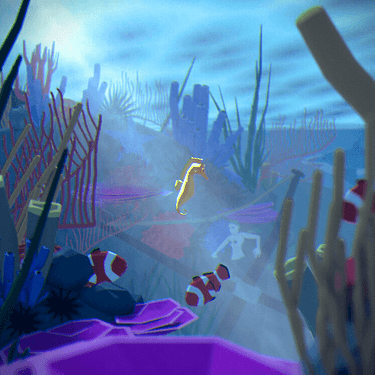
@Medial The lighting and fog is what makes this scene elevated in my opinion, great job with all the underwater vegetation, I also saw the mermaid down there😁, took me a bit to see that lol, also nice work with the shark in the background, gives a lot for the user to think about.

@consummatumest Really good job with the colors here, especially with the rock structures in the background, I like the fluffy feel on the corals, I live the submarine here, different than the other submission, I think it goes great with the scene, wonderful job!

@visionary5 lots and lots of color on your scene, looks great, the pink seabed look rather interesting,but with everything else it fits well, the circular corals are probably my favorite pary of this scene lots of details and has a satisfying look to it, amazing job!

3 Likes

@VVruba congratulations on winning the Blender collab “Coral Reef”. Your creative underwater-world scenery looks from a submarine point-of-view. Where the plexiglass windows distort the view in a nice, creative way. We also appreciate the look into your design process with an animated GIF. It helps students! Well done.


General note : This “Coral Reef” subject could easily be called “Nemo’s place”. What an impact Disney has on our way of visualizing an underwater world.


  • FedPete - Vibrant colors ‘Yes’! But the vegetation is too simplistic. Air bubbles are a bit strange for this type of scenery. The sky needs to go from light to dark, not the other way.
  • Kzanna - Great composition. Try to increase the lighting a bit by adding additional lights to enhance certain aspects, like the turtle, which is barely visible. Or a more vibrant Nemo. Global world lighting can be improved by using the world sky texture ‘Nishita’.
  • Medial - Greal low poly, but maybe too low on the main purple object. Closer objects need more details. The construction of the scenery is good. try to enhance the center (of attention), a pirate ship.
  • consummatutest - I was very impressed by your submarine’s interaction with the water’s surface, in the first scene of your movie. Well done! The color is a bit flat, too bluish-green. It suppresses the yellow submarine.
  • visionary5 - I like this, because of the wide range of different creative corals. Nemo is a bit lonely, a simple linked duplicate could solve that. Overall lighting is good!

Note: I don’t want to offend anyone. I try to write down positive ideas and visions in my simple use of the English language. I am also sometimes more inspired by a particular subject or solution. I’m also learning from you!

6 Likes

@Christopher_Powell & @FedPete Thanks guys, I went for a fish-eye camera so it’s kinda like you’re the fish, part of the reef so to speak. I’ll take the sub though :man_shrugging: maybe we’re in a seamoth :sweat_smile:. I just wanted the viewer to feel like part of the environment so I think it works either way.

@FedPete your scene is super intense, you took post-processing and cranked it to the max. There is some kind of wave distortion, noise, chromatic aberration, vignetting… Maybe it’s a bit hypocritical of me since I also use those things quite often but I think you pushed them a little too far. I like the addition of starfish in your piece, kinda feels like the rest of us completely forgot about those guys.


@Kzanna I like your piece mostly as it is, it’s my favorite this week. I think for improvements making your water a bit more vibrant would be nice. The muddy teal is not incorrect per se, but I think your scene could be more lively with a brighter more saturated water color.


@Medial Your foreground feels too busy while not bringing that much value to the piece, and there is too little focus on the seahorse in my opinion. I would, quite literally, just crop in. The pink coral on the left also feels like it’s intruding on the seahorse’s space a bit too much. Lastly, there’s no watery hue in the piece, it doesn’t really feel underwater because of it. Maybe I’m being a bit harsh but you set a high bar last week. You did make a lot of models though, so props for that. Here is a quick edit (I hope you don’t mind):

Seahorse


@consummatumest The Beetles are gonna be gunnin’ for you to get their yellow sub back!
Good effort with the caustics but they feel a little too “electric” and show up in shadows. You could try to more closely match real-life behavior of light when faking an effect.


@visionary5 Black background, again! :sweat: At least put another rock in there.
Anyway, good effort with the geo nodes, they are hard. I also attempted to use this challenge to learn them but failed and gave up; ended up just using material nodes with displacement. One thing I do know is that you can pull the black dot from the Group Input node into the Seed value of the points distribution and size. You can then change it per object in the modifiers tab. It would help to randomize the corals on the left a little.
I am impressed by the foldy brain coral, it’s a very complex shape that, to be honest, I don’t know how I would approach. I’m kinda curious how you made that :grinning:

6 Likes

I am really loving these feedbacks and thank you for sharing knowledge @VVruba @FedPete @Christopher_Powell

3 Likes

Thanks for the feedback and constructive critique, much appreciated.
I think it was my first attempt at square composition (I feel much more comfortable with 4:3 or 16:9), and I agree on quite a lot of points you make. True, the seahorse is placed as a main subject, but in the same time it is not, mainly because of its size and other things detracting from it. Id have to keep that in mind in the future. Probably should have put the masthead in focus instead of the seahorse. But I like the story to happen in the background (Linda Landscape with the falls of Icarus style).
I wanted this entire image to feel busy, but probably it is overdone, and it feells @FedPete has good point here with purple coral being too low poly, or rather ill-placed, as it comfortably eats up half of the foreground :wink:

What I dislike the most is the lighting in this scene - I failed completely to reproduce sun rays through the water, also not 100% sure wdym by water tint, I have a feeling it can be very different. But here it looks way too much like a fog, I didnt know how to get the result I wanted with the limited time I had. Also eevee probably doesnt help, but that’s what I decide to stay with.

3 Likes

Privacy & Terms