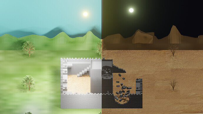
just a suggestion maybe put the halves of the sun and the moon in the middle of the scene… or at the same height and equal distance away from each other
Oh a reminder to any that fancy a quick castle. There is an add on built in that makes castle bits.
Enable Mesh Extra Objects.
Then under the Add Menu, Mesh, go down to ‘Extras’ Wall factory is there.
I actually used that for my walls
I guess, but they aren’t the same season or time, so
Nice low poly look
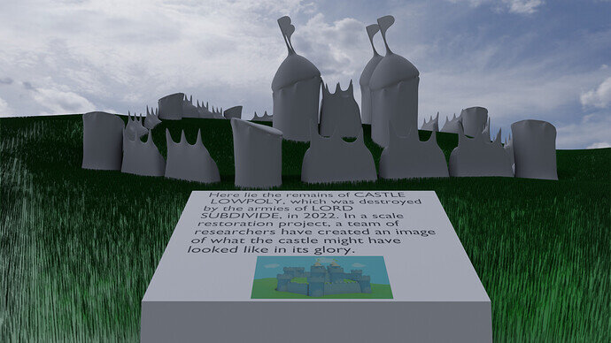
An excess of ambition for the collab, but something I wanted to do at some point, so it was a spur to start it at least.
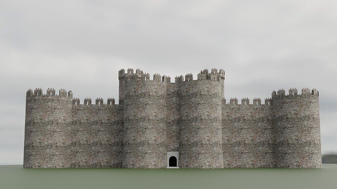
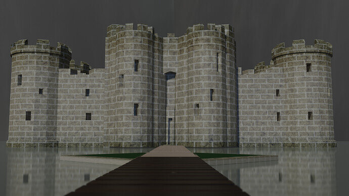
Harlech Castle.
Probably do a thread showing more work in progress.
We @BlenderCollab have a few days to vote. You can vote fast but also think slowly about design, colors, technique, difficulty, subject, realism, etc. Choose consciously and not on your own entry.
And the new subject week 34 “Amusement Park Items” has already started. The winner of this week’s “Castle” challenge may select a subject for week 35.
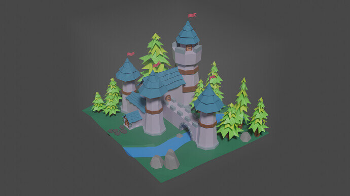
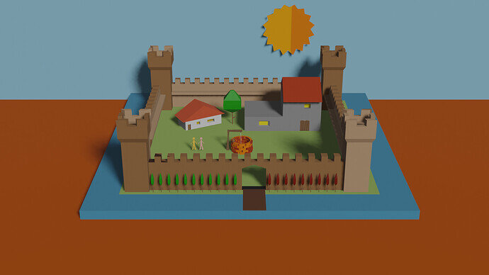
@Yee , congratulations on your winning entry in the “Castle” collab. It’s a cute collection of tiny castle elements. Can be part of an RPG scenery.
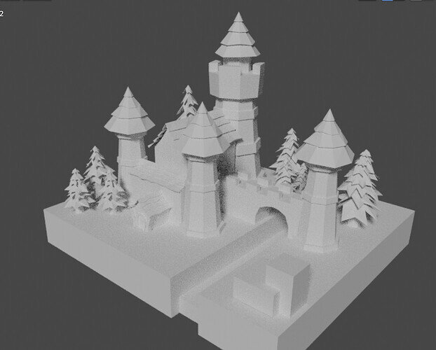
- elibyy - A fine set of details. But the truth lies also in the details. The moat around the castle lies below the ground level, not on the ground.
- Cows - To me, it looks like a painting. Day and night, new (fresh) and old (worn). When using the sun or moon as a background, then lighting (shadow casting and exposure) can be a problem.
- TheDespicableDM - a fun idea! Adding more details and textures could bring more life into the scene.
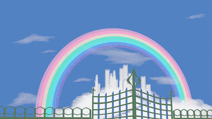
- Willrun - I like the bright and colorful scene. I think cloud city could use more exposure. More and bigger in the scene (in the center). The fence blocks partly the view of your beautiful castle. Now the attention goes to the rainbow.
- Lochness - Great castle and point of view. If you used a more blue sky, the grey castle pops out more. Now it blends into the background.
- NP5 - This project is less about polygons, but more about texturing. High details but with a noticeable repetitive texturing, which is hard to overcome.


