3 hours is way less than I was expecting.
smart thinking …
Vote for “Default Cube”
We @BlenderCollab have a few days to vote. You can vote fast but also think slowly about design, colors, technique, difficulty, subject, realism, etc. Choose consciously and not on your own entry.
And the last subject this year, week 52 " Snowman ” has already started. The winner of this week’s “Default Cube” challenge may select a subject for week 1 (the first of this new year 2022).
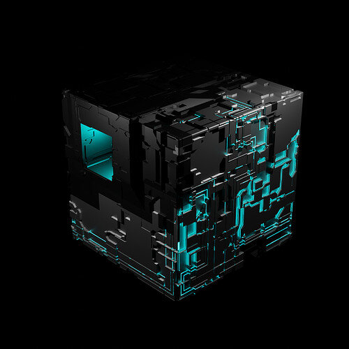
Congratulations goes to @Digitz for his ‘Borg’-like Default cube. It’s a mysterious construct, colourful and lots of tiny details. Great entry for such a simple subject.
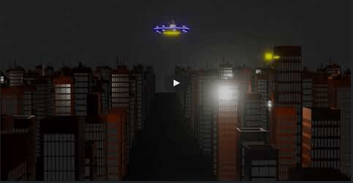
- Rao, it was an old project. But the animation did the trick!
- Yee, loving this one. First I thought you used a displacement routine (it can be done!). I think it could use improved light and or texturing.
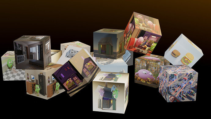
- Mateusz, great idea, maybe more wind (blow) effect. As in moving objects.
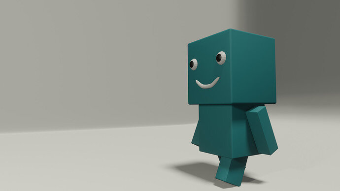
- umishrak, fun figure. Add more object to give us a story. Why is he smiling, or walking towards …
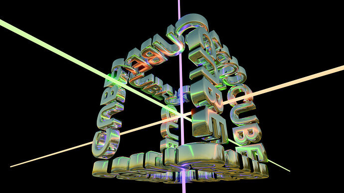
- FedPete, reflective materials and glowing tubes, give a lot of visual mess. Try to simplify.
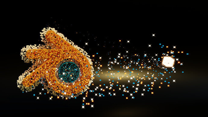
- Enodes, fun idea, but too simple I think. Bevel the cubes for example.
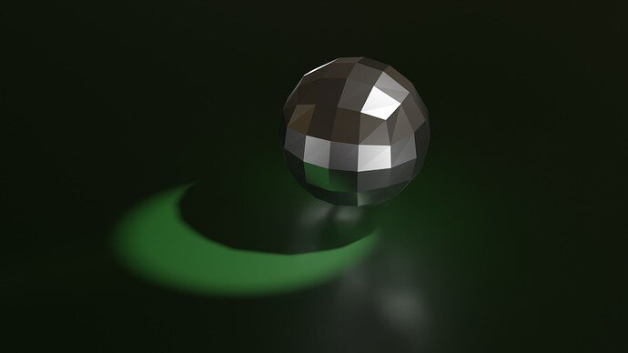
- NP5, I like the reflection/highlights. But is has less ’ Cube’ feel.
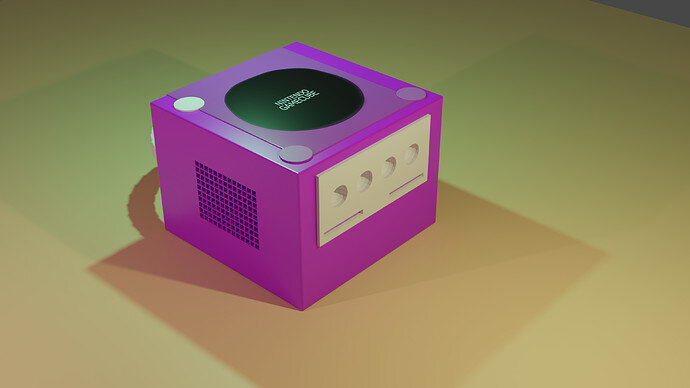
- Willrun, expected a higher score.
I agree. I was thinking to add motion blur to it but it became to complicated for me yet. It would take a lot of experimenting. To get it right I would have to make cubes fly fast from the source “mother cube” and gradually slow down as they settle down in the destination. Would be blurred on the right and les and les toward the left. It would be a quick thing to do if I already knew procedure. But now you mentioned it. I will be tinkering with falloff. 
I’ve never played with it yet, but there is a Directional Blur node for post processing in Compositor. Might be a more simple way for you to get the effect you’re looking for.


