I’m from India, and I’m 12 years old 
 , and thank you!
I think it’s really good that you are interested in blender, nice to meet you, I live in the UK xxx jess
Thats. Yhm, unconventional story 
Made me laugh. And art work looks soo goood.
It looks in places they reduced fps. Still must have taken ages to render.
Nice piece 
All assets, are free for download if you are a Blender.org community member.
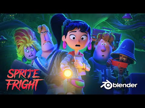
It was amazing to see how much work they did. Character studies, color schemas, walking cycles, lighting …
And then you see so little of this hard work back into the movie.
I expected more from it, it’s not my favorite piece. But yes, it fits this weekly collab subject.
I did the old courses, started somewhere in 2016. Now a YouTube tutorial is enough.
I’ve surpassed basic Blender knowledge, and in need of bigger hardware to do bigger projects.
Amazing
Thank you 
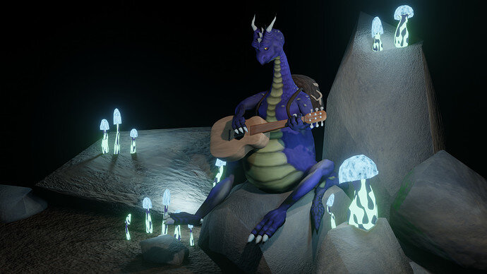
Van Peachenstein highly appreciates your comment and will keep on practicing the guitar 
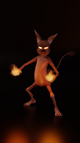
Little late but here I am with my “Fire Imp”
It took me way longer than planned but learned pile of new stuff.
Hand painting is so much fun. Quite resource heavy though. Had no idea.
Very nicely done, so worth the extra amount of time it took to complete. 
Thank you. Who need’s to sleep anyway 
very nice. I love the fires in hand…
Voting for “My own monster” theme - week 43
We @BlenderCollab have a few days to vote. You can vote fast but also think slowly about design, colors, technique, difficulty, subject, realism, etc. Choose consciously and not on your own entry.
And the next subject, week 44 " Once upon a time in Wild Wild West, there was” has already started. The winner of this week’s “My own monster” challenge may select a subject for week 45.
0 voters
Maybe little, cool/hot for sure 
Cool 
thanks xxx jess
@Jack_Mak_Morn , Congratulations, for your winning entry in the " My own Monster" collab. I has a good composition and fine lighting in a dark environment. The animation (with sound) is excellent, it is fun to see and watch. The texture of the monster is beautiful, full with nice details.
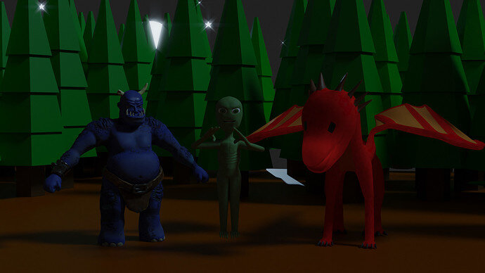
- Roa - The global illumination could be improved. And I like the dragon glowing mouth. Maybe adding a bit of smoke.
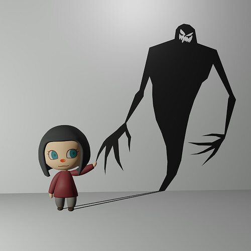
- Sblendid - Welcome back, nice to see you back with such inspiring illustration. I think the girls face could use a touch of sculpting (nose, mouth).
- Mateusz - While the shiny floor is a nice effect, it doesn’t match the overall design. (Maybe adding shiny floor tiles, some floor texture …)
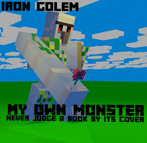
- Yash2009 - Very recognizable figure. The idea is great, but I miss some details, like the clouds. Different lighting could add some details to them.
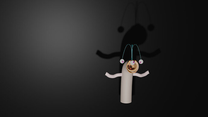
- StevenNani - It’s a funny monster, but it floats in space. It needs more context (how, what, where)
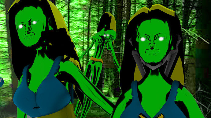
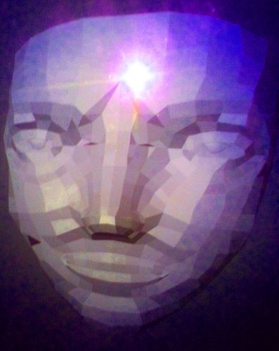
- jessbernstein - I find this a really spooky monster, maybe because it is human-like. It could use more color variations.
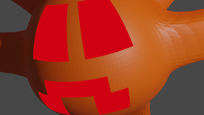
Caleb_Kofoed - Add smoothing to the mesh object. Add details and maybe it is too close up.
All fine entries, thank you all for participating.
Rectification
When I do my weekly chores of setting up the votes and new collab challenge. I don’t look at details of the outcome. So I didn’t see we had two winners this week 43 “My own Monster”. @Rao was curious about this!
My apologies for this mistake. Congratulations goes also to Rao for his winning entry of the “My own Monster” challenge.


